A MINTY MAKEOVER
Bringing the Breathsavers’ neutralizing
flavors to the 21st century
Backstory
Client name : The Hershey CompanyLocation : Pennsylvania, USAWhat they do :
The Hershey Company has been one of the largest manufacturers of sweets and savory snacks for over 125 years. It started with chocolates and has grown its portfolio to include: mints, popcorns, pretzels, and dietary snacks.Breathsavers is one of Hershey's brands that has been around for over 40 years. Through the years, it has been designed based on trends but has not kept up. In their research, consumers not only want the fresh feeling from their mints but from the way they look too! Our task was to refresh the image of Breathsavers to match the new brand positioning and voice while also building a visual system that will take them to the next level and equip them for the future.
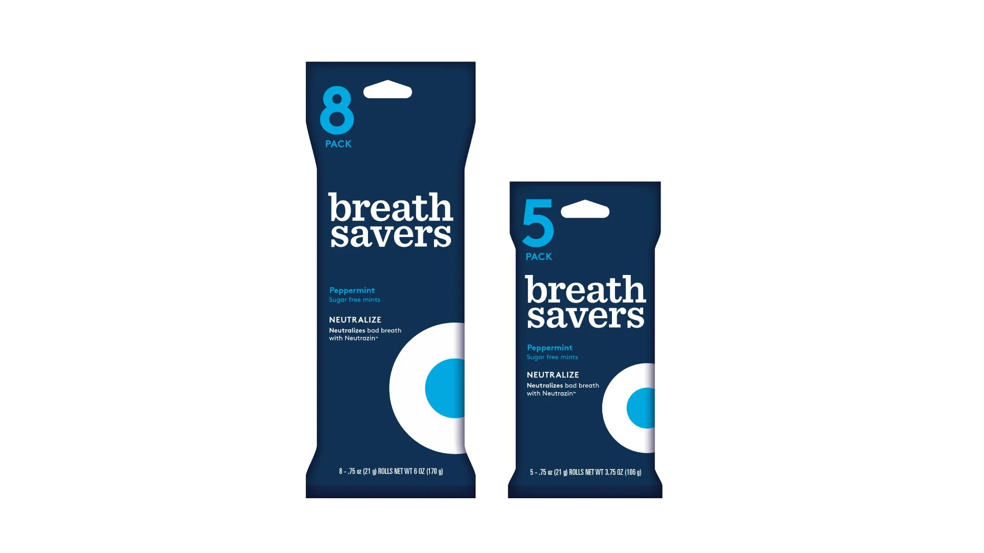
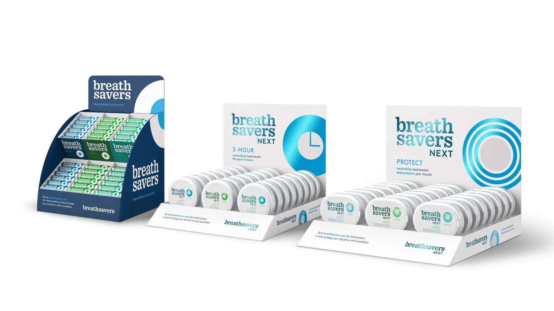
This challenging part is creating a compelling design that can survive time while fitting it in a three-by-one-inch roll. At the end of the project, we will provide a new logo and a visual system that can flex from roll packaging to point-of-sale displays.

Solution
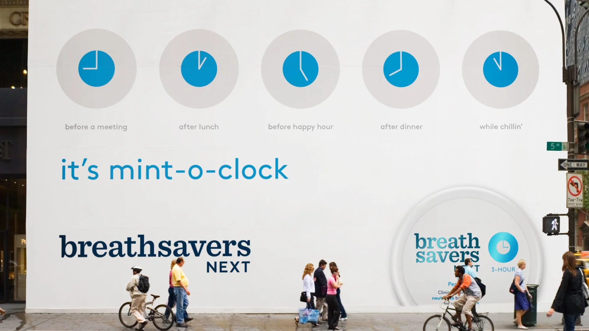
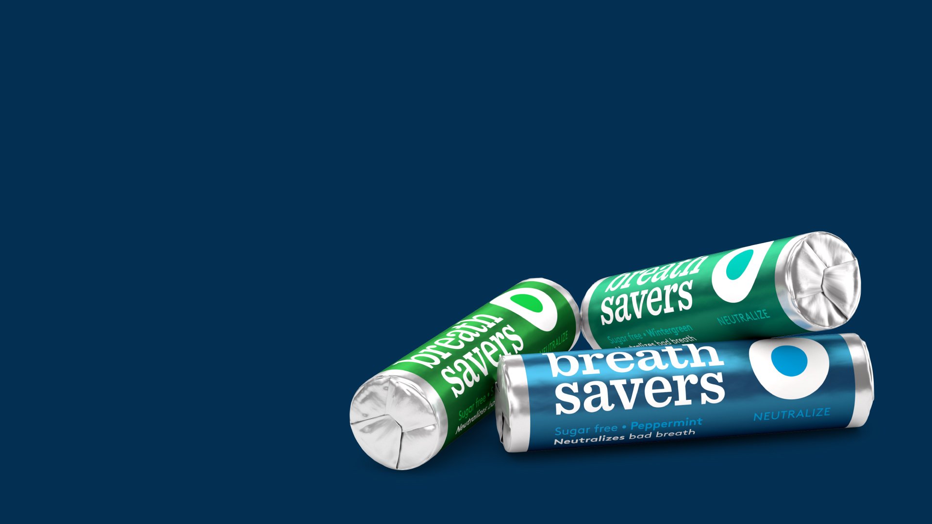
In the end, the client selected a direction with friendliness and systematic visual cues. Our logo is approachable using a typeface, making the brand easily distinguishable, especially when presented at a small scale, in a category with much visual noise. In addition, the mint shape inspired our graphics and explored the product's benefits while keeping it fun and straightforward.
Did it pop?
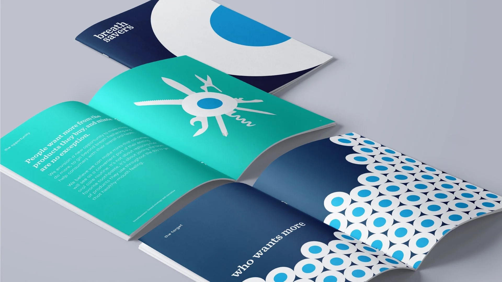
Our strategic lead design was a success. After testing and some regulatory changes with the graphics due to packaging constraints, the client implemented the new brand. As a result, you can find the new labels proudly displayed on shelves and in big box stores nationwide. As a final handoff, we developed a delightful brand guideline that includes visual narrations using the graphics we created for the new visual system.
Process
We work alongside the strategy team to learn the goals to take the brand to the next level. For example, we encouraged the client to lean on how the mint neutralizes your mouth than just giving you fresh breath. Our collaborative effort motivated us to make sure our design could communicate the right message.
We took inspiration by looking at other brands in the category and learning how effective they are. For example, many mint brands are very cluttered and graphically heavy. We use this finding to elevate the brand and design a straightforward and refreshing system for the category.
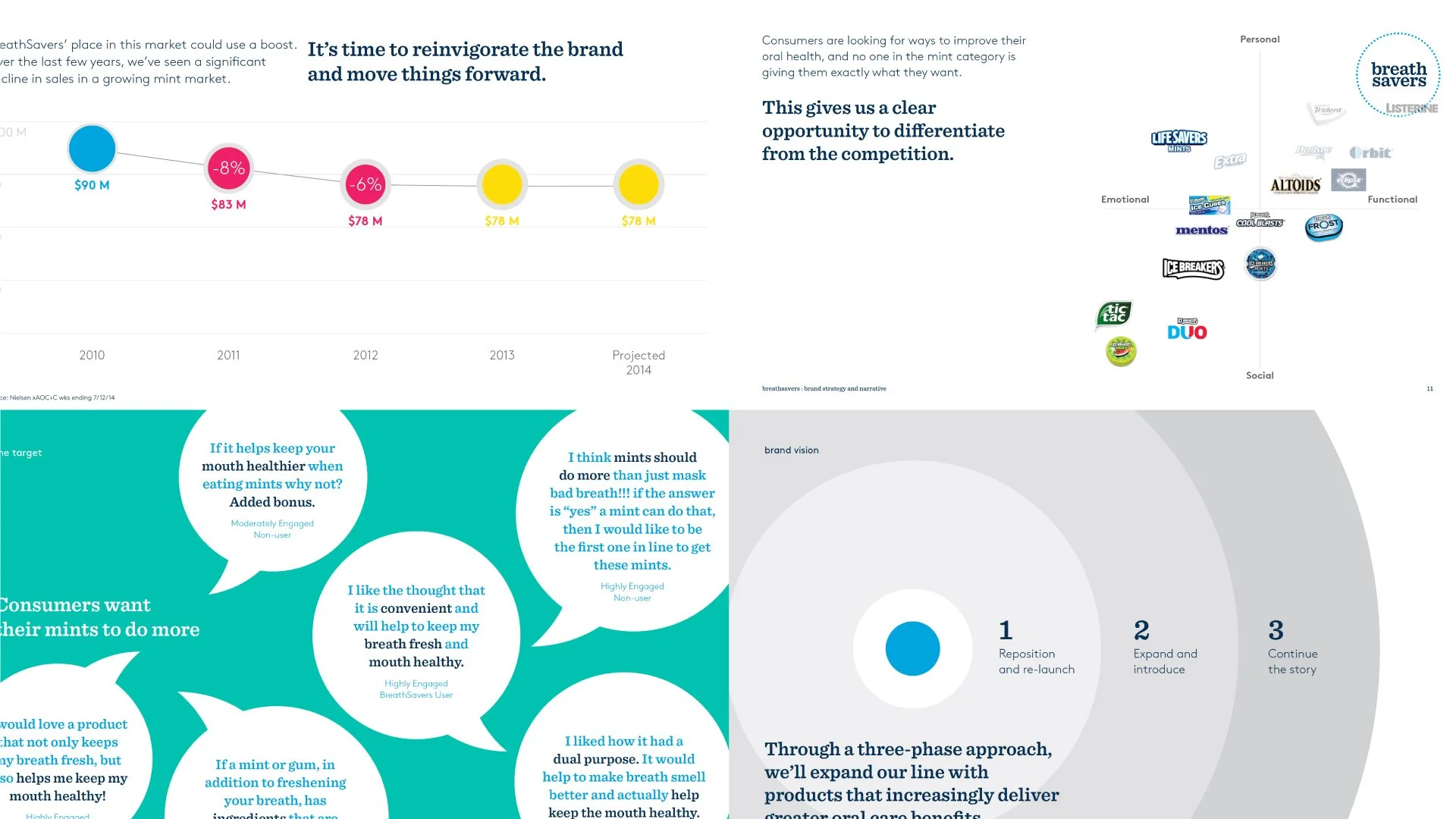
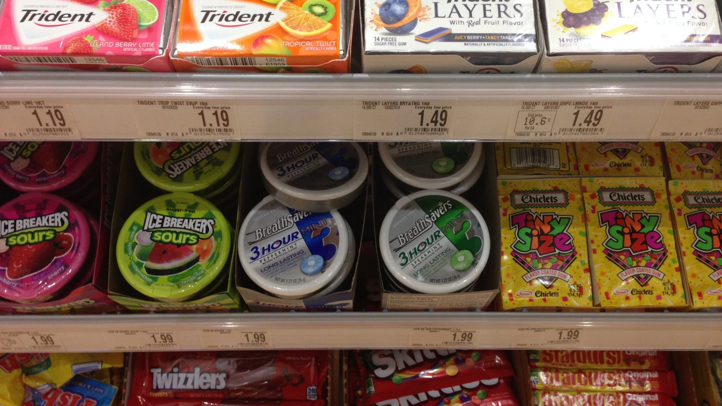
Research and surveys that informed strategy and designOld Breathsavers rollsOld BreathSavers 3-hour puckPictures from our food trip in PhillyInspiration
We looked at designs between close-in to far-out ideas. We used some inspiration from Swiss graphic principles for the simplicity and longevity of their graphics.
Sketches (clockwise from top-left): Lettering logo concept, point of sale sketches, and brand book storyboardConcept board to design conceptProject squad
Designed with ProphetPeter Dixon, Partner • Paul Wang, Senior Design Director • Michael Allen, Design Director • Baron Santiago, Senior DesignerI was responsible for design audit, design exploration, and building the guidelines. In addition, I created the selected logo and visual system for this project with the help of Mike and Peter’s direction and content refinement. Paul helped early in the concept phase.


