Need
For Speed
Creating the new logo for AT&T 5G service
BAckground
Client name : AT&T CorporationLocation : Texas, USAWhat they do :
AT&T is one of the leading telecommunications and media company in United States.In anticipation of the 5G service, AT&T needed a new 5G logo that represents speed as their previous attempts looked dated and did not carry the momentum of the brand’s progression.
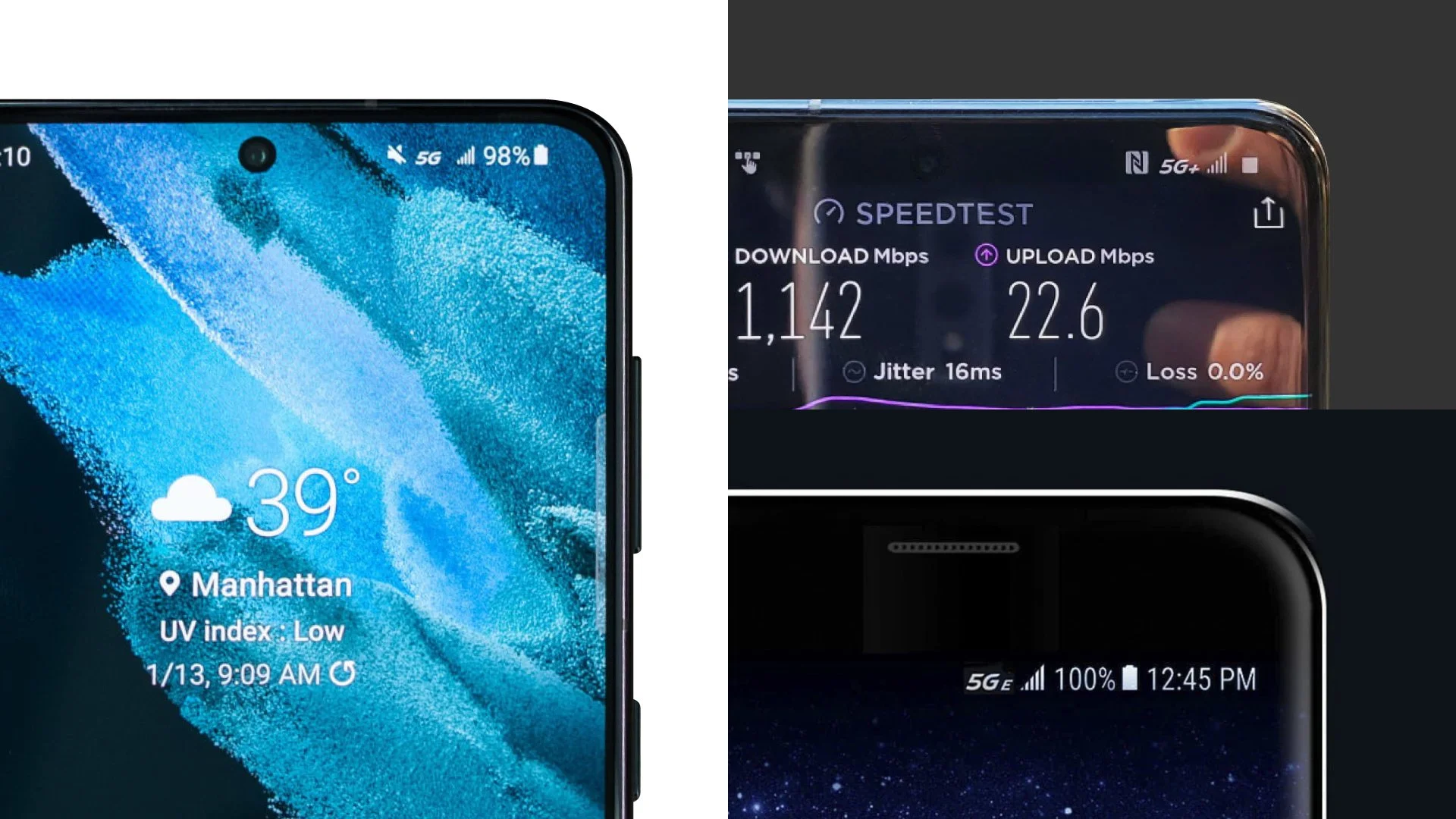
The challenge of this project is that AT&T already has a set of visual systems, including a proprietary typeface that we must use. So while the new logo needs to adhere to the current system, this logo will also appear on the status bars on Android phones, which are about 18x18 pixels!
Solution
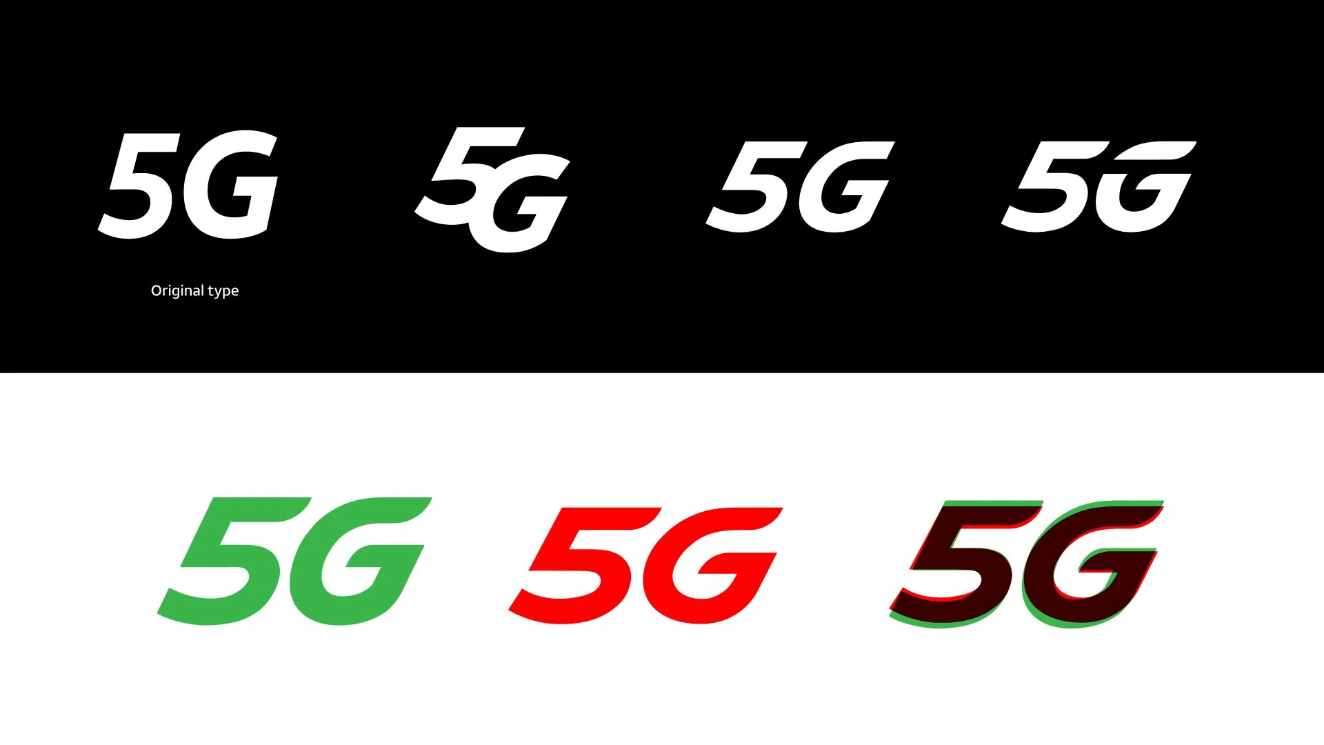
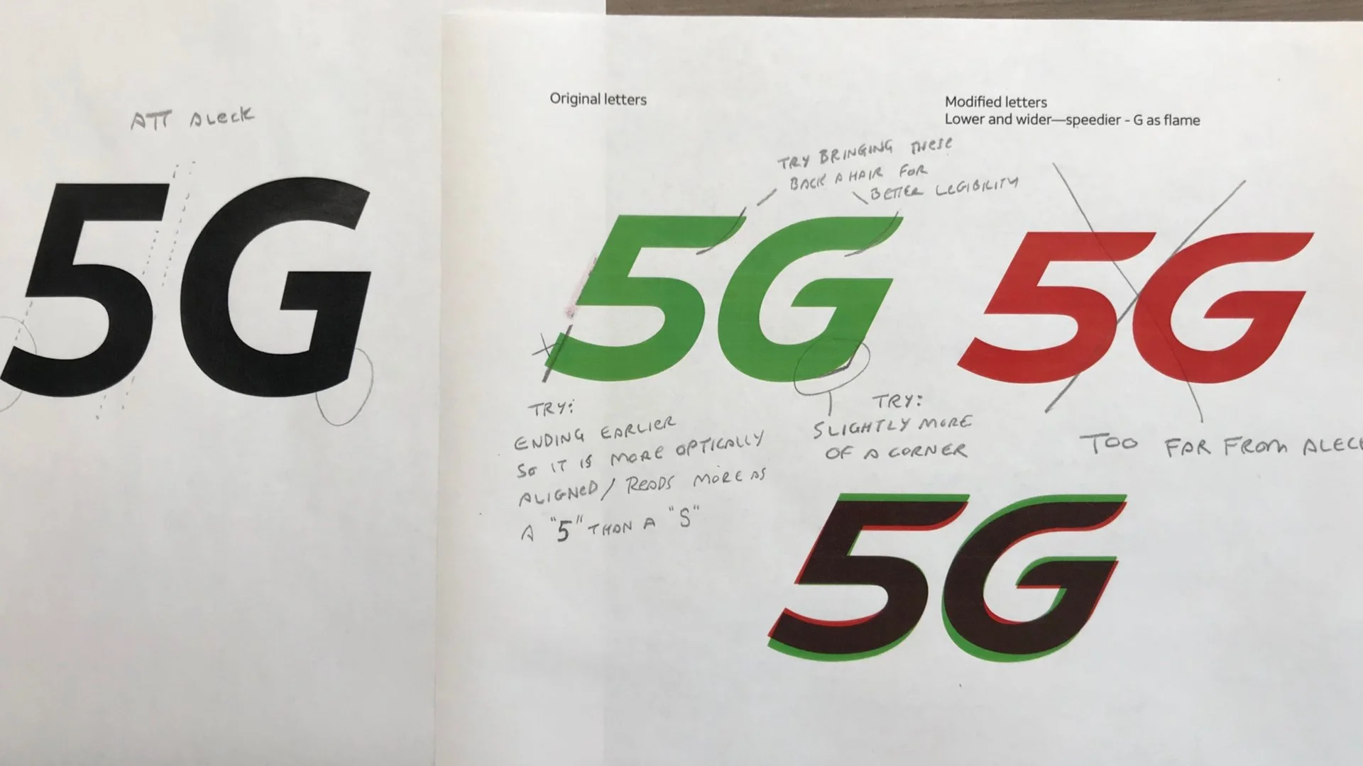
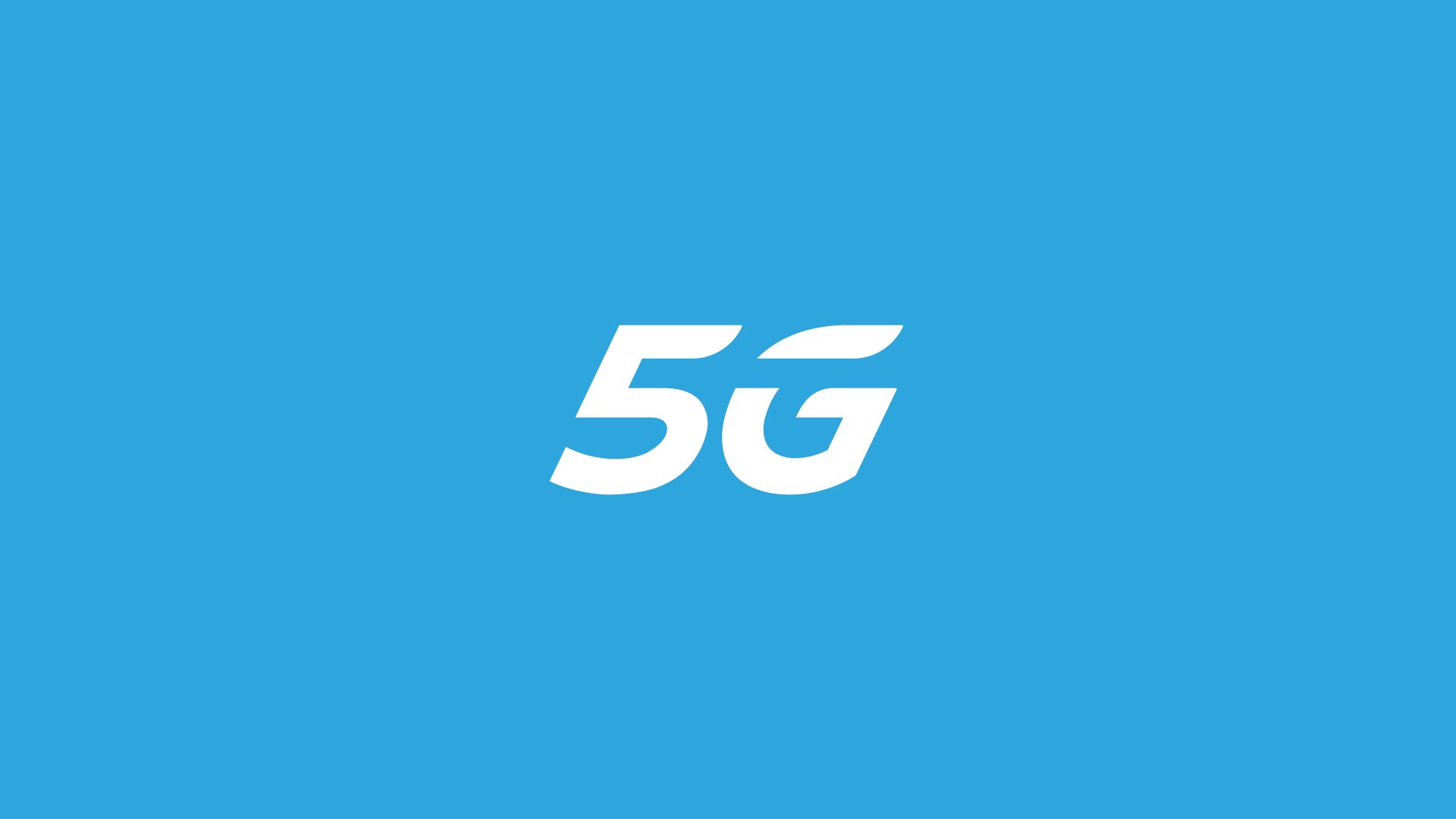
Using the brand type, I modified the angle of the italicized version of Aleck Sans, added other customized little touches, and gave visual cues to communicate speed and motion. For example, I angled the finial and terminals of the crossbars and softened the corners to suggest fast without being aggressive. During the process, we ensured that our symbols would work in actual scale using our phones to test the symbol reproduction quality was consistent.
Did it pop?
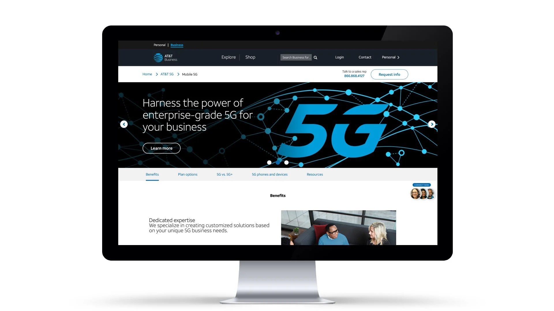
In December 2018, the 5G service launched, and the new symbol appeared nationwide. So, 5G is finally here and going strong and seen in commercials and different brand executions and sponsorships across America.
Process
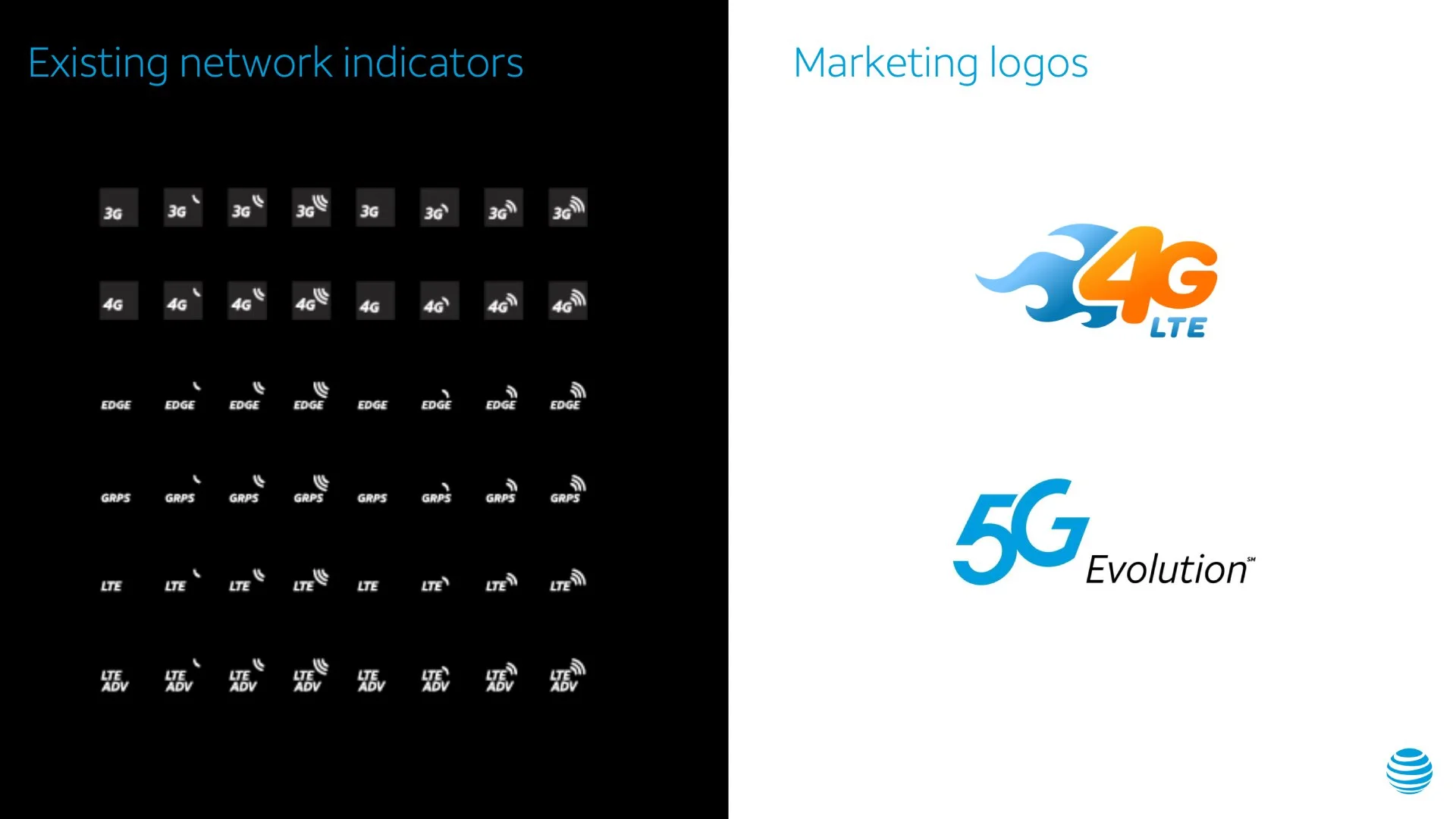
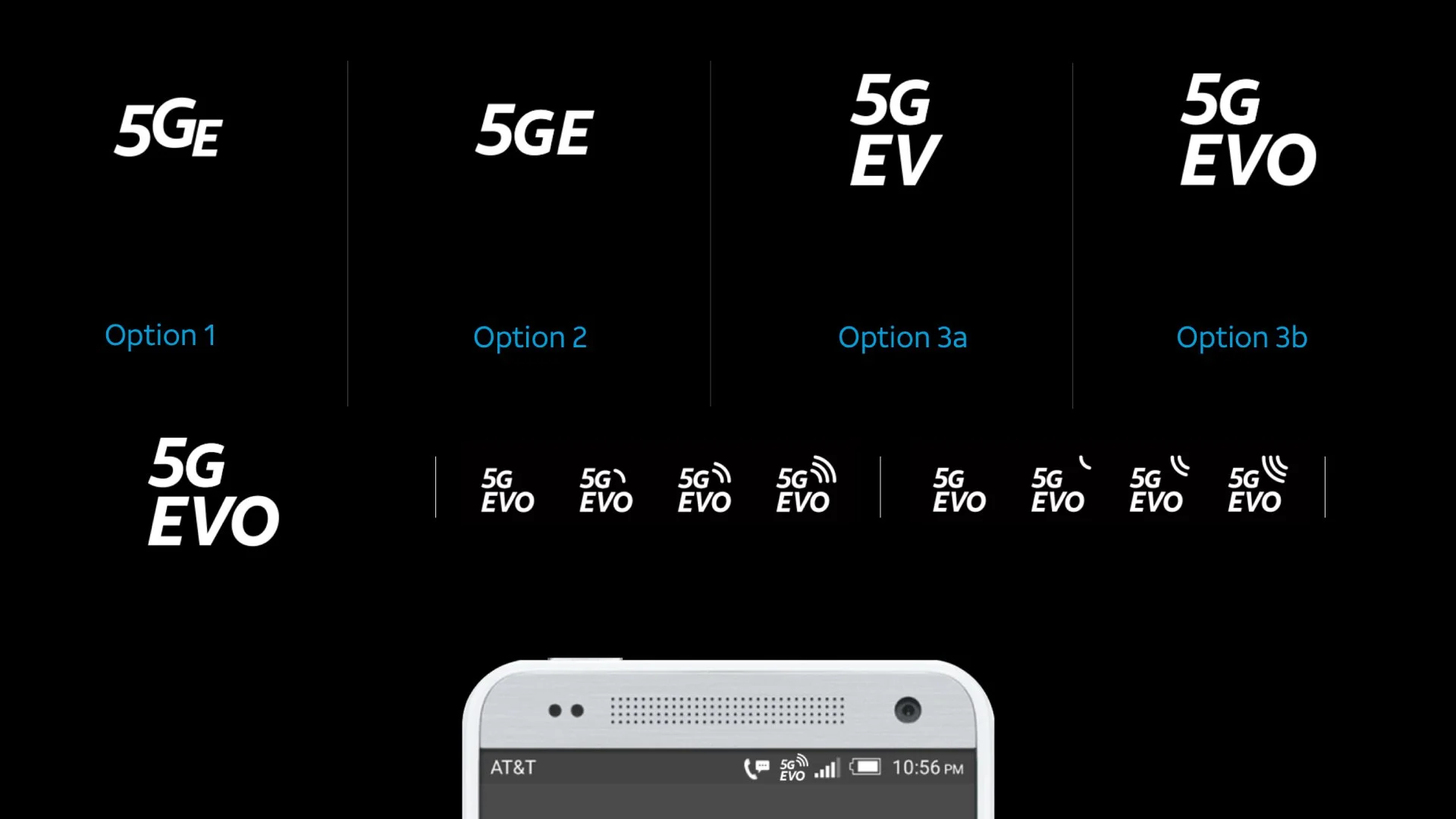
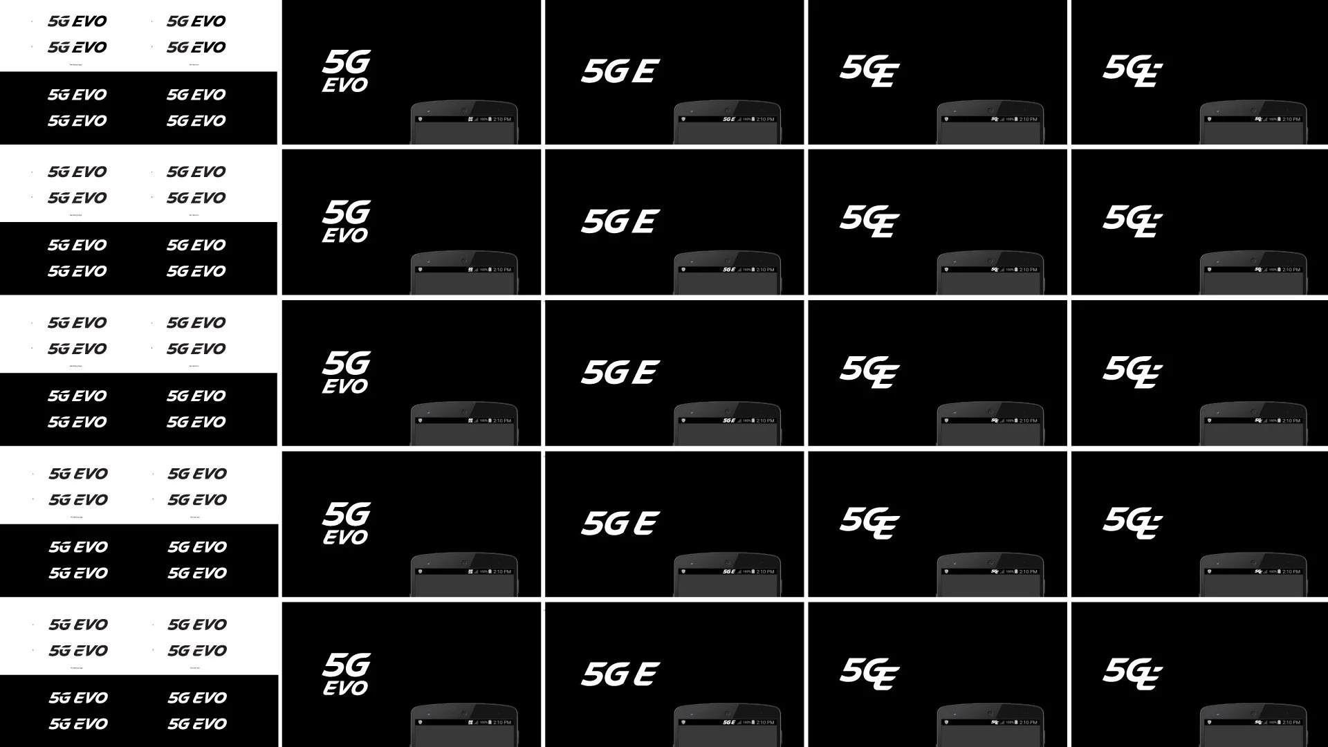
AT&T's design team attempted to design the new symbol but lacked quality. It was too playful for a brand set to be the next entertainment company and needed to portray itself with maturity. In addition, the symbols explored did not meet legibility when applied in the phone's network status bar.
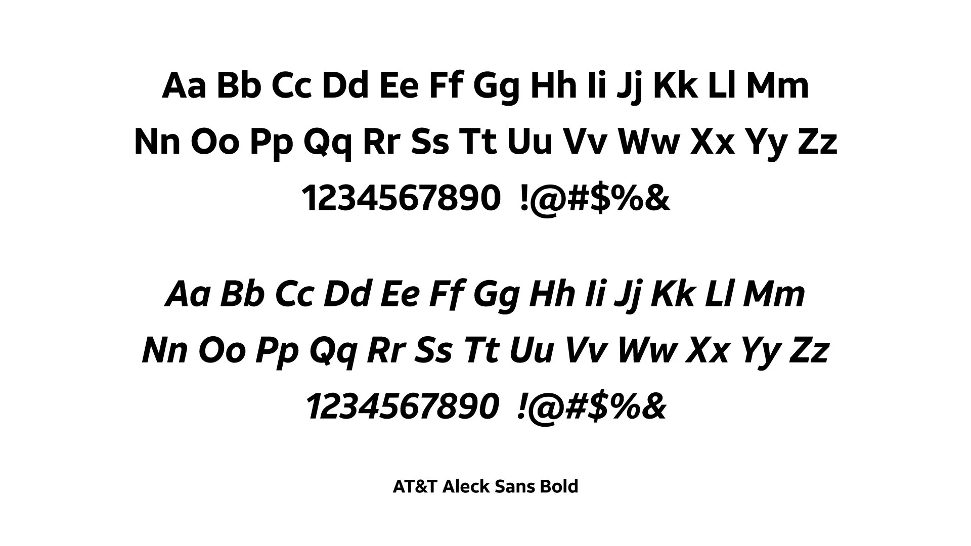
Existing network service iconsClient's previous explorationsAT&T customized brand typefaceInspiration
To achieve brand cohesion, I studied the AT&T typeface to figure out much we can leverage the qualities of the characters without losing the personality. The italicized style was insufficient in showing speed and had to be modified.
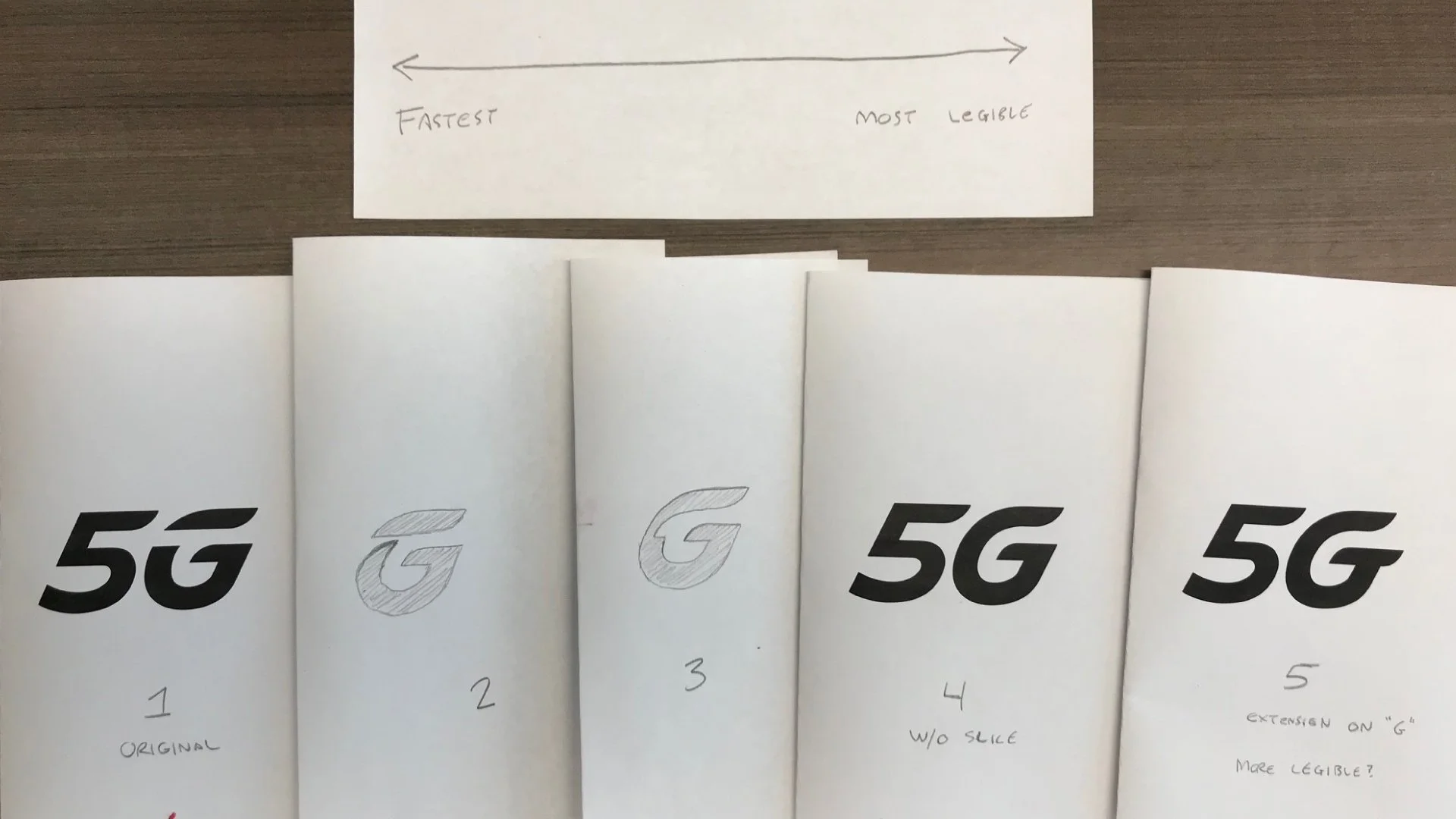
Initial sketches to get an idea where the client wants to take the logoLOGO SKETCHES
We looked at many variations and treatments to the symbol—angles, height, and details that would suggest speed while keeping in mind that it will be shown small on screen.
Exploration of customization and detailsClient's comments and other ideas to be sketched outFinalizing details for the network status bar iconLogo variation explorationProject squad
Designed with ProphetAndres Nichols, Partner • Baron Santiago, Design Director/DesignerAndres and I worked closely with the client to ensure that the logo we create will have a long shelf life.


