Smart shopping
Creating an educational shopping
experience for high-tech furniture shop
Backstory
Client name : LovesacLocation : Connecticut, USAWhat they do :
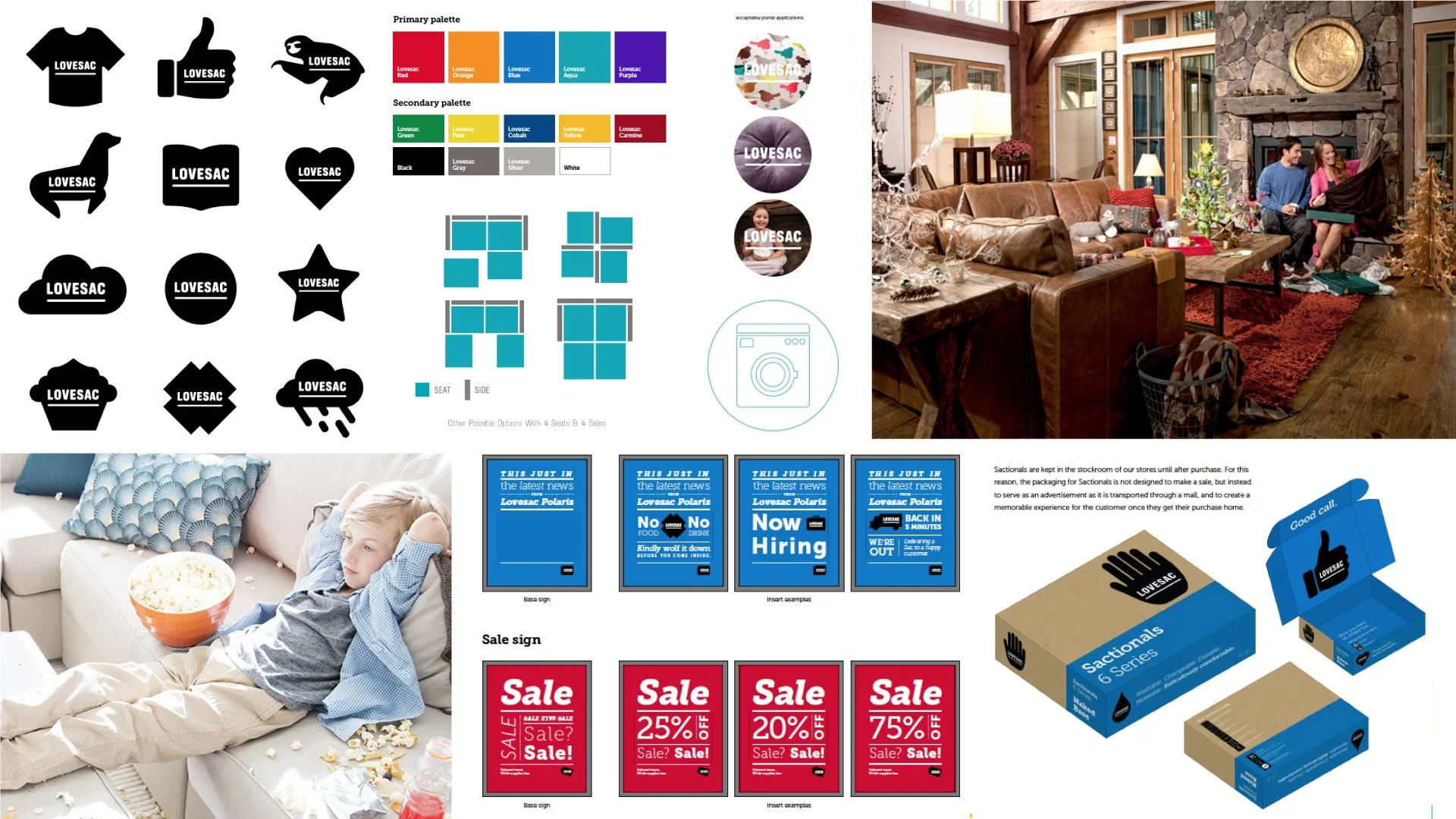
Lovesac started out selling bean bags in the early 90s and was a huge success. Then, in the early 2000s, they took the brand into a new path and started selling their 3-piece system modular couch called Sactionals. With this new addition in the product line-up, success was imminent, and stores began opening up across the United States, making Lovesac the pioneers in modular seating furniture.Before our work, Lovesac’s brand visual system changed almost every year but did not update the stores. Since then, they have created inconsistencies across the stores in the states, and with a growing brand, cohesion and familiarity have become a priority.
Our client is very proud of his brand, so he wants to build a brand that can last forever, as his products claim. Therefore, creating a timeless graphic system is crucial. In addition, we must ensure its endless applicability through print, digital, and space by giving them a new logo and a visual approach to reflect their products’ ingenuity.
We also had to design a store to make the space work for the products and deliver the message as customers walk through the store without getting a lengthy sales pitch about the ease and ingenuity of their product.

Solution
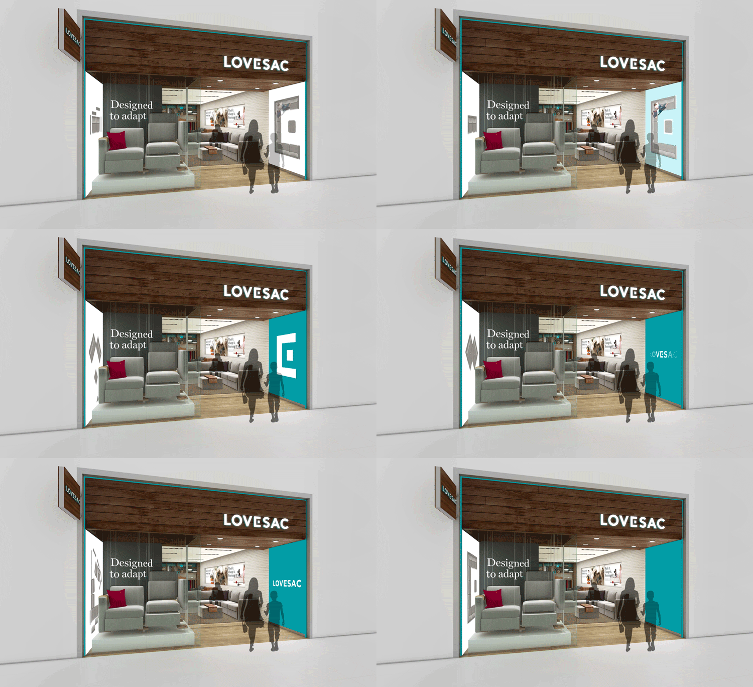
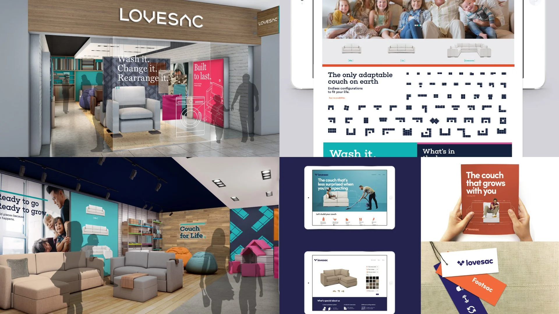
We based our winning design solution on the signature product, The Sactionals, a modular sofa built with simplicity. We used The Sactionals as inspiration for the logo and visual system. We chose colors that compliment the brand’s warmth and innovative qualities. These also inspired our typography by combining serif and modern sans serif typefaces. And using the new visual system, we created a museum-style shopping experience where we visualize their lengthy sales pitch in the store.
Did it pop?
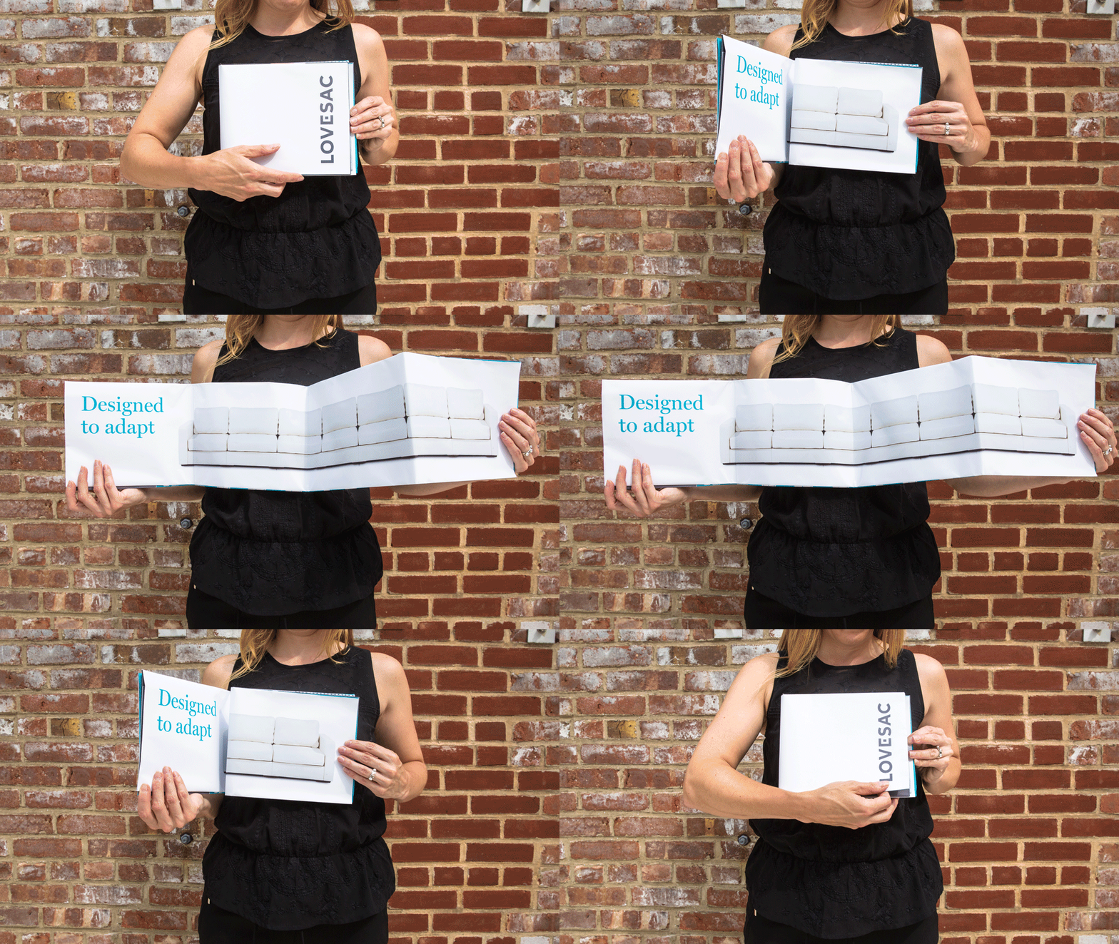
Creating a thread from product to visual system to space is a brand that is in control. We were able to translate the founder's passion to life and created a tailor-made shopping experience for their brand. They implemented the new visual system nationwide, and stores looked like our rendering came to life. As a final handoff, we delivered a brand book proportionally sized as one of the Sactional bases. The Lovesac brand is thriving, inviting new investors and collaborators to join the party. They even have commercials playing on prime time!
Unfolding the footprint poster. Customers can take a few of these home to layout on the floor and get an idea of how many pieces they will need. Donna modelingStorefront renderingStorefront in reality, photo from Lovesac wesbiteInterior renderingInterior in reality, photo from Lovesac websiteProcess
Our process started by looking into their current brand and competitors while also doing store visits, inventory of materials, etc. We found out that every store has different logos, and some would have multiple branding styles. Each store layout also reminds you of a standard furniture store that is less innovative than the product.
We also visited their headquarters and met with the founder and designer of the new Sactionals. During this visit, he gave us a sampling of their speech to potential buyers. Interestingly, they had this lengthy sales pitch convincing enough that we all jumped up and down the couch to prove its strength.
Lovesac shared their house-built strategy which we used as our inspiration for designClockwise from top-left: Mike Perry is getting the sales pitch on configuring the couch pieces using the magnetic toy blocks. The proprietary clamp Lovesac uses to combine the couch pieces along the foot base(not pictured), Mike Perry testing the mobility of the couch piecesMagnetic toy blocks inspired the E in the logo and the square shapes in the visual systemThe old visual system is a collection of elements that do not go well together. It results from many changes over time and basing on trends of the period. It buried the innovative qualities of the product through less sophisticated typography and a less sophisticated color palette that provides too many options making the brand less competitive. Even with photography, they are camouflaging the products.
Inspiration
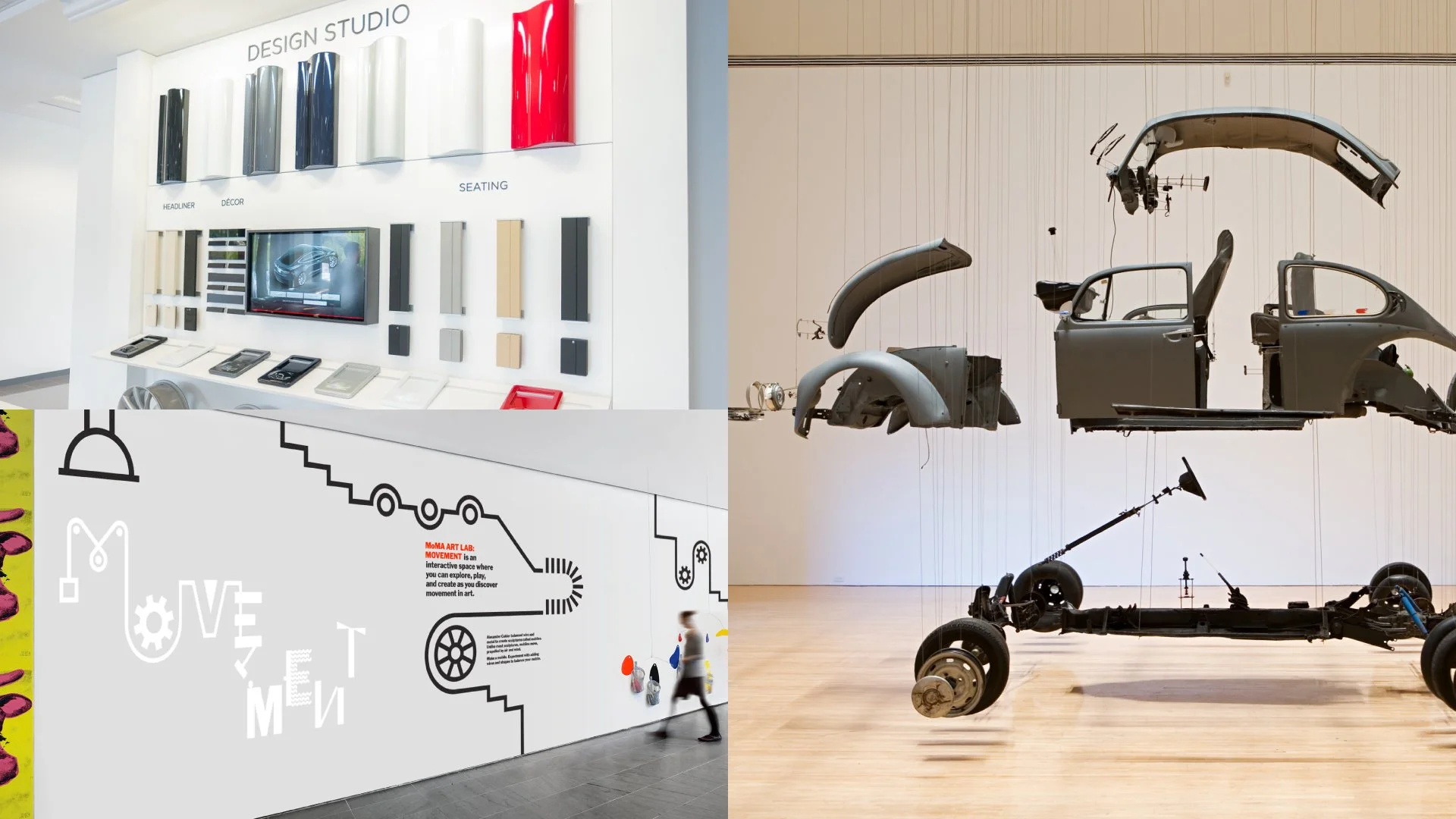
Our inspiration for the space came from car showrooms like Tesla, where they lay out the different pieces to personalize your car (pictured on the top-left). MoMA Art Lab: Movement inspired the museum-like exhibits in the store (shown on the bottom-left). Damian Ortega’s Cosmic Thing VW Beetle dissected) inspired the exploding couch displayed in the store window.
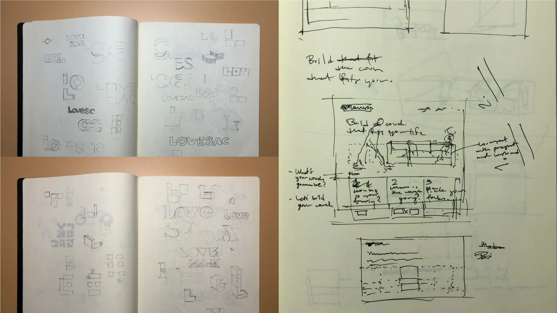
On the left are logo sketches and to the right is a layout sketch of a website conceptDesign concept explorationsProject squad
Designed with ProphetAndres Nicholls, Partner • Craig Stout, Associate Partner • Donna Hadfield, Art Director • Baron Santiago, Senior • Designer Dani Kim, Designer • Sofia Oom, Design Intern • Arthur Chu, Design Director - Architect • Mike Perry, Senior Designer - Architect • Alex Majkowski, Senior Designer - Architect • AJ Artemel, Designer - Architect • Vibha Agarwala, Designer - ArchitectThe graphic design team consisting of myself, Dani, and Sofia were responsible for the design audit, design exploration, and building of the guidelines led by Donna. I also went to the stores and jumped on the couch with the client. I designed the selected logo and visual system for this project with the help of Sofia and Donna’s creative direction. Sofia did all the animations. At the same time, Mike and Arthur lead the store design with the assistance of his team and guidance from us to bring the space to life, from displays to wall graphics.


