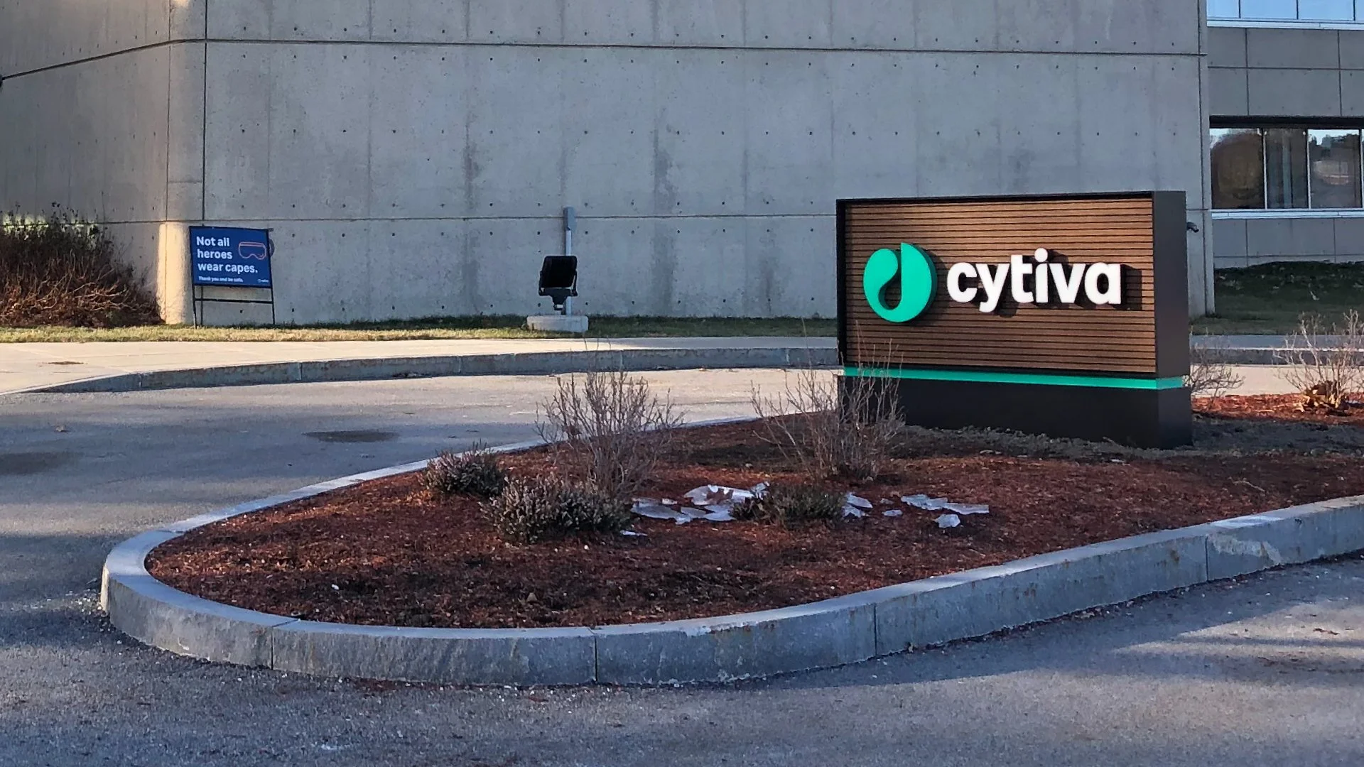
Brought
back to life
Creating a Life Sciences brand with style
Backstory
Client name: Danaher Corporation Location: Massachusetts, USAWhat they do:
Danaher is a conglomerate company consisting of different corporations in different industries spanning from Pantone to medical devices.Danaher Corporation acquired GE Life Sciences business to expand their life sciences portfolio to include research and production of cures and therapies. This brand acquisition required Danaher to create a new identity that should be ready as soon as it's a done deal.
The new brand needed a new name, a new logo, and a new visual system that reflects modernism and warmth to feel elevated amongst its competitors on top of communicating speed and precision.
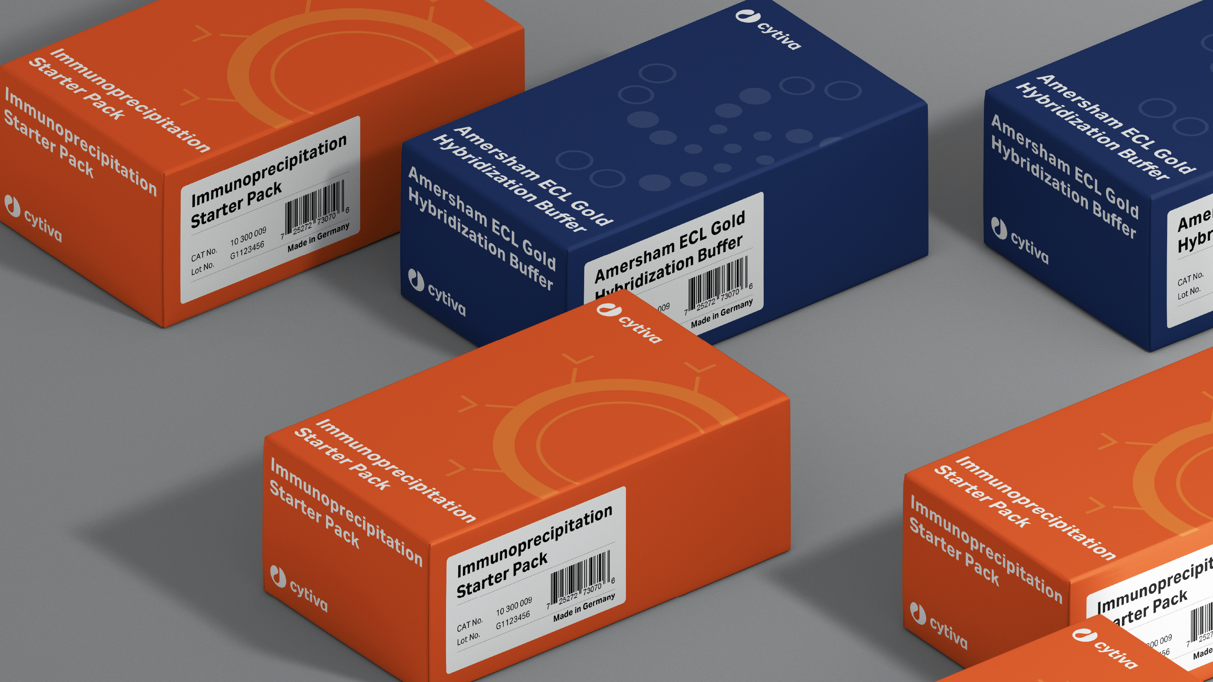
The project seemed straightforward initially, but our challenges came about when the project was divided into two phases. They've asked us to design the logo, determine a new color system, and customize a brand type in the first phase. These elements will "find and replace" the current GE elements (GE logo, color palette, and GE Inspira type) on the web, printed materials, and product badges as soon as the acquisition is finalized.
The project's second phase is to build a visual system using the elements from the first phase. From this point on, the process became more familiar, and my team was able to deliver a modern and sophisticated biopharma brand.

Solution
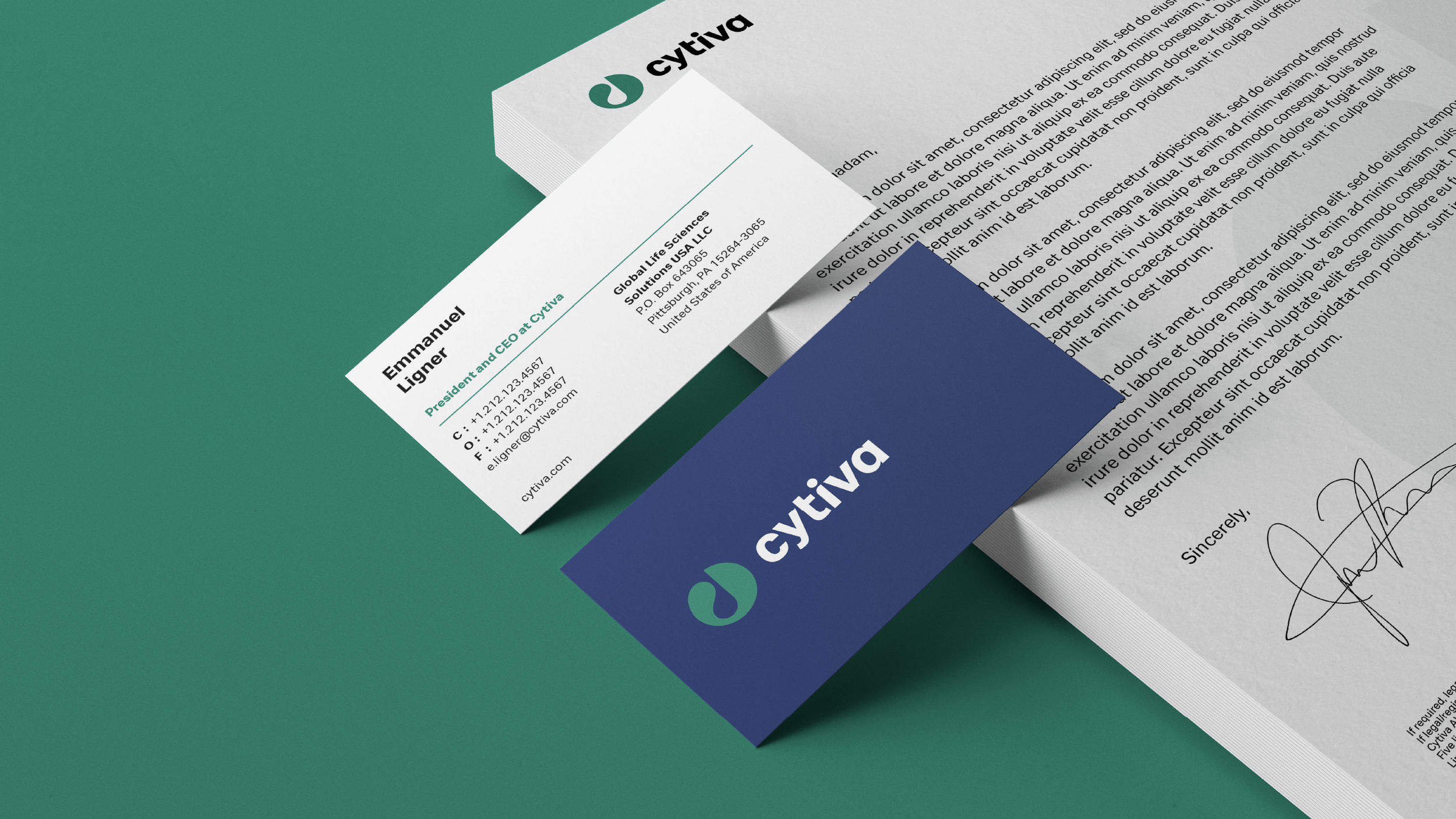
After many deliberations and testing, the client decided to use a symbol and name that came with the acquisition. Josef Müller-Brockmann designed the logo, which helped us when we worked on the visual system.
We partnered with Dalton Maag to develop the brand type using their popular font to start and customize it to ensure that it maintains the same footprint as the preceding type so it will not have any implications on existing materials.
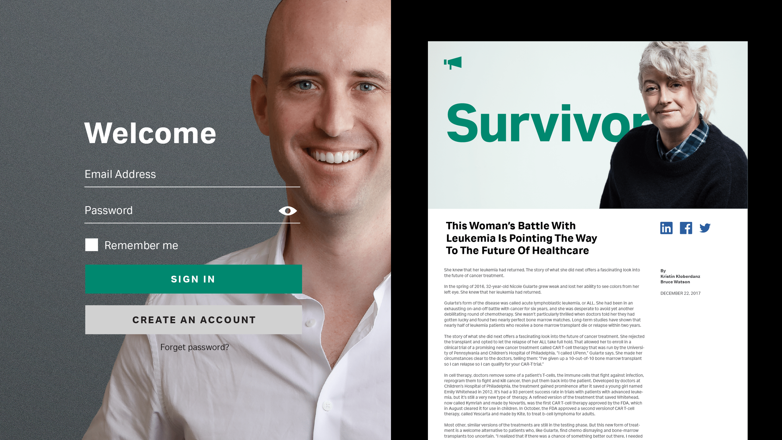
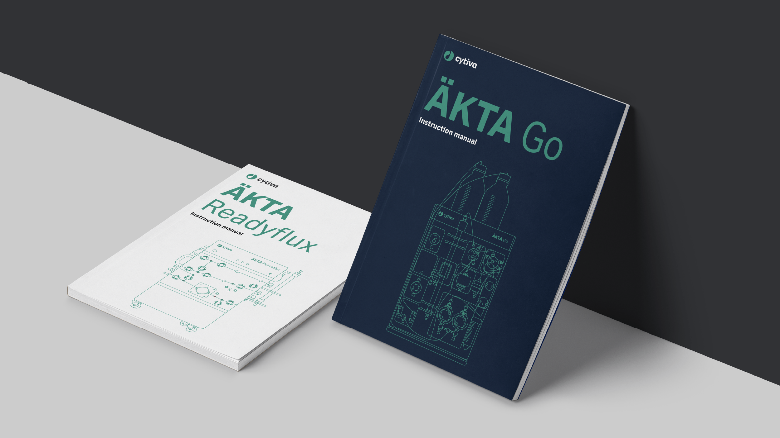
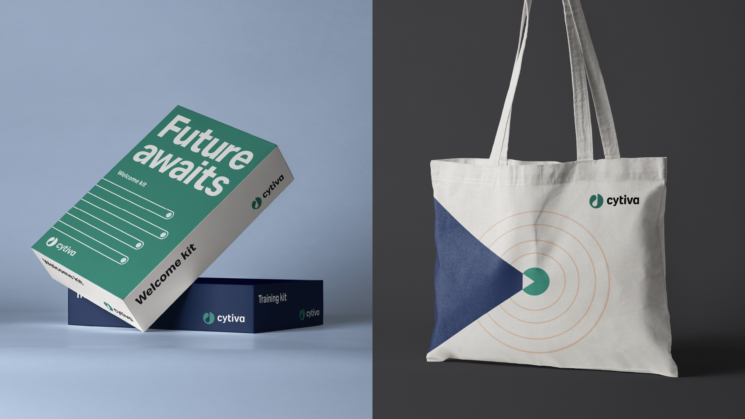
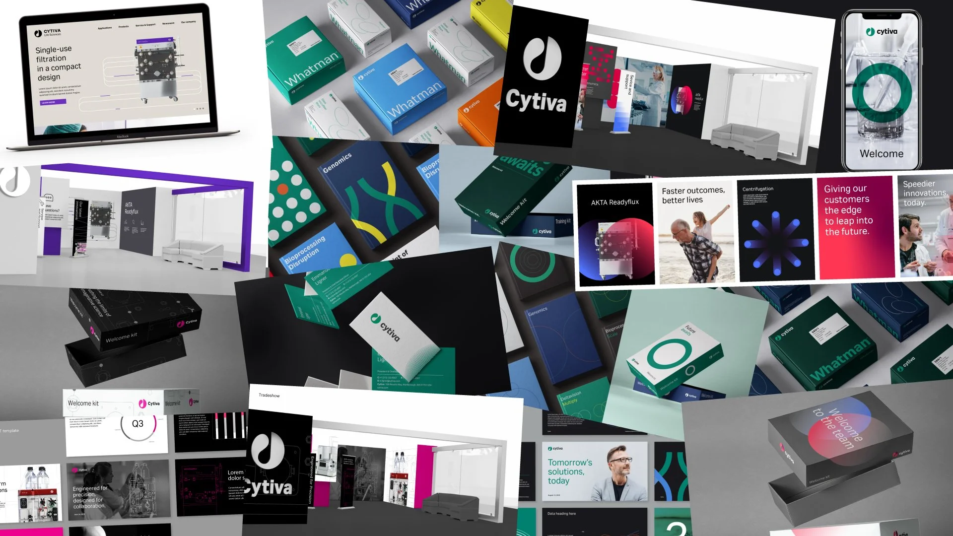
It was natural to adapt Swiss-inspired style to the visual system—simple, bold, and sophisticated. While the first phase helped us finalize the logo, colors, and type, the last thing for the team to do was fill in the other elements to complete the system. The process includes designing a pictogram system representing the different processes involved in using their instruments. And to further separate the brand from its competitors, our approach to imagery showcases the people working behind the scenes. It brings in the brand's human power aspect, which is rare where shiny objects and cold laboratories flooded the category.
3D rendition of the logo by Sasha Austin
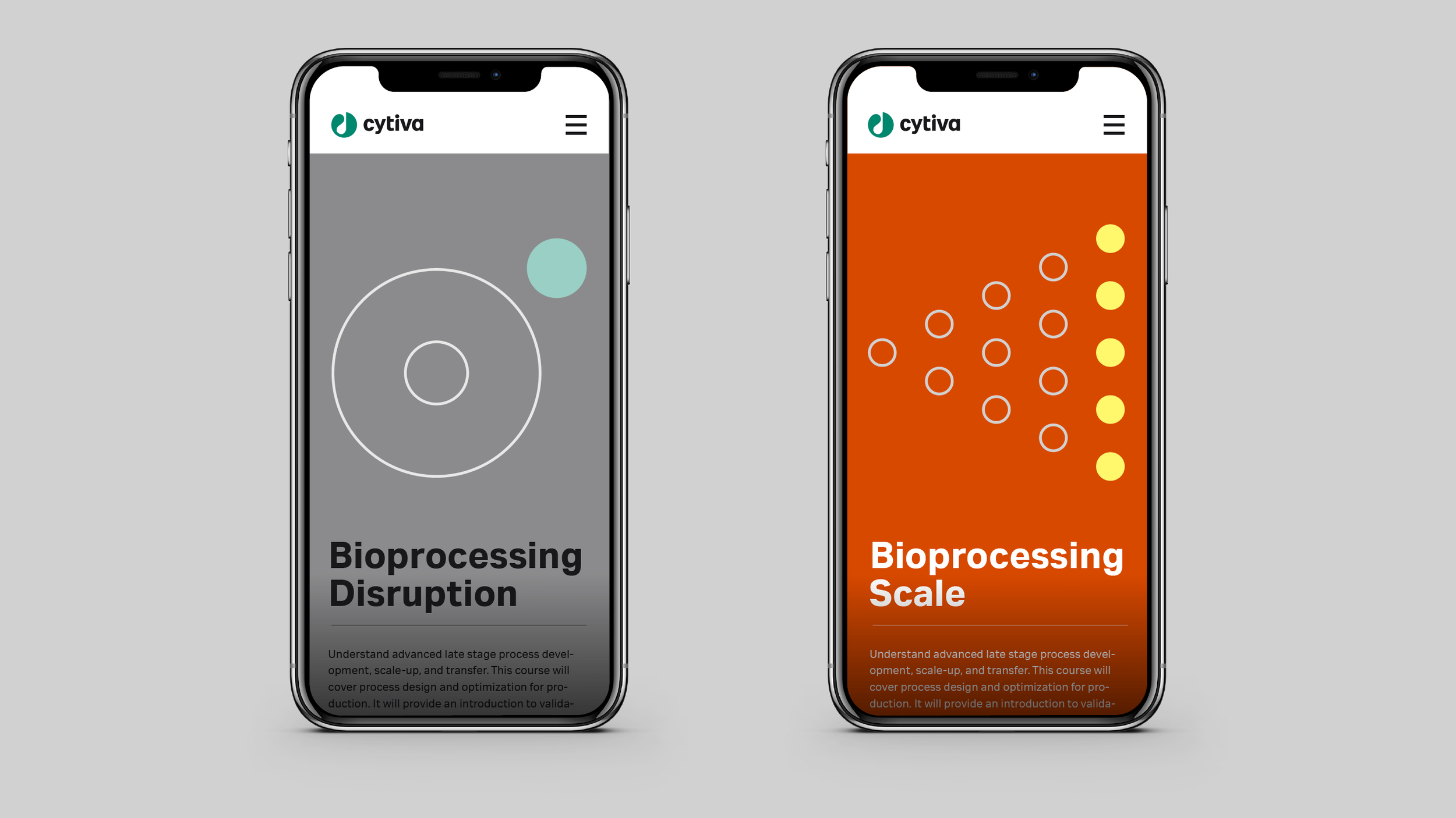
Website displaying its functionality
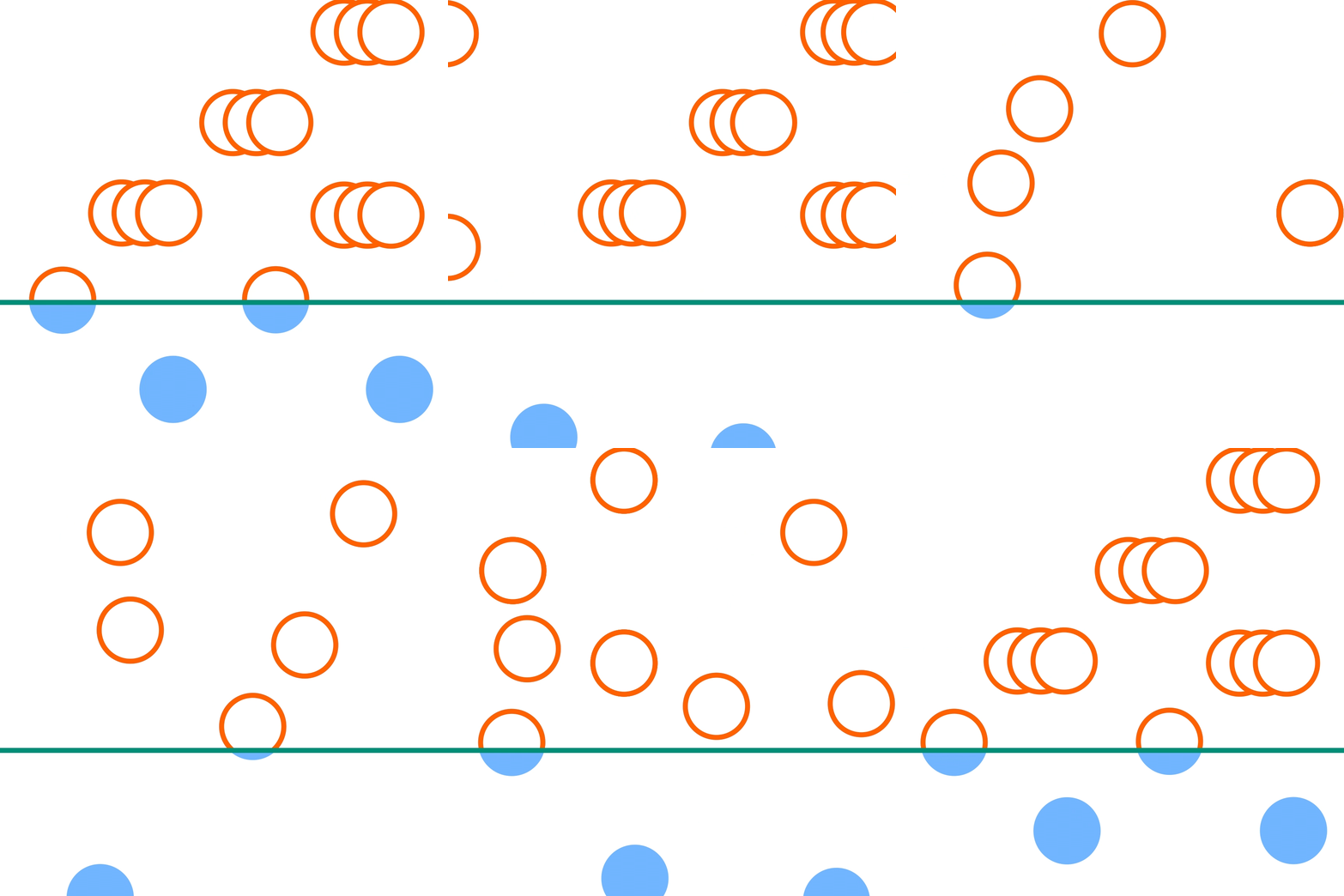
Below are some of the animated pictograms developed for the system. They were originally designed to be static, but, later on, animating them helped explain the processes better as we developed the brand. I worked directly with scientists to develop them further and had them describe the activities that happened so I could interpret them using lines and shapes.
Monoclonal Antibodies (mAb)Cell TherapyTangential Flow FiltrationWe also developed an illustration style to cater to the Asian market. I worked with our team in Asia to create the style and adapted it to animated videos as we started transitioning old materials to the new visual system.
Did it pop?
We successfully collaborated with the client using our agility and creative thinking about the process and our ability to fill gaps—fitting existing elements to the system and creating a world-class design that would live for a long time. This design engagement has led us to other projects for the next three-plus years since we started the project to help the brand succeed. These projects include refining the brand strategy, building ad campaigns, establishing a brand voice, assisting with the environmental design, developing a social media strategy, and many more. The result from their customers was astounding. The new design is recognized well in the category and regarded by designers as a benchmark for a global biopharma brand.
Process
It was an unusual process for the team. We came into the picture to help with the name and visual identity. Then, another agency developed the strategy, which we used to build a story around our design. While it is not our ideal approach, we made it work (we refined the brand strategy later once we developed a partnership with the client).
The GE brand relied heavily on its legacy and symbol, but the brands they ran lacked quality and were inconsistent. So it was a rough yet tactical start, but we flexed our creativity once we got past the initial phases.
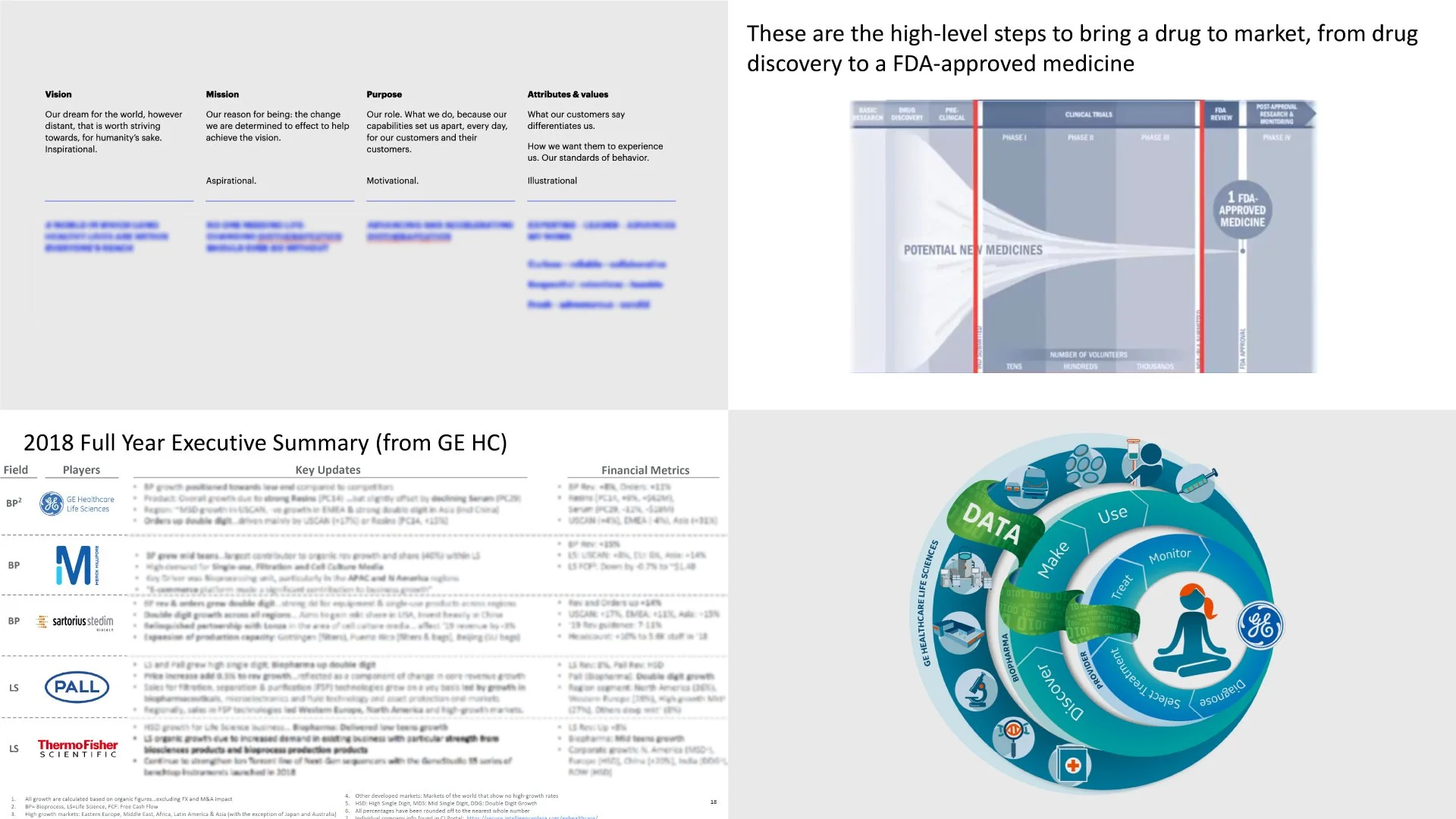
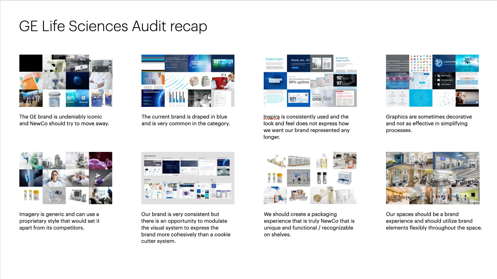
Strategy and development of the new brand name and visual identityGE Life Sciences materials that needed to be replaced after the acquisitionWe audited the GE Life Sciences brand and also the competitors, and it shows that GE is lacking when it comes to the visual representations of the brandKeeping the same footprint
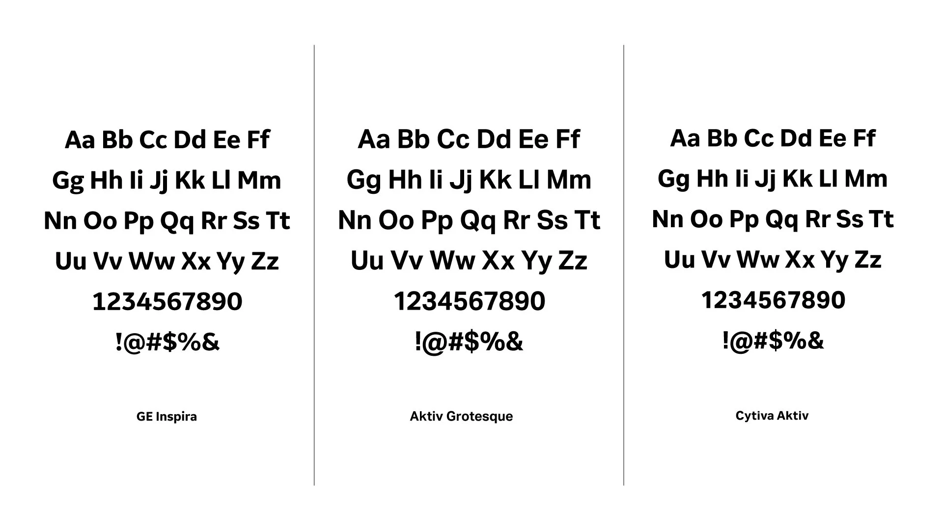
Custom-type was an initial request from the client. They demanded to design a new typeface that must have the same footprint as the original type so it will not mess up the diagrams, paragraphs, etc., as “finding and replacing” the font will be more cost-effective.
We reached out to Dalton Maag to help with the process. As a result of the collaboration, we developed a typeface that will reproduce well on low-quality output screens and printers to high-quality printed material and tablets.
Above is a comparison of the original typeface, out-of-the-box type from Dalton Maag, and the customized version for CytivaExploration
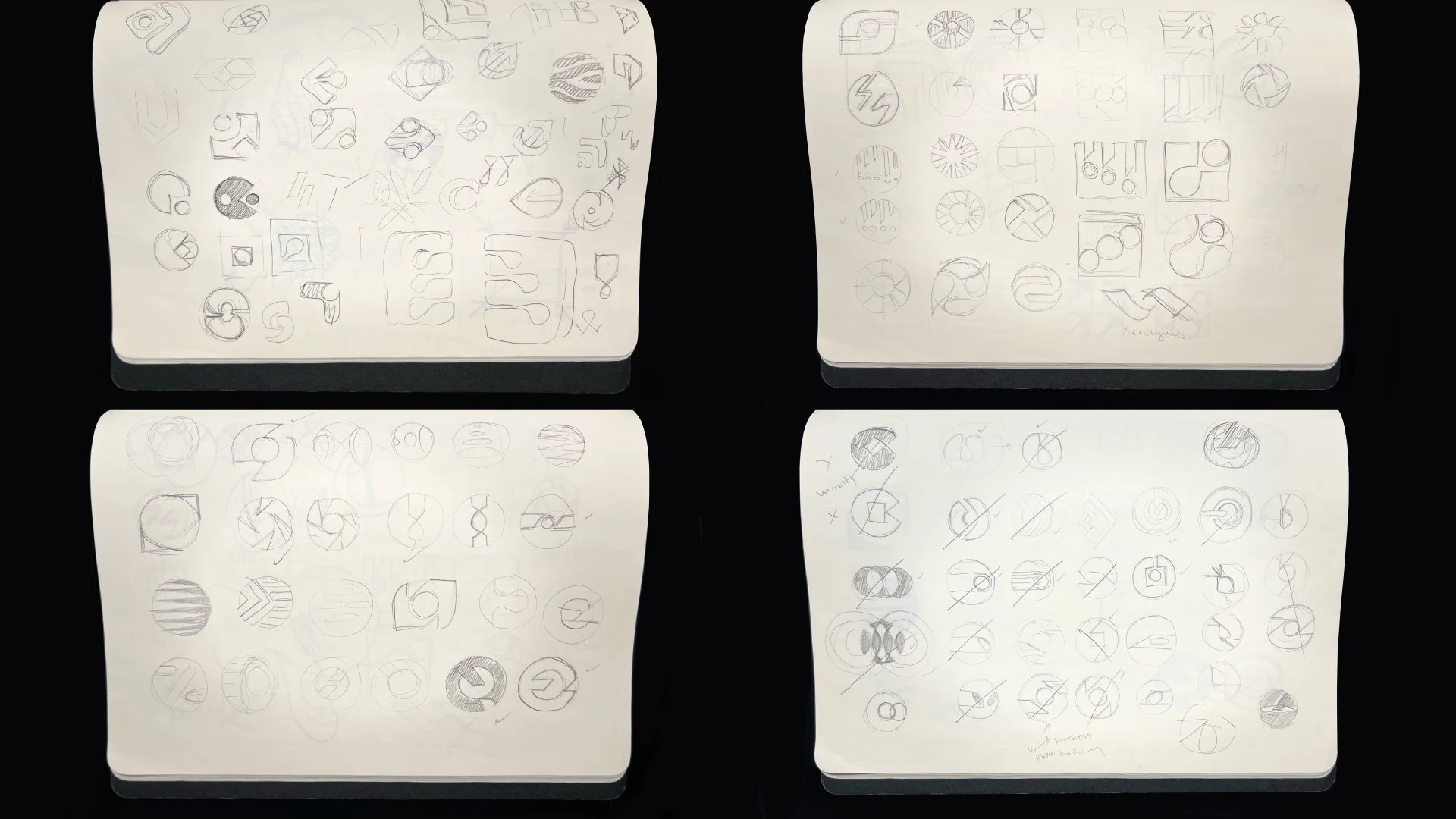
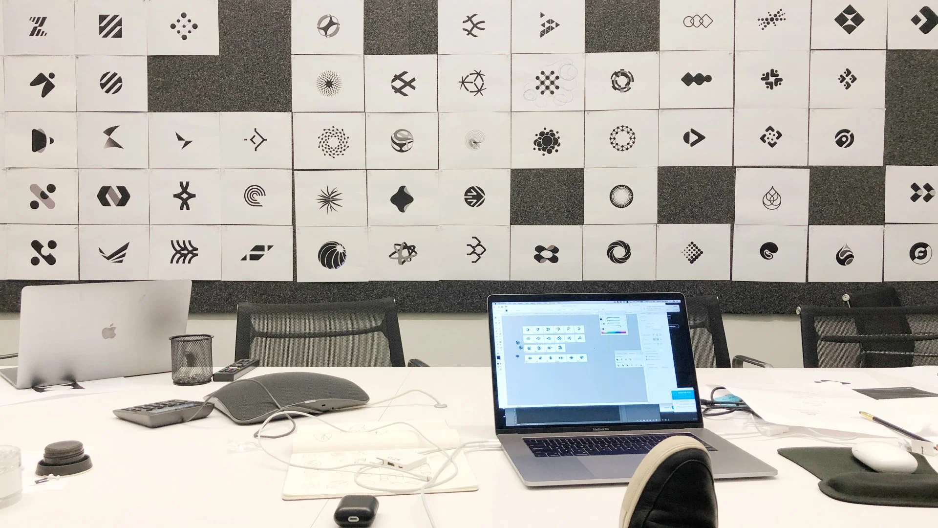
Given the enormity of the brand, we didn’t hold back in exploring logos that would visualize speed and precision. But there is a catch; we needed to create a circular symbol. Why? Redoing the molds for the machines is expensive, as it includes a round indentation where the GE ‘meatball’ would have been placed, so creating a round symbol will be an easier replacement.
Symbol explorationVisual system explorationProject squad
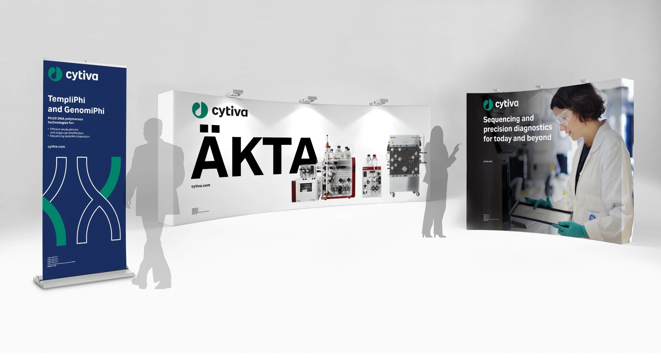
Designed with ProphetAndres Nichols, Partner • Baron Santiago, Design Director • David Wong, Senior Designer • Dani Kim, Senior Designer • Ryan de la Cruz, Senior Designer • Lauren Kong, Designer • Arthur Chu, Design Director, Architect • Alex Majkowski, Senior Designer, Architect • Elaine Fok, Design Director, Asia • Jiupei Heung, Senior Designer, Asia • Christian Kozowyk, Photographer • Irresistible Films, Animation and Video • Sacha Austin, 3D AnimatorFor three-plus years in the project, I've managed multiple teams since the brand's inception. Under the leadership of Andres, we designed a visual system with the OG team— David, Ryan, and Dani. Lauren came along to help with the guidelines and templates. Next, Arthur and Alex designed tradeshow booths and environmental graphics. Finally, Elaine and Jiupei created the illustration style and initial storyboards. Also, a special shoutout to Christian Kozowyk and the B&A team for doing a photo shoot during the pandemic and Irresistible Films for helping me realize my visions for the animations.


