New look,
Better Choice
Creating consistency through simplicity
Backstory
Client name : DigicelLocation : Kingston, JamaicaWhat they do :
Digicel is a mobile phone network and entertainment provider operating in the Caribbean and island nations in the pacific. They provide services to local communities as well as their relatives overseas.Since Digicel opened its doors, competitors sprung up and saturated the market in the Caribbeans. And over the years of trying to keep up with new competitors appearing left and right, the Digicel brand got out of control. This inconsistency led Digicel to pull back to corral the teams together, and they decided to rebrand themselves and explain why they should be the first choice for customers.
Digicel’s ambition for the brand was to connect everyone to everything in every part of the world—from communication to entertainment, from creating a central payment service to money remittance. They also want to create a seamless customer experience. To achieve this, they needed to develop a new strategy and bold brand to reflect their take on simplicity with this goal in mind.

Solution
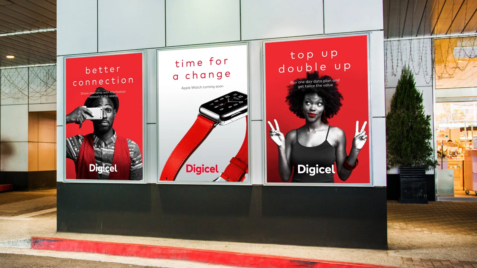
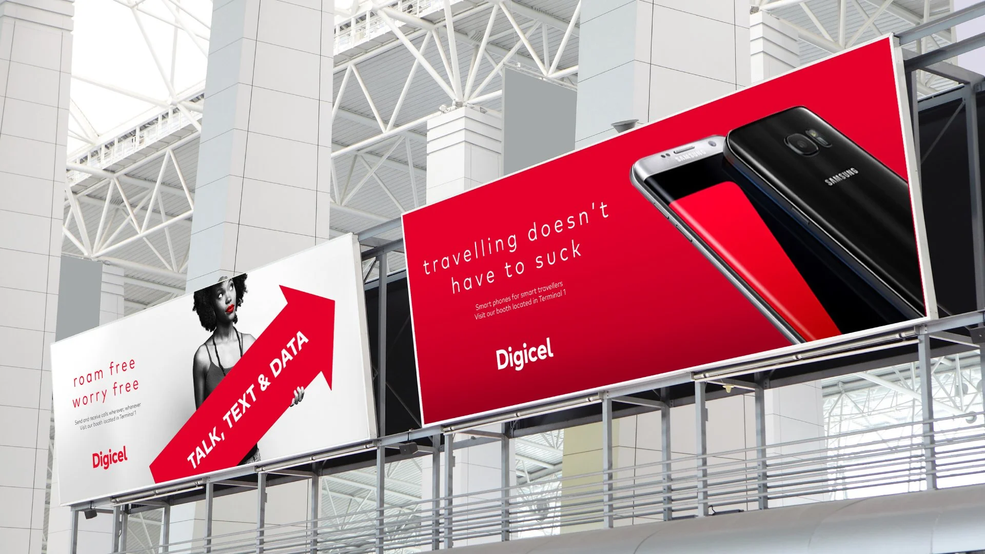
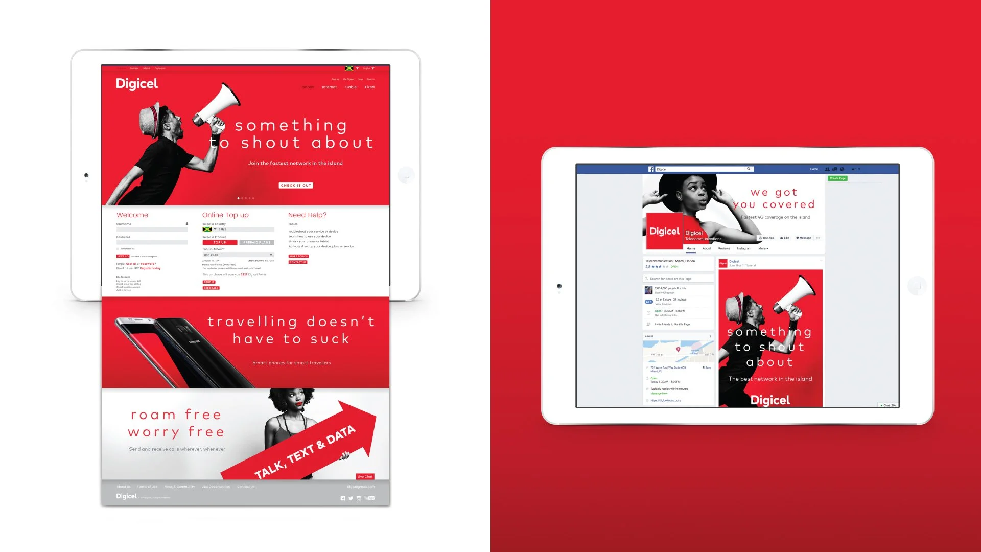
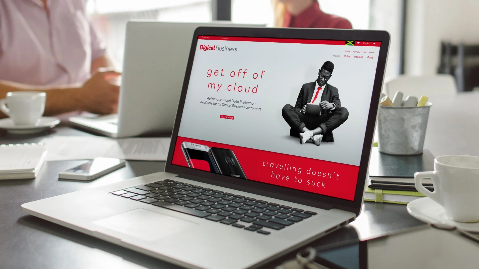
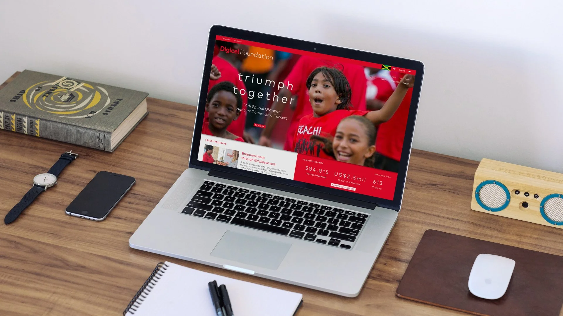
Using simplicity as our guiding principle for this brand, we designed a system that employs simple elements from type, color, and imagery. We updated the logo using a straightforward geometric typeface and tailored the letterforms to make it unique for the brand, which is reflected in our choice of the brand type. Furthermore, we recommended a color palette consisting of only black, white, and red to ensure impact while maintaining simplicity and keeping the color that gives them an advantage. For imagery, we use black and white photos to create a cohesive approach in accommodating the multiple nationalities they serve and adding a red highlight to make it unique for the brand.
Did it pop?
Starting from scratch enabled us to explore new grounds to ensure that the brand is elevated and well equipped to take on the competitors. The recent redesign reflected the brand’s goal of providing simplicity and better service to its customers. They launched the new brand in 2017 and have been flying their colors up to this day.
Process
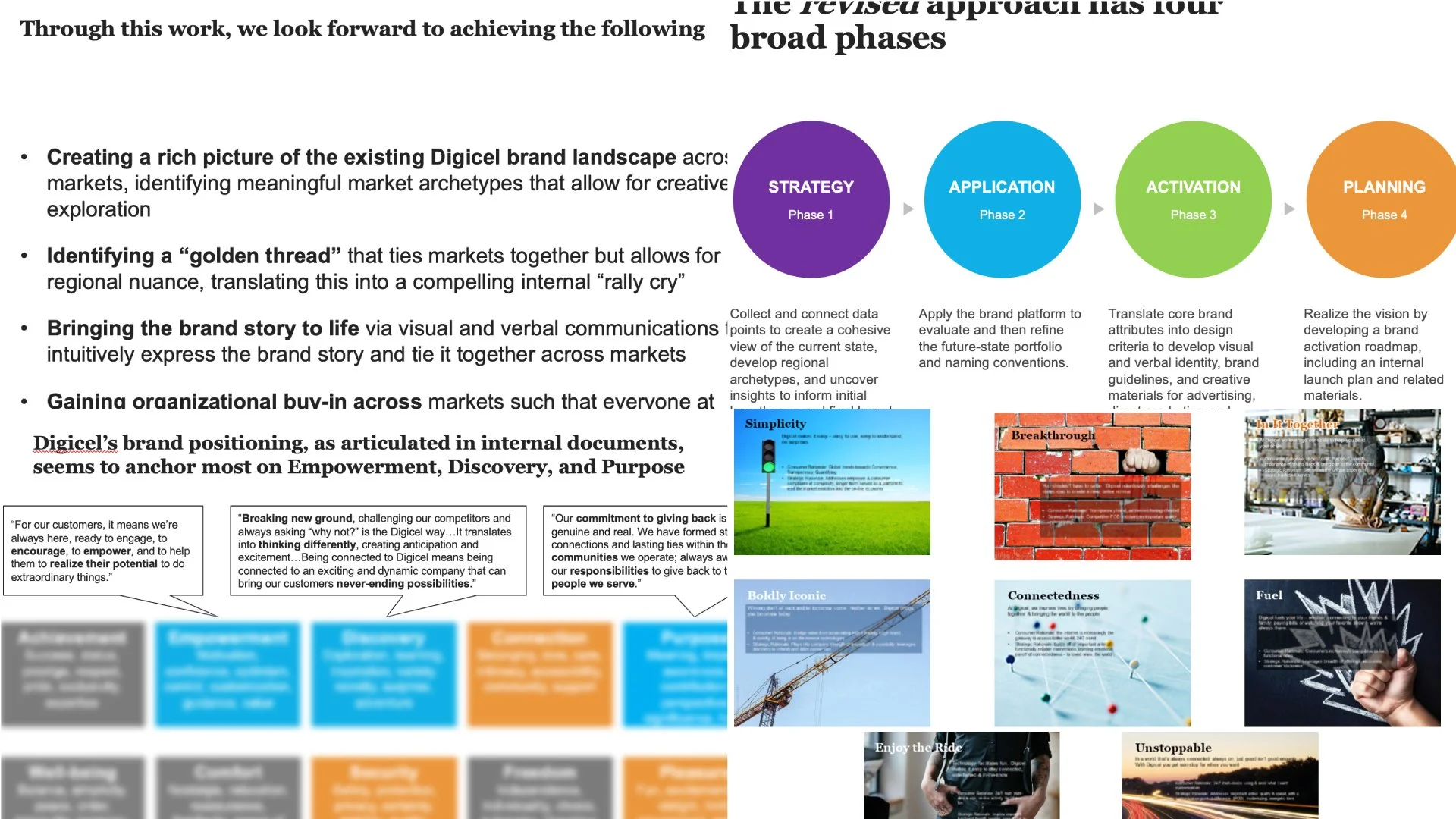
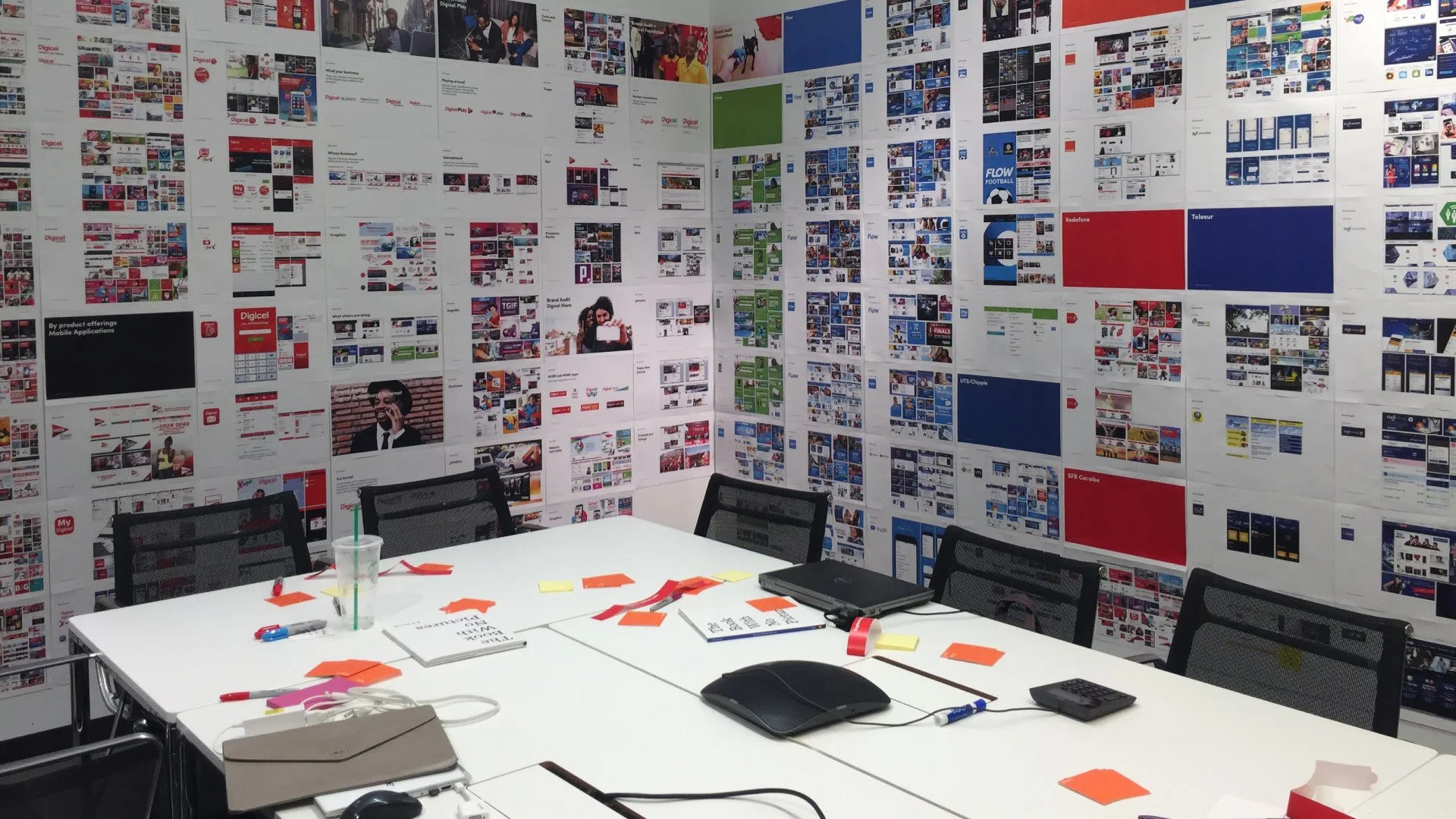
Preparation for this project was a big task. First, we looked at what the current brand was doing. While operating in many countries, it was challenging to identify the brand elements that were working and not. We also looked at the competitors with the same rigor to ensure that we covered all bases. After the research and strategic work, we decided that the brand needed a total overhaul and kept the one element known for the brand—the red color.
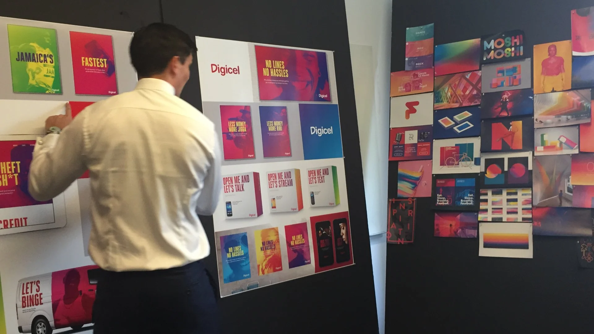
For this project, we started our design exploration by creating experience rooms. First, we made a walk-in mood board room filled with inspirational images that aided the client in making the final choice—the board contained aspirational brands, different imagery styles/techniques, graphic devices, illustrations, etc. Then, we also revealed the concepts in each room to make it immersive and keep the client focused on the elements.
Strategy and development of the new brand storyClient in one of the rooms addressing some ideas using the mood boardsOur intensive audit of the brand and its competitors filling up the roomDesign, disconnected
Their visual system provided many inconsistencies as it was passed around repeatedly to many countries, creating a soup of disaster for brand cohesion. There was no strategic approach to graphics, and we believe the logo was a derivation of Comic Sans cleaned up for a corporate brand.
Exploration
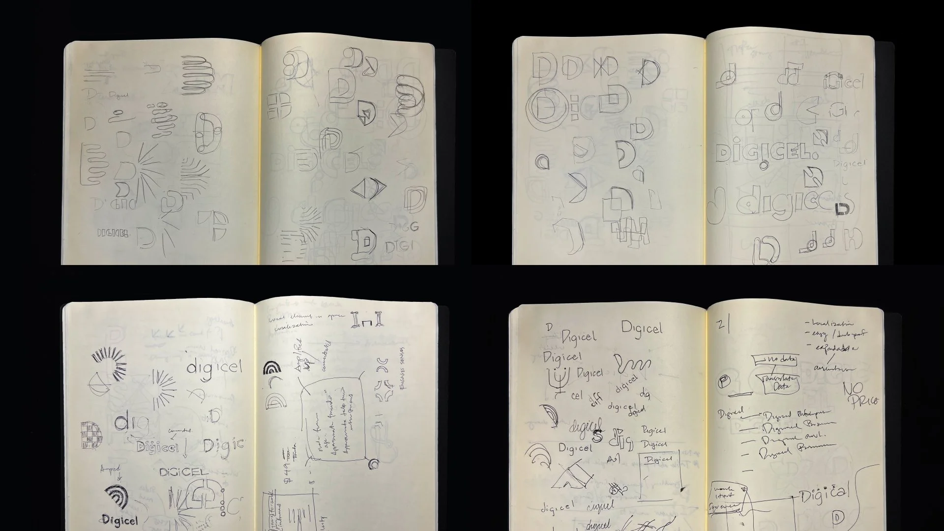
Our logo exploration spans from a typical telecom brand to an entertainment brand. During that time, one of their goals was to build up their entertainment brand as they also provided cable service and wanted to expand it to their mobile capabilities.
Visual system explorationLogo explorationProject squad
Designed with ProphetCraig Stout, Partner • Baron Santiago, Design Director • Joseph Maruca, Senior Designer • Sofia Oom, Designer, InternI was responsible for leading the design exploration with Joe and Sofia along with Craig. My visual system direction is the final design for the brand and developed further with the team to ensure that simple elements still have great applicability.


