Smooth
operations
Streamlining a gaming enterprise
Backstory
Client name : PENN Entertaiment (Penn National Gaming)Location : Pennsylvania, USAWhat they do :
PENN Entertainment is an American entertainment company and operator of integrated entertainment, sports content, casinos, and hotels. Formerly known as Penn National Gaming, it began by operating racetracks and has since successfully acquired different gaming businesses, establishing itself as a dynamic force in the gaming industry.With a growing portfolio over the years, Penn Entertainment, then Penn National Gaming, needed to modernize its conventional brand to represent what they are trying to achieve as a brand—to lead the gaming industry with its vast array of enjoyment possibilities through technologies and strategic partnerships.
Our task was to reinvent the brand to represent streamlined experiences under one umbrella. A re-energized brand poised to bring innovations and new excitement for people to discover other ways to have fun.

Solution
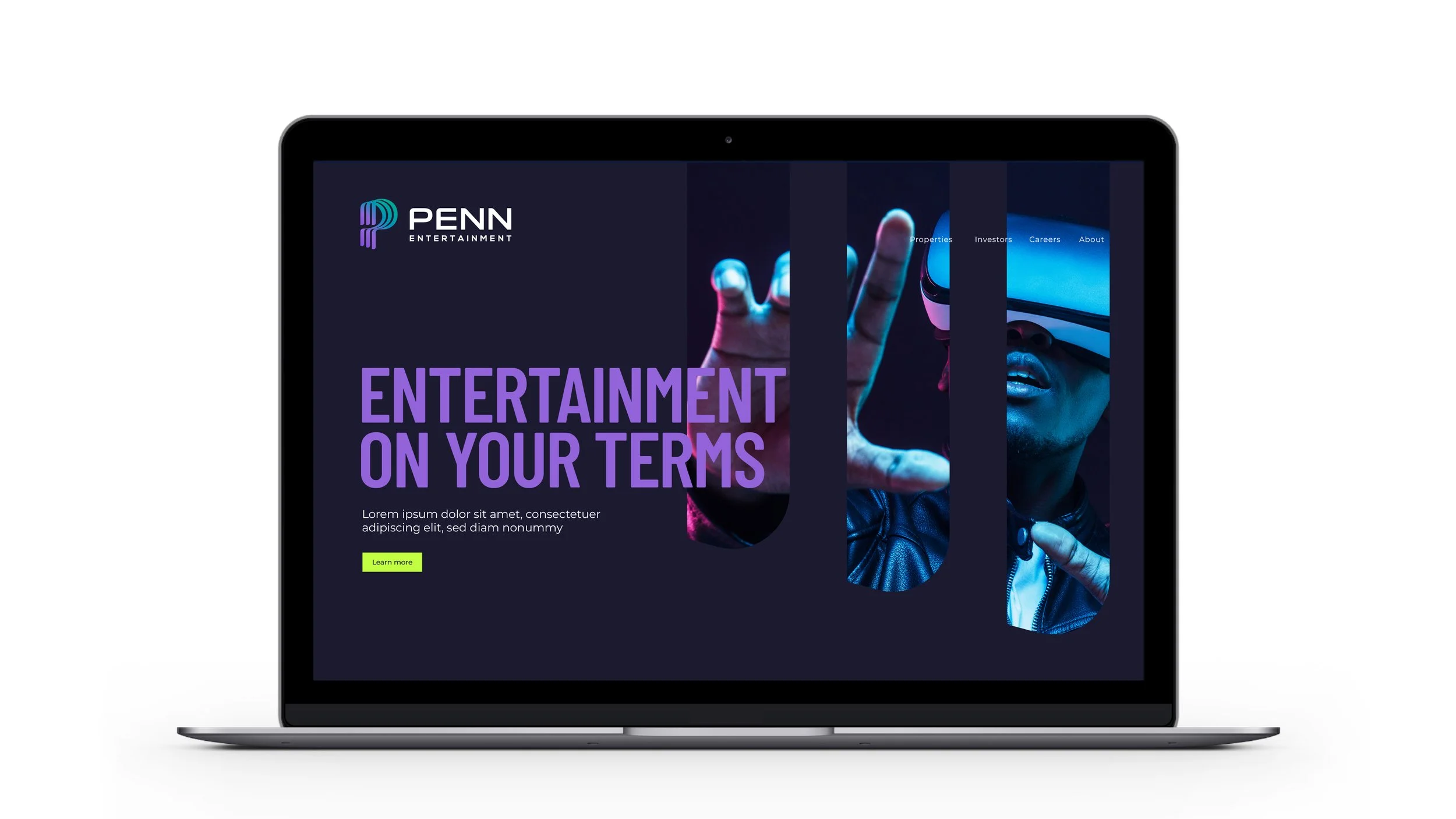
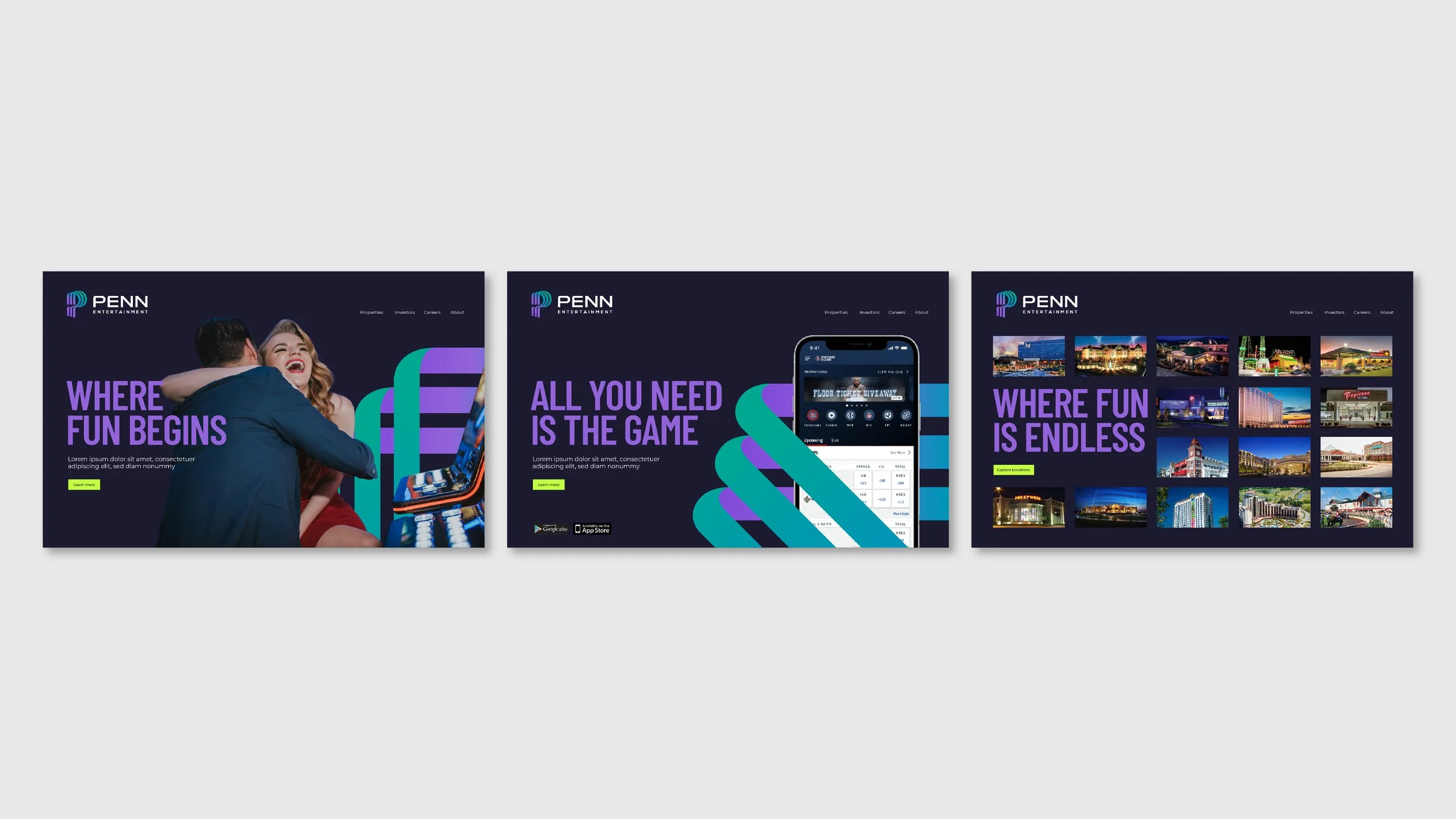
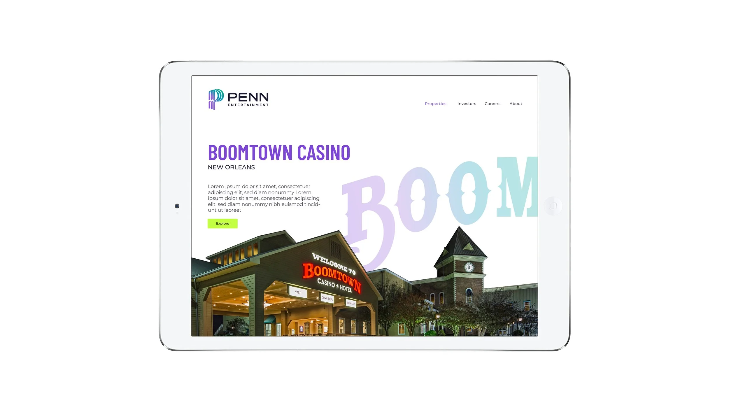
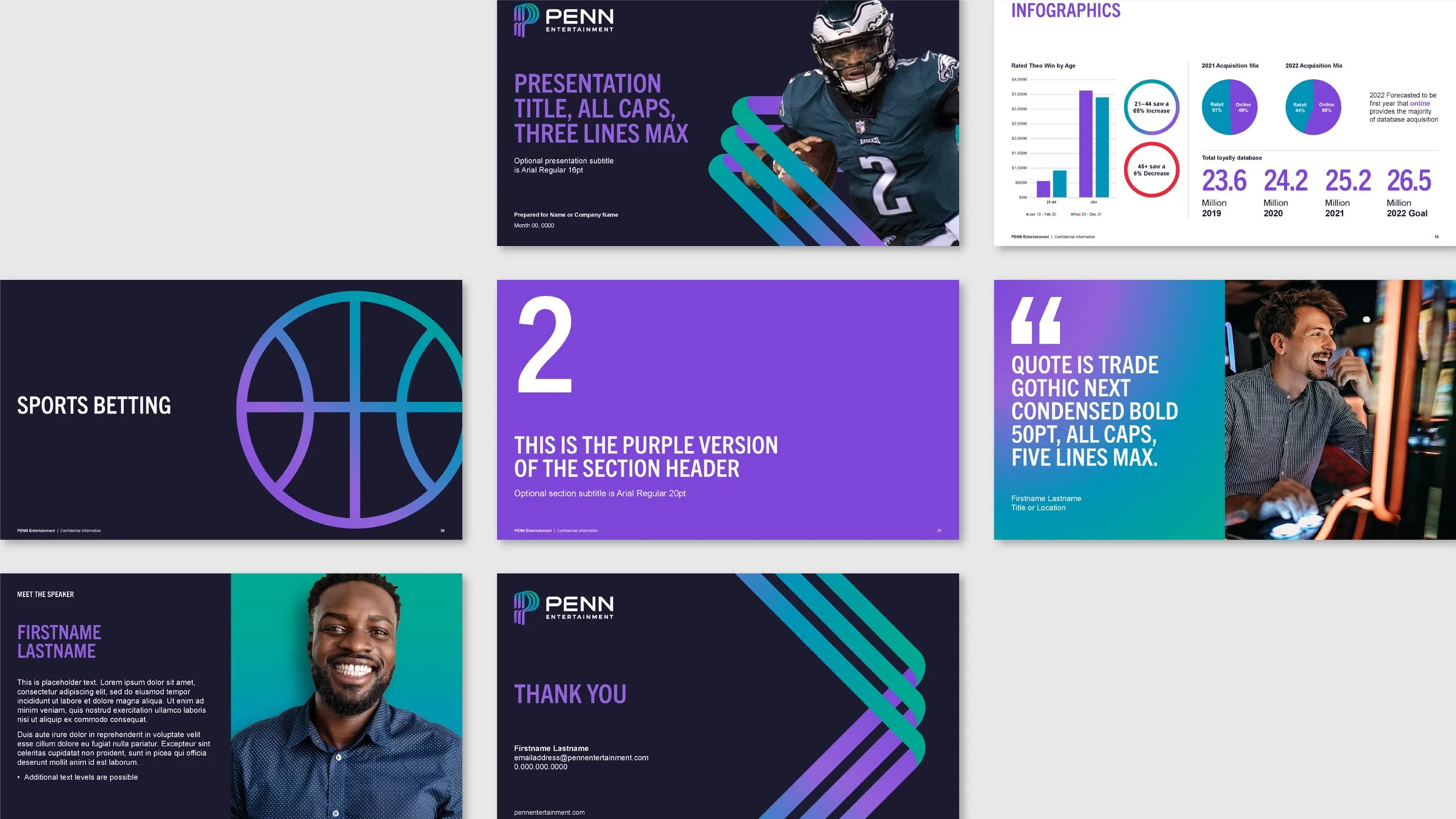
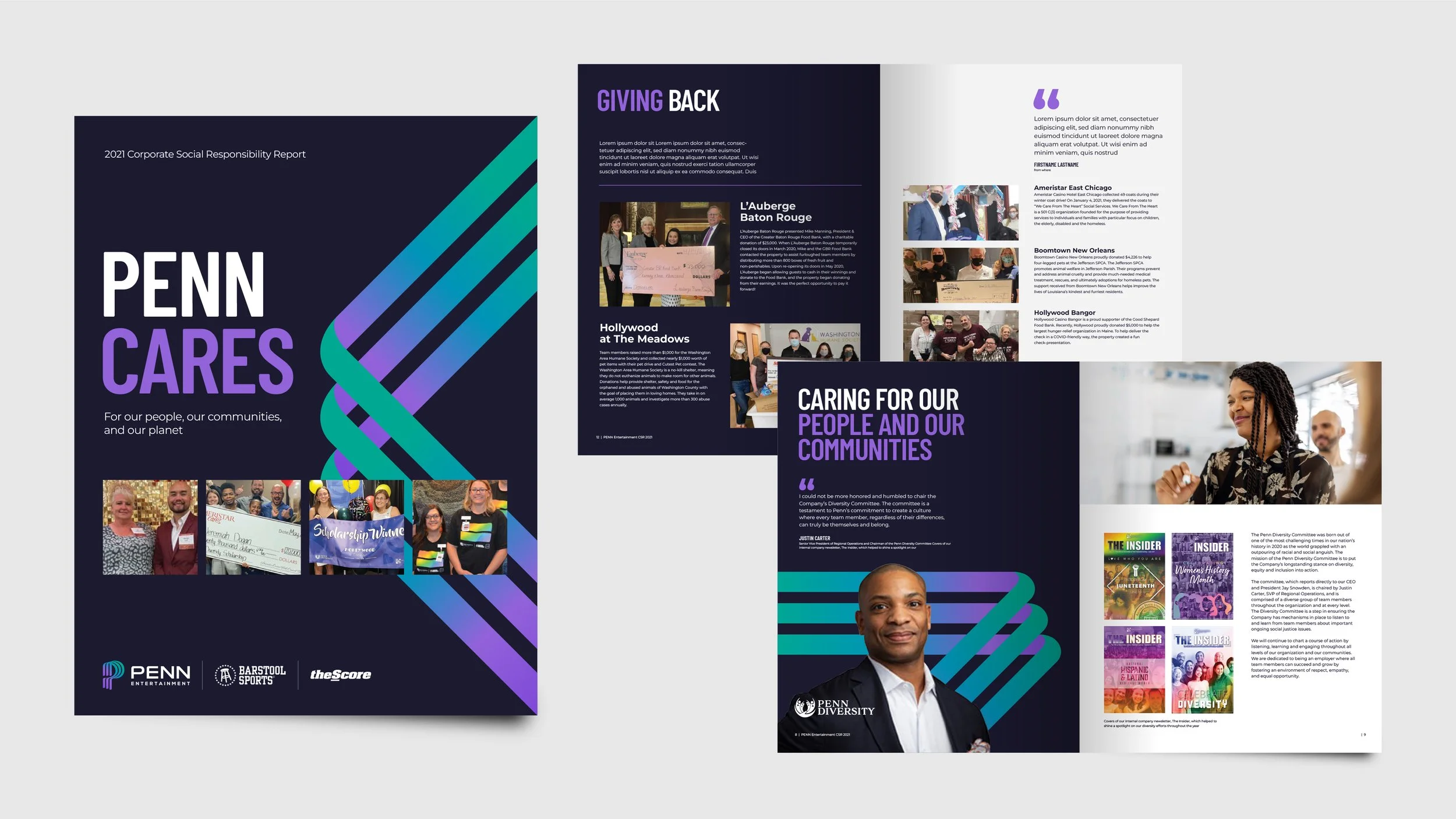
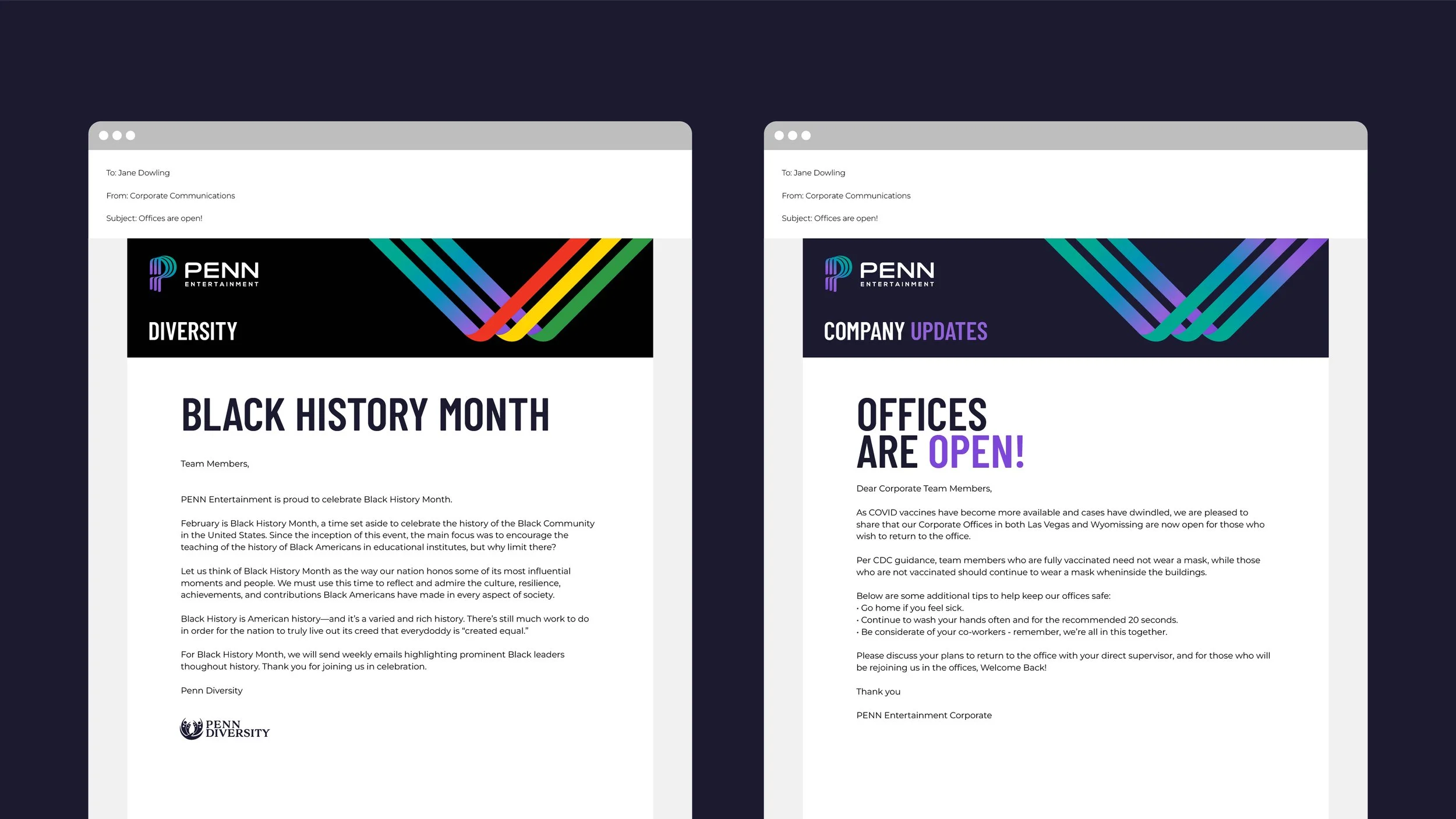
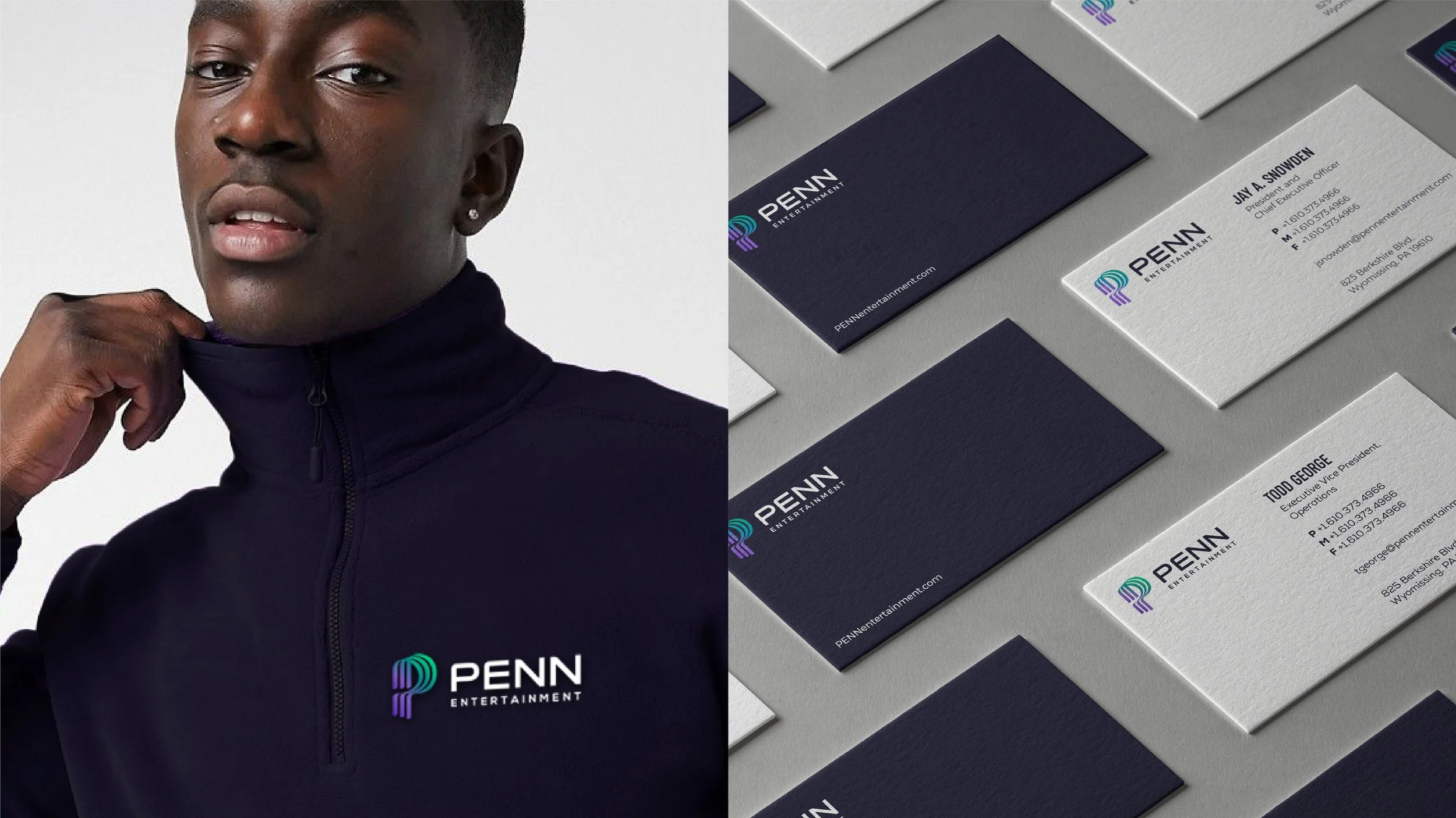
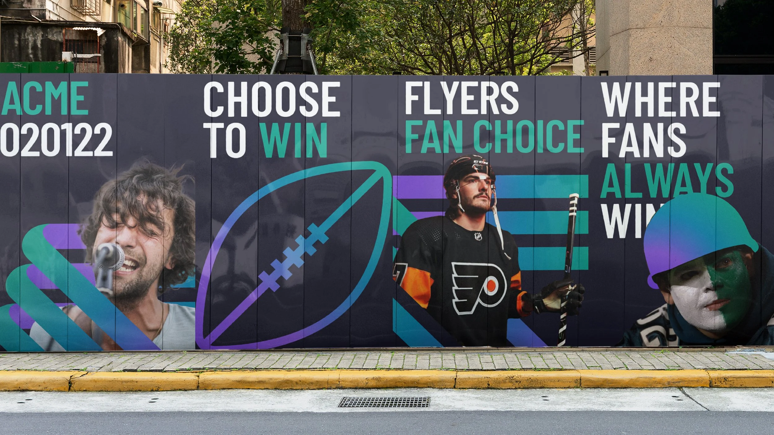
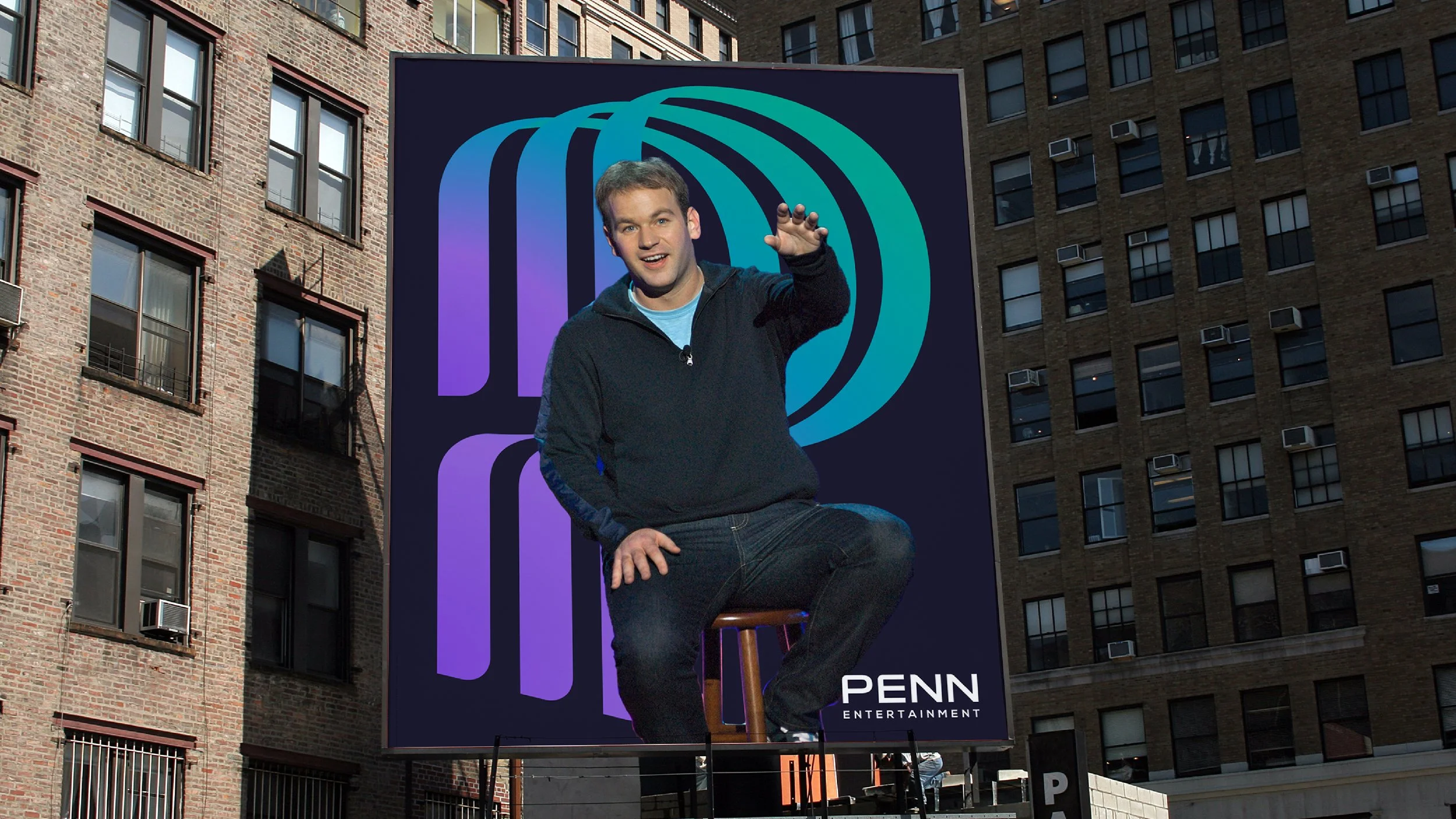
As the strategy team defined the new and improved name, brand architecture, story, and messaging, the design needed to move simultaneously to define this brand's new look and feel. The symbol represents the three verticals of the brand: live experiences, sportsbook/betting, and media/lifestyle content. The perspective composition of the concentric lines evokes a view of the future of gaming. These elements, in combination with provocative colors, appear throughout the visual experiences, which speak to the integration and synchronicity of the different platforms and innovations they will pursue.
Did it pop?
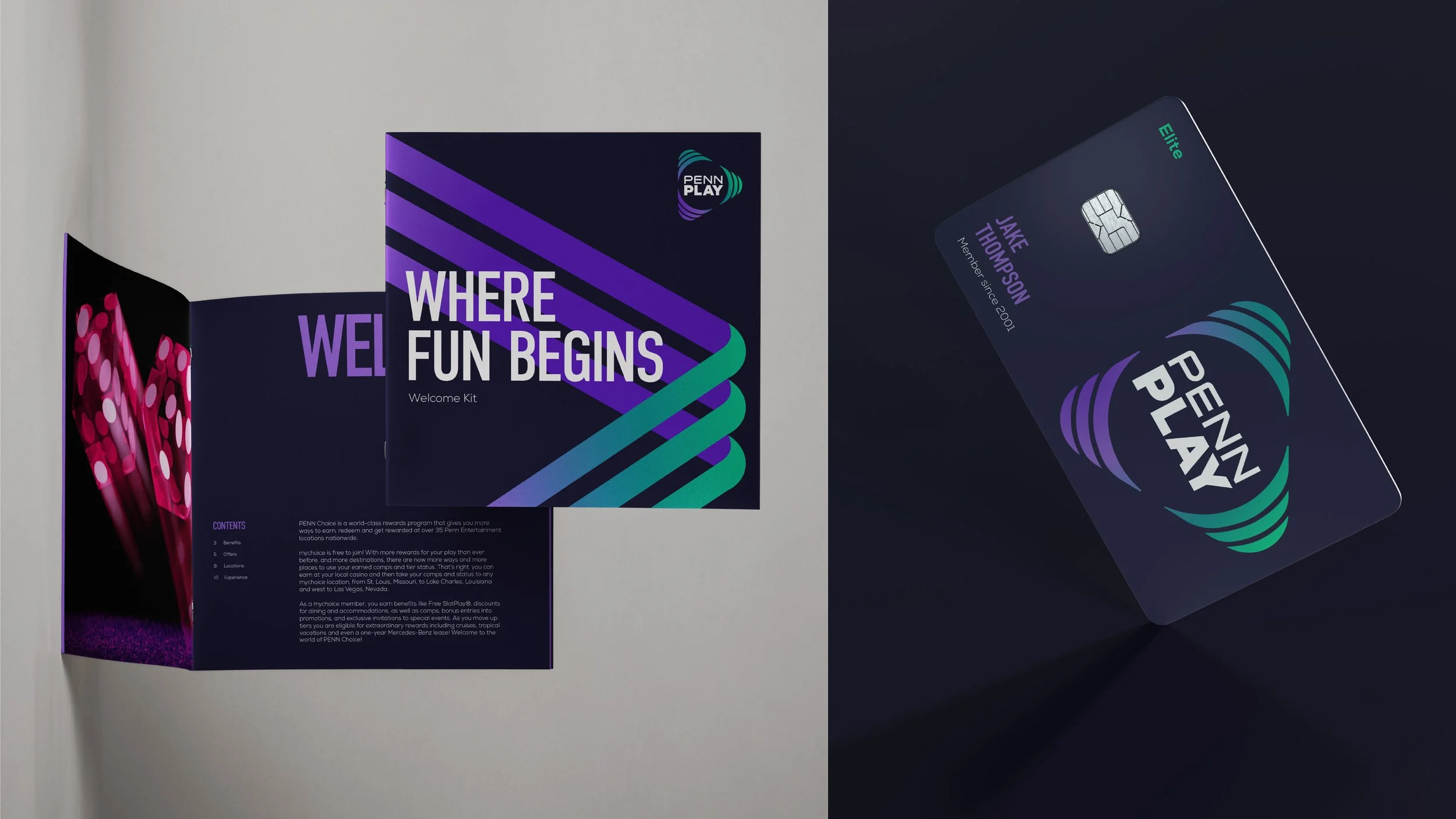
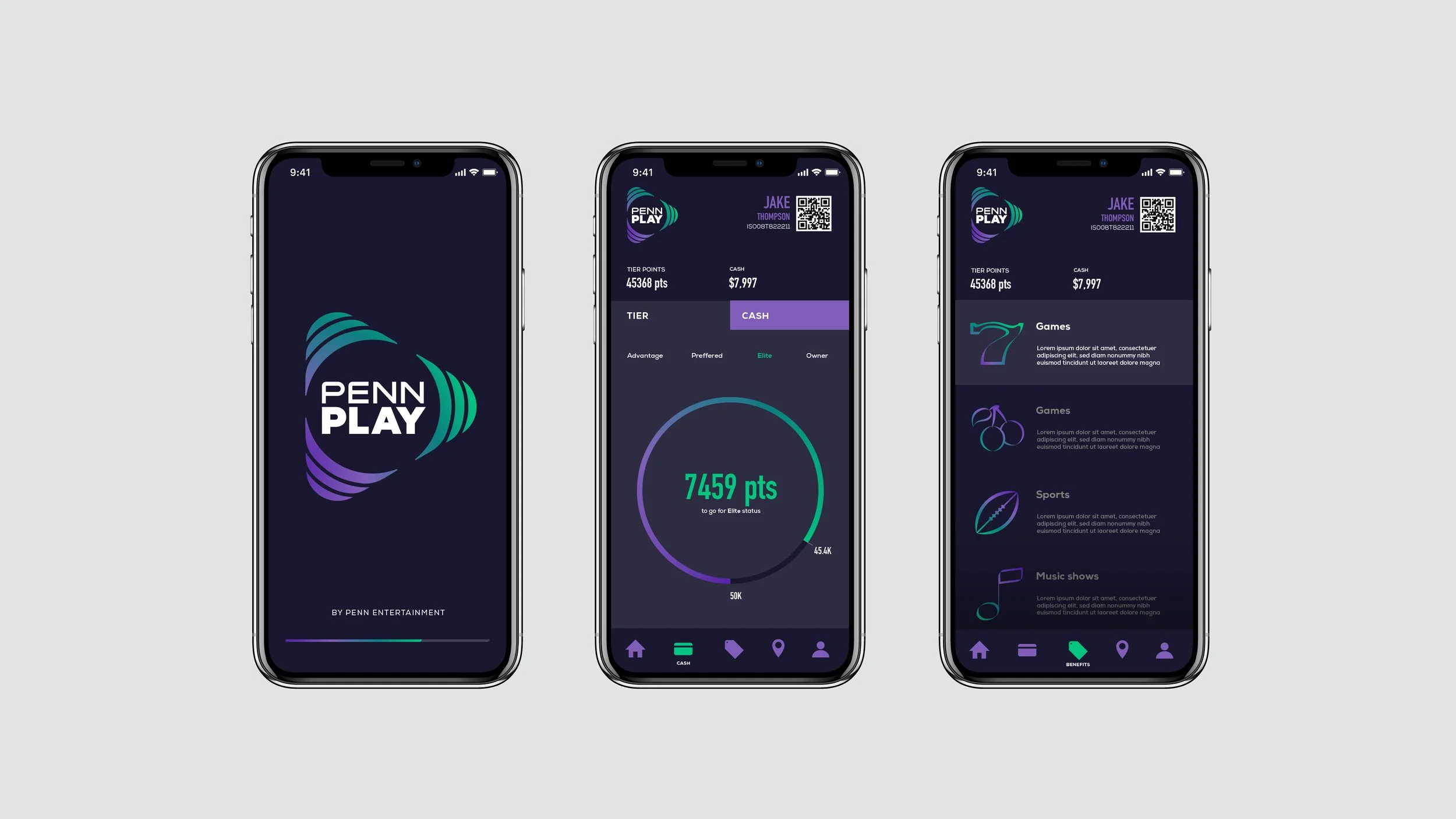
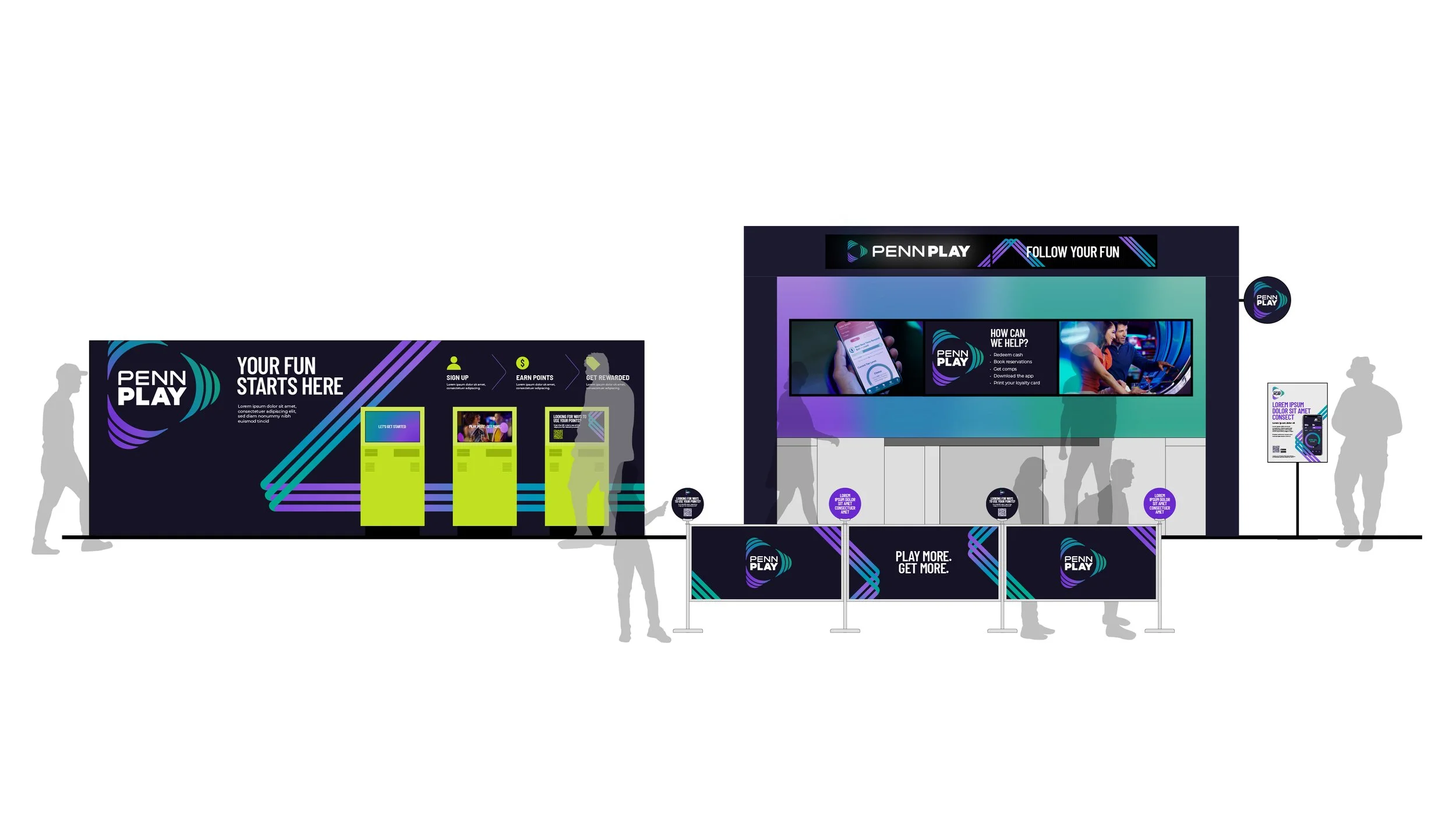
The brand launched in 2022 and gradually converted properties to integrate the new visual system. The leadership team was ecstatic about the new name and design and felt confident about their strategic decisions. The work and collaboration extended the project to other engagements. In 2023, they launched a new, integrated loyalty program using the latest design and graphics and are now preparing to launch a new campaign.
Credit card design with the new visual identityProcess
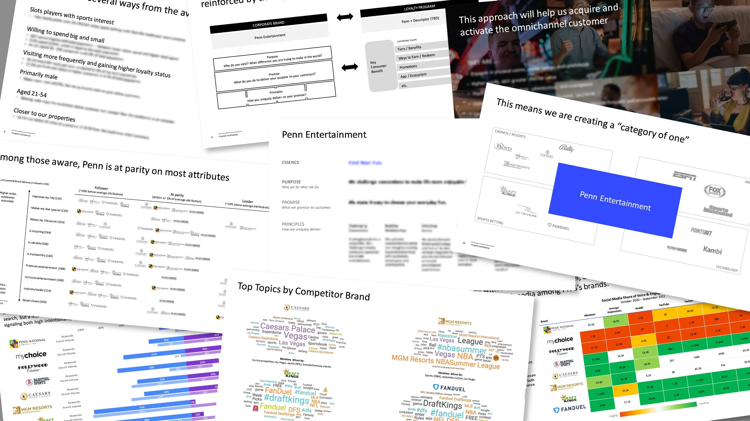
We've worked simultaneously with the strategy team to ensure our ideas align with the brand's direction. Like in other cases, we ensure that our designs come from strategic insights, starting with an audit and creative attributes that describe the new brand. At the same time, we are exploring a new name, which has visual implications as well, but in the end, we, along with the client team, decided to stick with something familiar and more tactical.
Strategy and researchVisual audit highlightsVisual territoriesInspiration
Our initial ideas were derived from the brand story, which speaks to players having a choice, being challenged, and being granted access to different ways to have fun.
Lots and lots of logo sketchesExploration of color and graphicsProject squad
Designed with ProphetPeter Dixon, Creative Director
Baron Santiago, Design Director
Aaron Pedroza, Designer
Shane Kosch, Engagement Manager, Strategy
Jaslyn McIntosh, Senior Associate, Strategy
Liz Weber, Senior Associate VerbalCover photo from Getty ImagesPeter and I were responsible for developing the visual language and managing the client expectations. I designed the final logo and visual system, while Aaron helped with the day-to-day design exploration and development. Copywriting was split between the strategists, verbal, and creative teams.


