See what
you eat
Visualizing flavors for a fast-casual
Mexican food inspired restaurant
Backstory
Client name : Jack in the Box / QdobaLocation : Colorado, USAWhat they do :
Qdoba is a chain of fast-casual restaurants serving North America. It rivals Chipotle in bringing a better rendition of Mexican food to the masses. Jack in the Box is a restaurant company and the owner of Qdoba before they sold Qdoba in 2018.The new CEO thought they were misrepresenting their products and needed to rebuild the brand and create a strong brand strategy, story, and visual system.
Qdoba needed a fresh look that would bring the rich flavors of Mexican food and the modern culture of Mexico to create an authentic and unique experience. In addition, the new visual system needs to be flexible and adaptable to different locations.

Solution
We used our brand persona, Quintessa, as our inspiration to push our designs by displaying graphics, textures, and colors to maximize flavor representations.
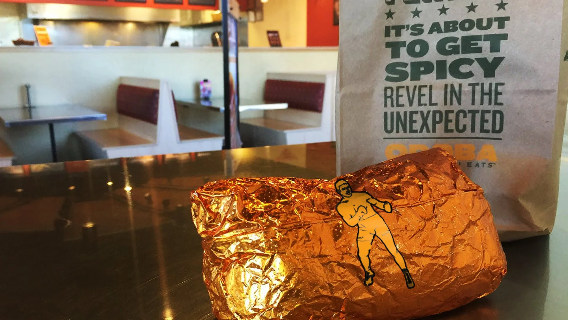
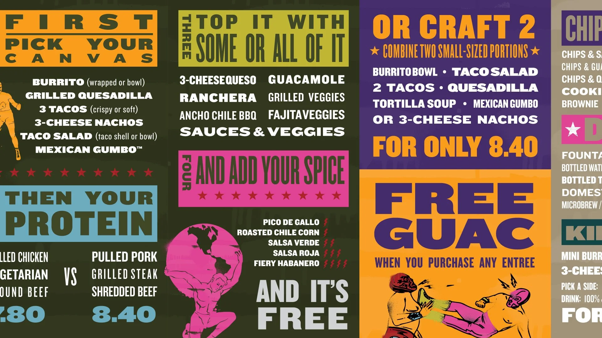
Millstones used for grains inspired our logo. At the same time, Mexican wrestling posters inspired our typographic choice where its variation can appear to have a customized look. Our illustration style combines drawings of Loteria game cards and tattoos, mixing them with colors and textures inspired by graffiti and murals scattered around Mexico city. These created a modern approach to interpreting Mexican culture.
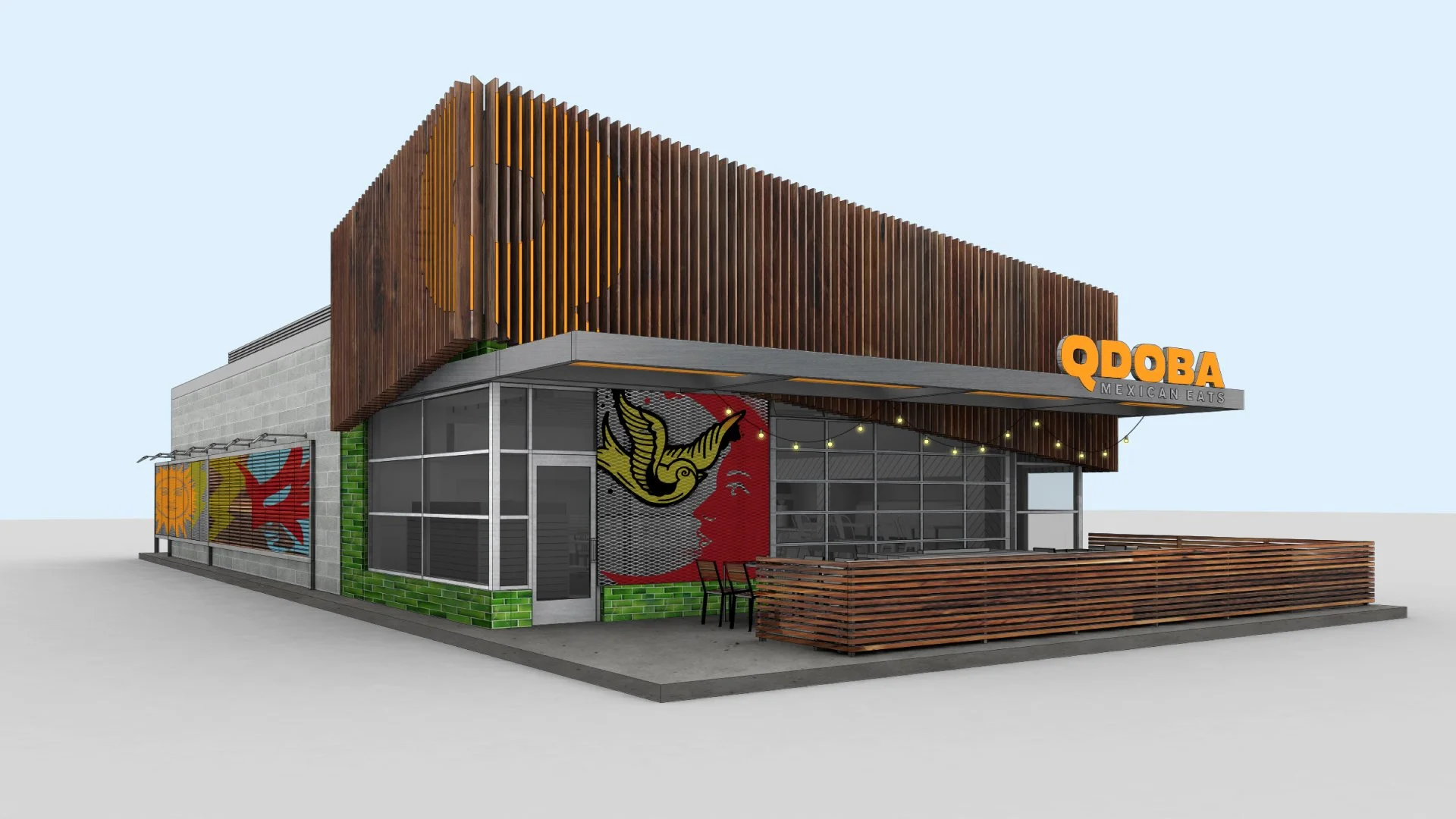
And then, we designed the stores to include rich textures and materials to create a fresh experience. For example, the women’s bathroom was a vision of what a Quintessa’s bathroom would look like, while a Mexican wrestling gym inspired the men’s bathroom. In addition, our graphic design was laid out across the restaurant, giving it a rich flavorful experience.
Did it pop?
It was a rich yet challenging design system, but we made it systematic and easy for designers to put together. The Qdoba team welcomed the new design and recreated it with ease. With comprehensive brand guidelines and design assistance, the client was able to bring the latest brand to life and applied it across the stores in North America, creating a refreshing Mexican food experience. Also, the new brand increased its value and made it attractive to new investors.
The video below will explain how a strong brand story and the unique visual system started a buzz and changed how they operate.
Old storefrontNew storefront and design adaptations by other vendors. Photos from Qdoba Franchising, Seattle-Tacoma International Airport, and Long Island Business News.Old interior spaceNew interior space layout and design adaptations by other vendors. Photos from Seattle-Tacome International Airport, Eater.com, Qdoba Franchising website, and Mortarr/Jim and Dudes.Bathroom designs inspired by the Quintessa and Luchador's locker room Process
Since this is a complete rebrand work, we had a big team that consisted of strategists, writers, architects, and graphic designers. After a few visits to stores, a competitive audit, and discussions, we decided we needed to redefine the target and build our story around them. This process helped us create a solid brand story and brand persona that helped guide us on how we could visualize the brand.
Overview of the different approaches that lead us to visualize the brandInspirations from tattoos and street art. Photos from archzine.fr, @JoannaNguyenArt, cuponismo.com, Anthony Wright/Mexconnects, Mike Ferrari Art, Third Man in Chicago/FindMasa, and Neuzz aka Miguel Meja.Inspiration
We looked into the Mexican-inspired graphics and symbolism to represent the culture through the eyes of the Quintessa, as she is a fascinating person, particular, and has story-worthy experiences. She keeps memories close to her heart to get them permanently marked on her skin and surroundings. In addition, she loves to immerse herself in visually stimulating places.
Sketches of logos and graphicsDesign exploration of other conceptsThis image shows the various directions of our logo design work during this project. First, we looked at logotypes and symbols—some expressive and some straightforward. Our final logo, designed by Joe, was the best choice, and the simplicity gave us many opportunities to express the brand through other visual elements.
Project squad
Designed with ProphetPeter Dixon, Partner • Dolores Phillips, Design Director • Baron Santiago, Senior Designer • Joe Maruca, Designer • Arthur Chu, Design Director - Architect • Mike Perry, Senior Designer - Architect • Greta Ruedisueli - Senior Designer - Architect • AJ Artemel, Designer - Architect • Kelly O’Kane, Senior Creative Lead • Josh Epperson, Concepting, Writer • Sarah Daily, ConceptingPeter led the design team, myself and Joe, with Dolores. Joe was responsible for designing the final logo, and I created the visual system. The architects and Peter collaborated with us to create a unique spatial system for the restaurants.


