Pop pop
Pop it UP!
Redefining value shopping
Backstory
Client name : Dollar GeneralLocation : Tennessee, USAWhat they do :
Dollar General is a chain of variety stores that operates in the United States with 18,000 stores.Dollar General wanted to create a new variety store format that would let them sell higher-value products to cater to moderate-income families.
They asked us to build the new store format with a new name, visual system, and store layout. They want the brand to be the destination for suburban moms to pick up various things for fun— from party needs to personal embellishments—and groceries. This place would be where they can express their creativity and get unique products without costing an arm and a leg.

Solution
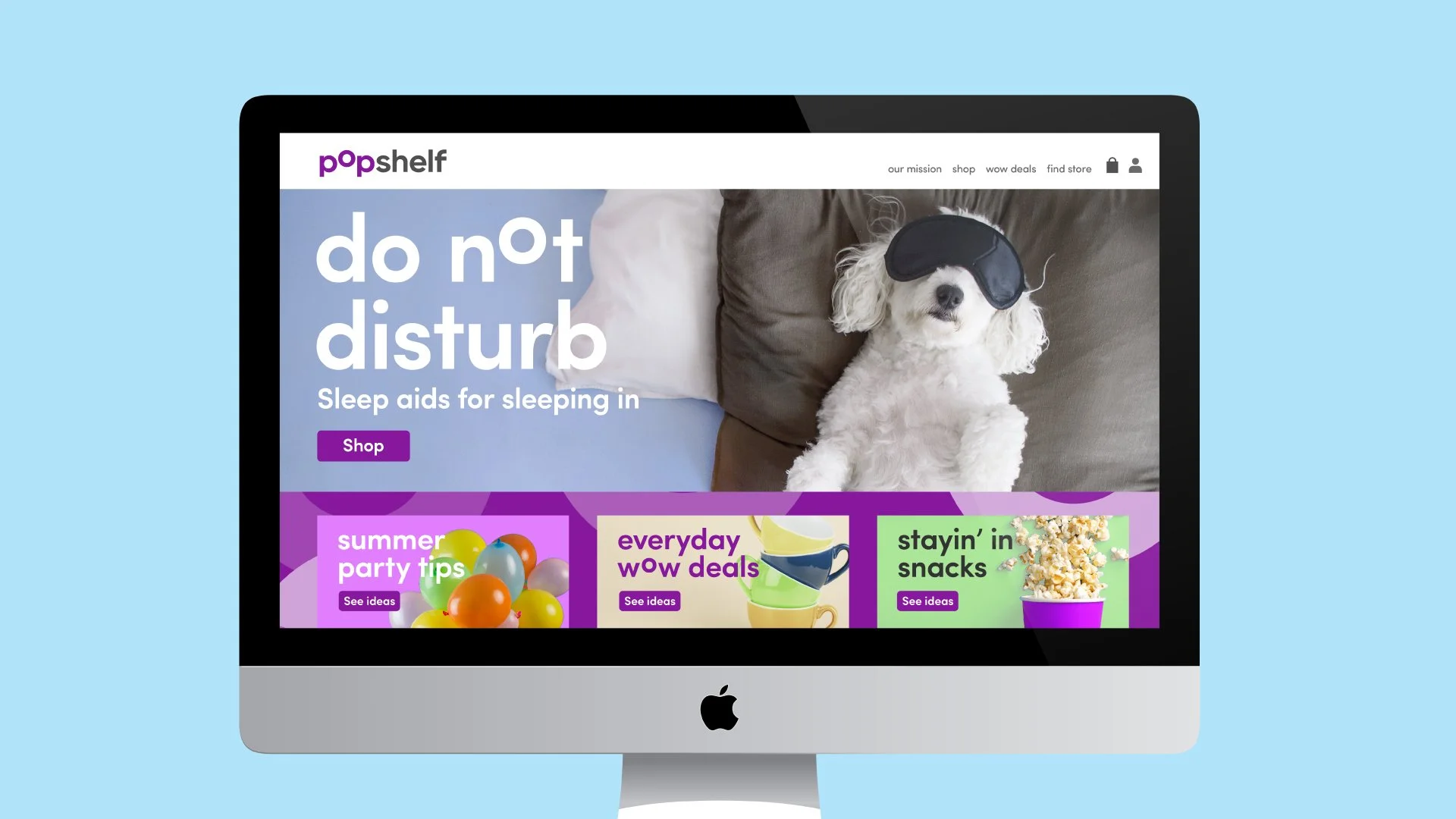
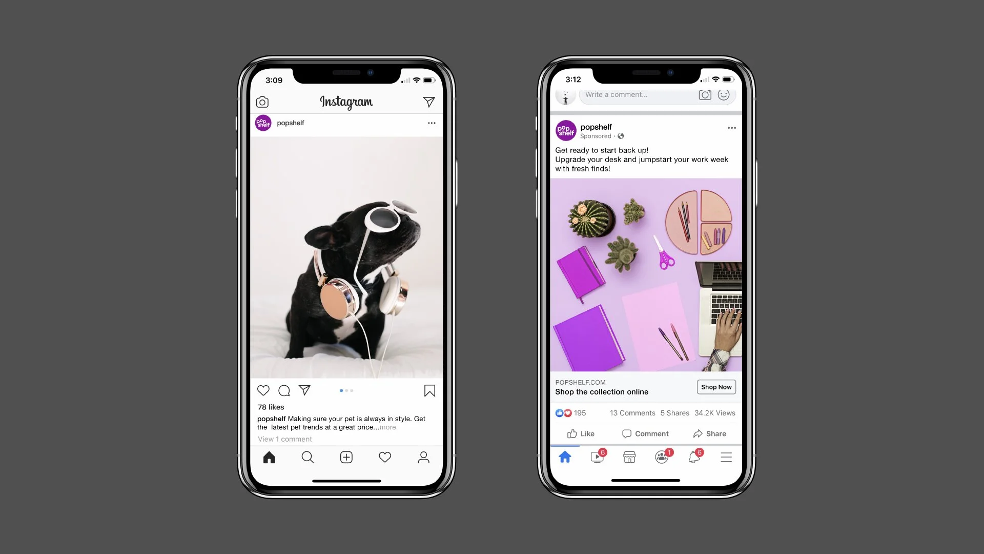
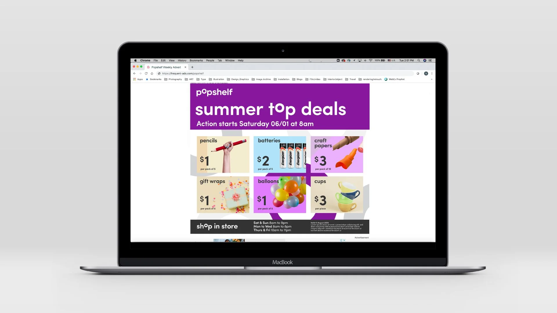
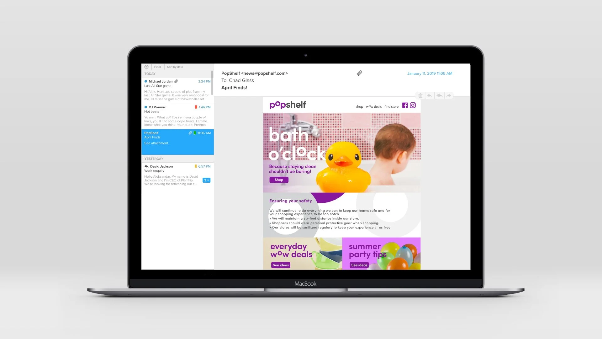
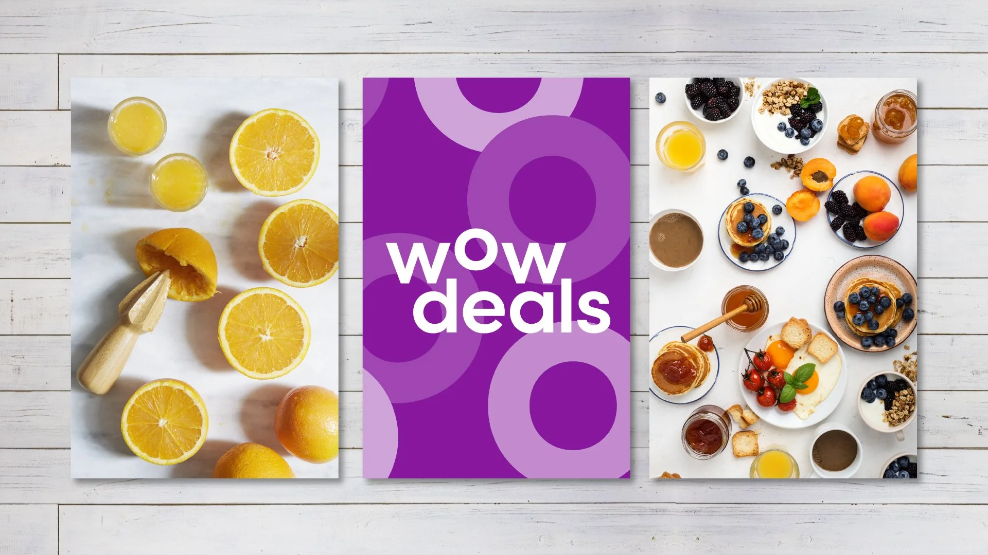
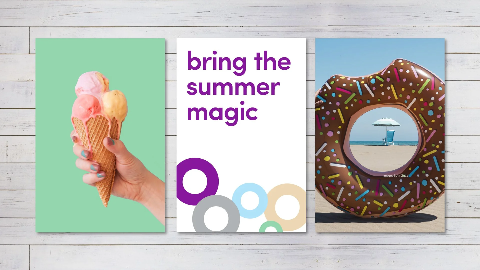
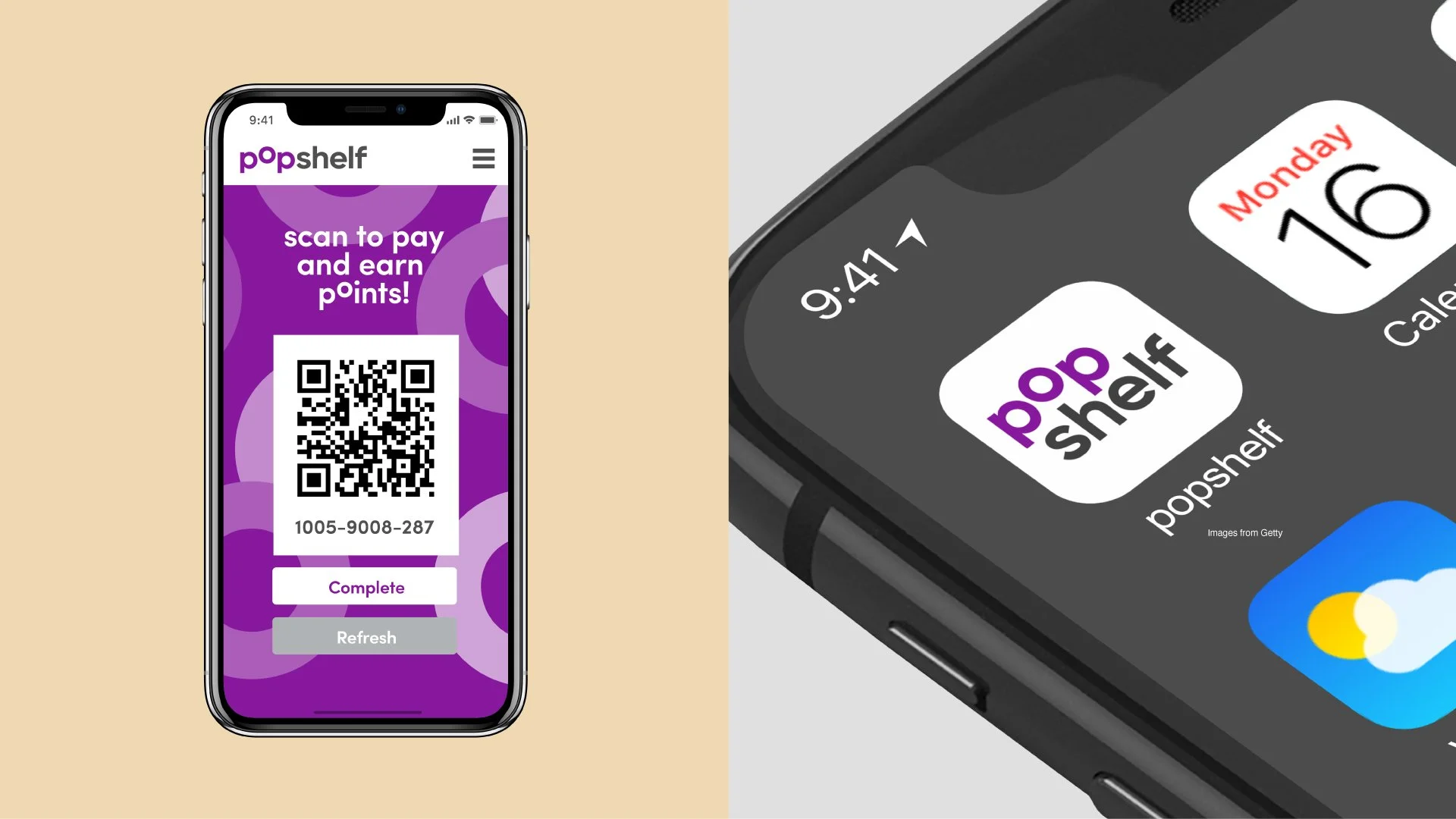
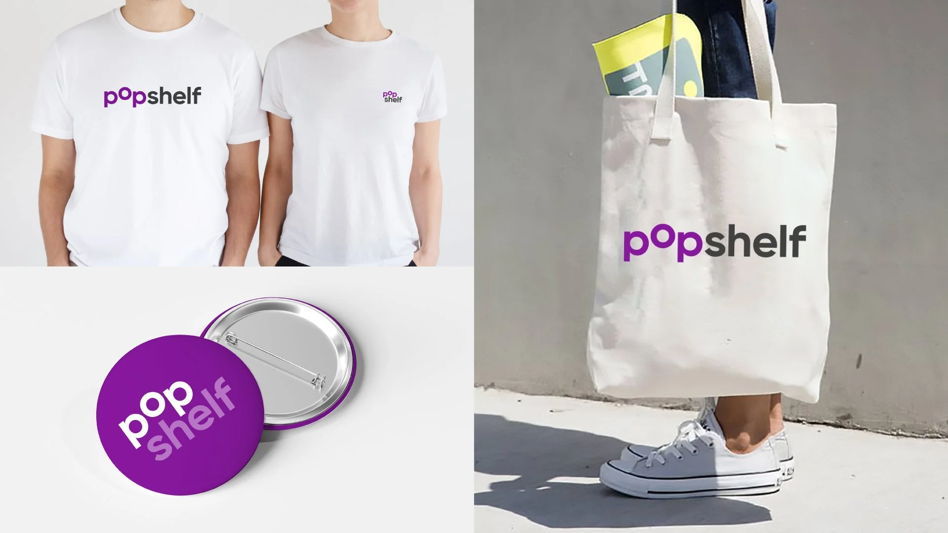
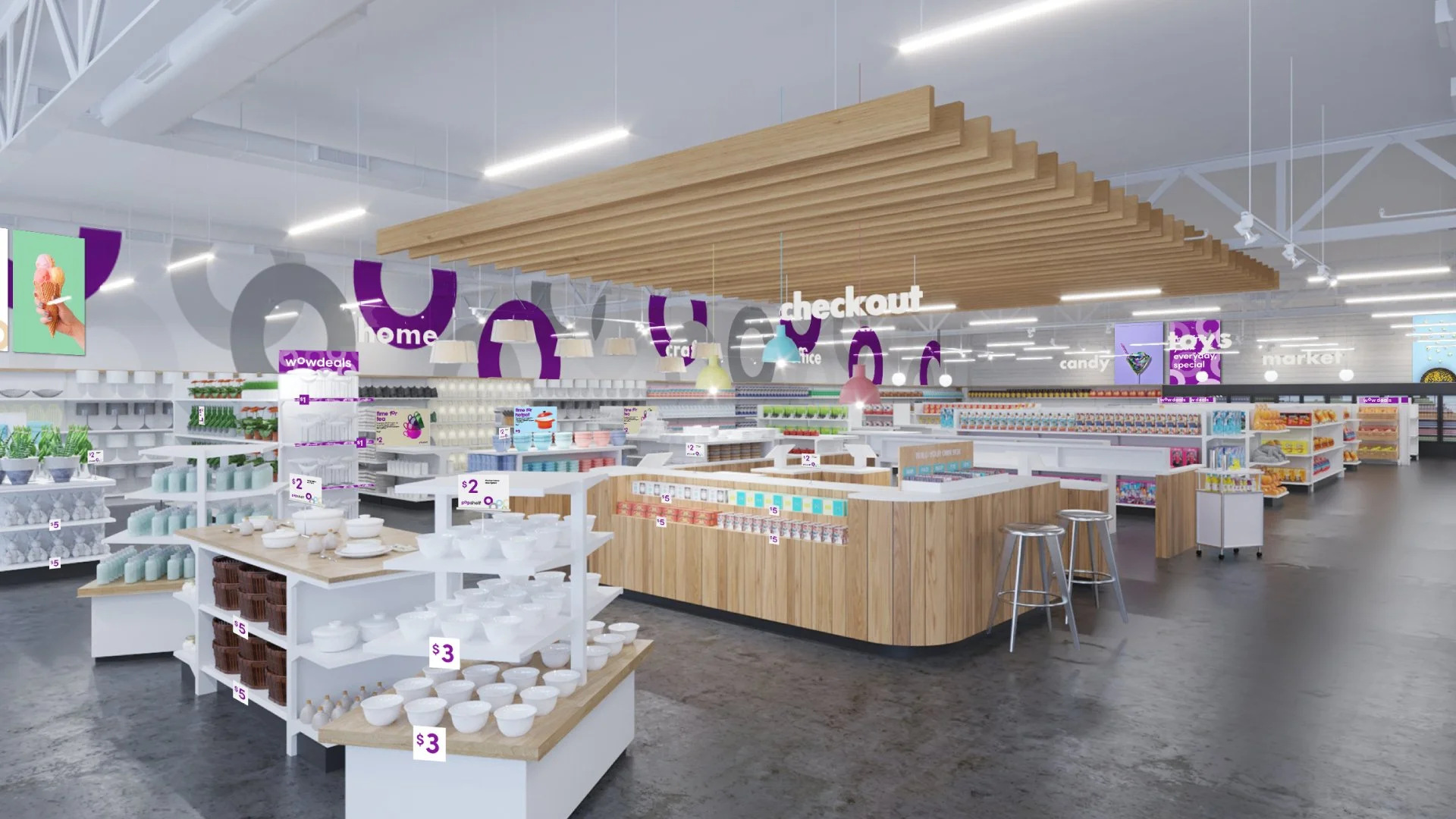
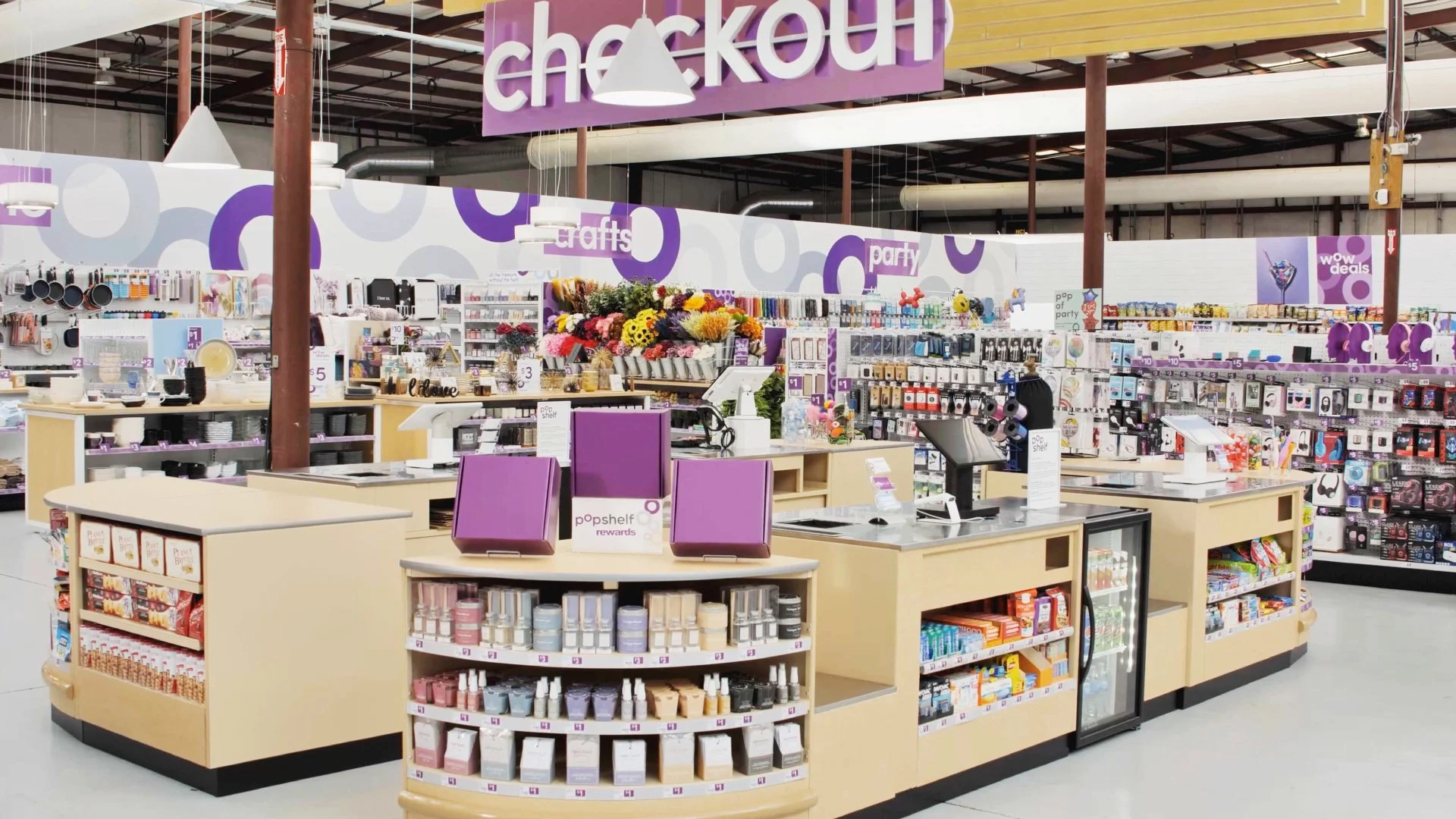
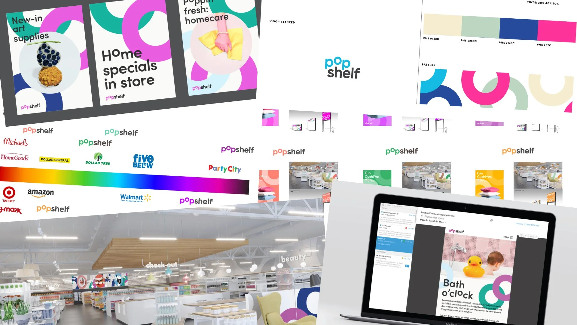
We created a dynamic graphic system that promotes fun and welcomes the customers. This visual system was applied across different media communication materials creating a seamless experience every time you see the brand. Regarding the store graphics, we made sure that the space feels more consistent compared to its competitors. Using colors and the visual system, we could bring life into the space.
Did it pop?
This project was memorable. Our team worked closely with the clients, which helped us translate their ideas better. In addition, working with multiple disciplines allowed us to create an experience for customers entering the shop and walking out with their purchases. As a result, the buzz around the new store was terrific, and our client was very proud of what we had achieved. And now, they opened multiple locations nationwide and will hope to reach 1000 locations by 2025.
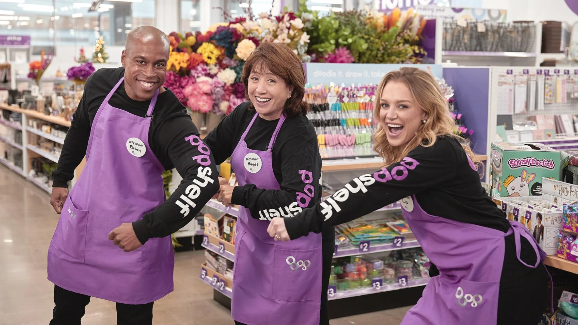
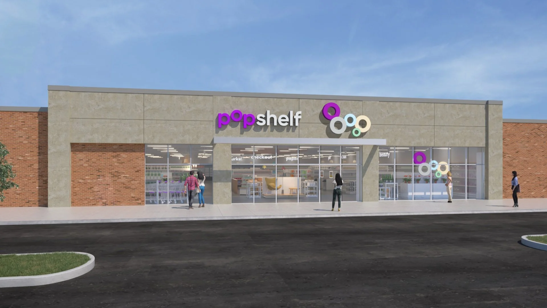
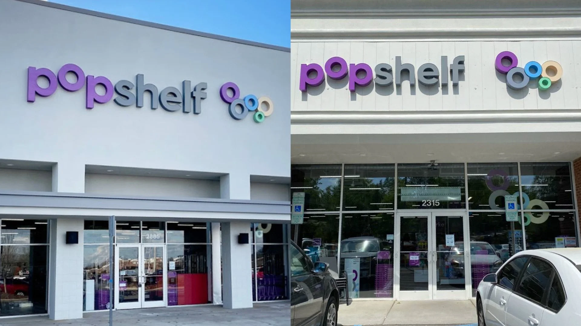
Employees showing off the new brand. Photo from Popshelf Storefront renderingInterior space renderingStorefront in real life. Photos from Big V Property group and South Charlotte WeeklyStorefront in real life. Photos from PopshelfProcess
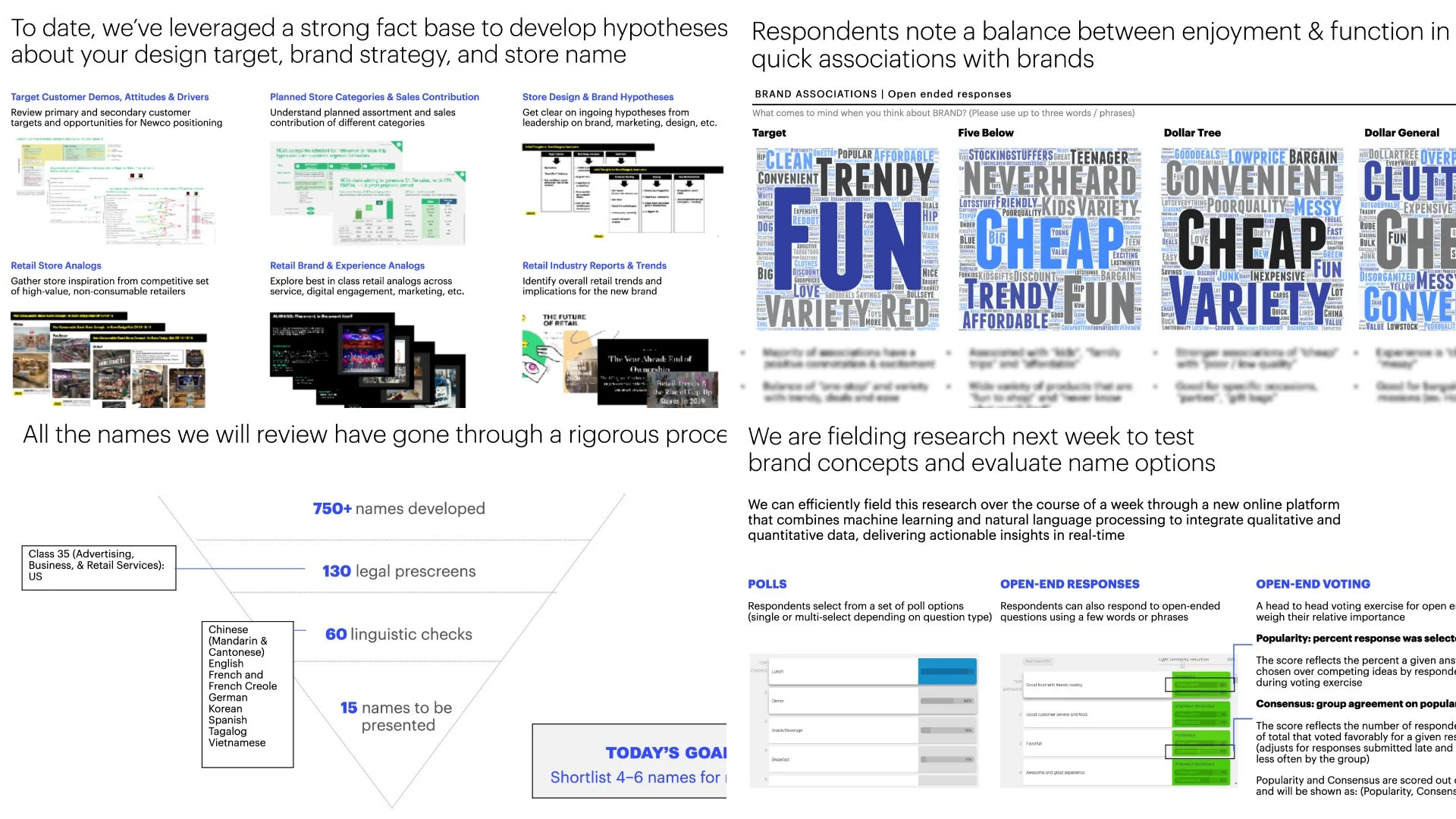
We started the project by going through the analytics provided by the client. The research informed how to begin our strategy work, create a brief for the naming, and start the store layout exploration. At the same time, we were doing creative research and ideations.
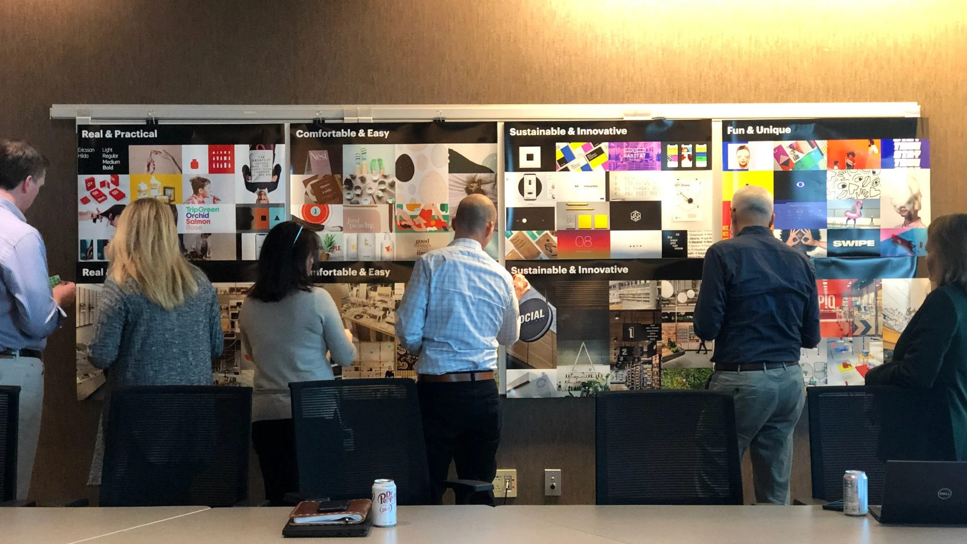
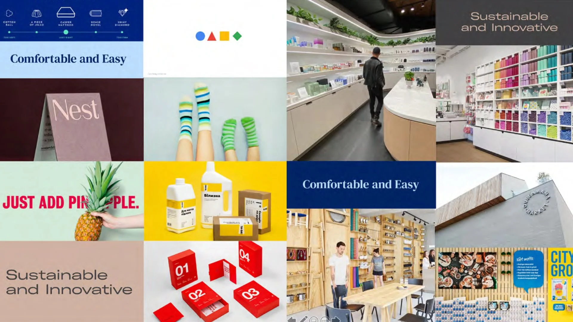
We also hosted an inspiration workshop with the client. This process helped the creative team arrive at a concept and pinpoint the design qualities of the potential system. Our exercise also informed some of the materials, display ideas, and textures they should apply to the store. Our simultaneous efforts led us to our name, Popshelf, which drove many of our designs moving forward.
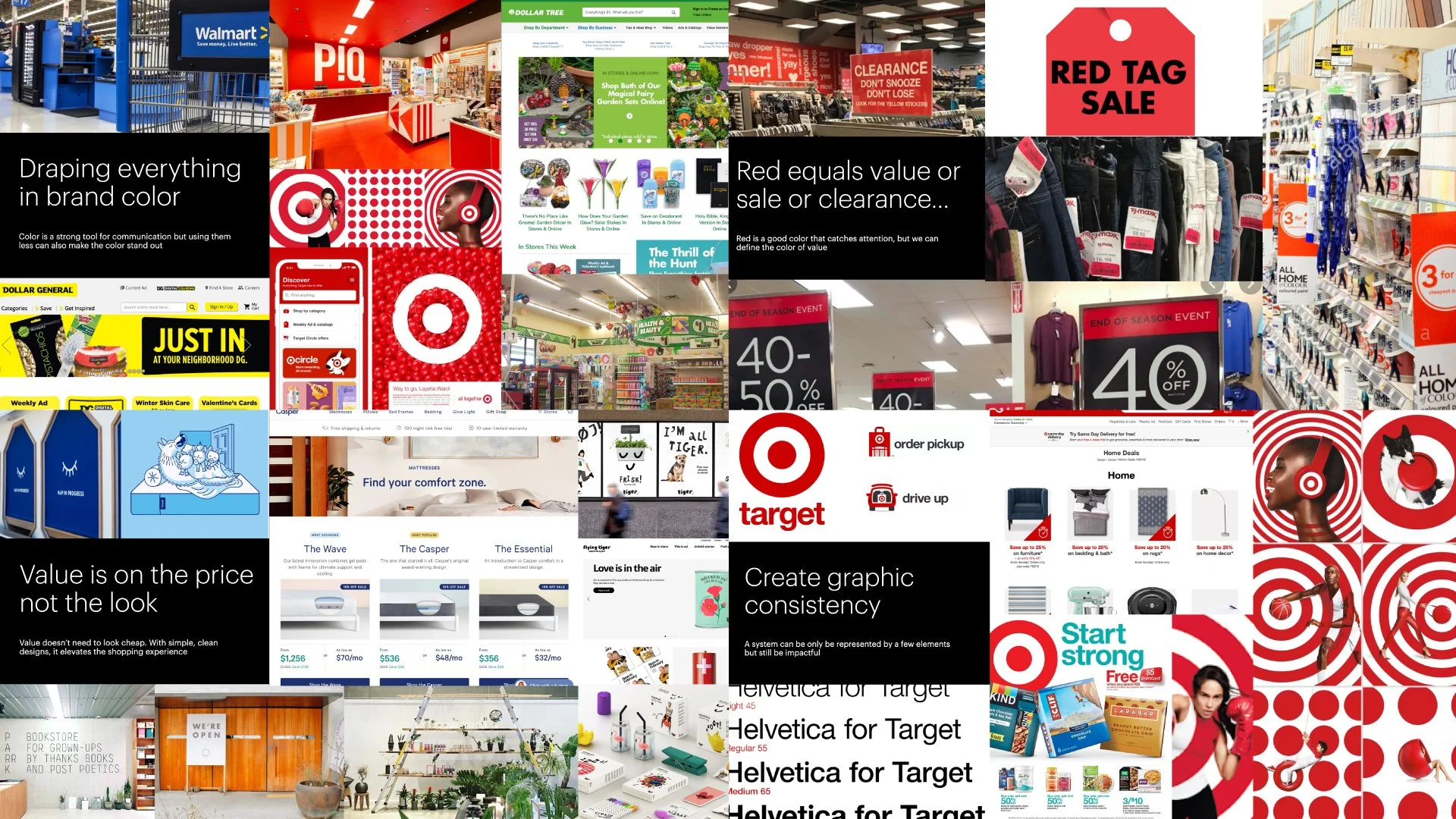
Brand strategy and naming processVisual inspiration workshop with clientsVisual audit and key learningsInspiration
Our session yielded great results that helped our creative exploration. As a result, we had a collection of graphics partnered with natural materials, light color panels, and organized display layouts. In addition, the client found the "Just add pineapple" image a good description of the new brand experience during the process.
Logo explorationVisual system exploration
Project squad
Designed with ProphetPeter Dixon, Partner • Baron Santiago, Design Director • Nuttorn Vongsurawat, Designer • Lauren Kong, Designer • Dani Kim, Senior Designer • Arthur Chu, Associate Creative Director - Architect • Alex Majkowski, Design Director - Architect • Brenda Natoli, Partner - Verbal • Liz Weber, Verbal • Johanna Wall, AnimatorCover image by: Amy Shamblen on UnsplashPeter and I were responsible for the design team by assisting them through the exploration process. Nuttorn designed the logo and the initial visual system while Dani, Lauren, and I pushed to systematize the design. Finally, Arthur and Alex collaborated with the 2D team to bring life to the space.


