Symbol of
Zero-Emission Power
Creating a visual system for a hydrogen fuel cell manufacturer
Backstory
Client name : Hyzon MotorsLocation : Illinois, USAWhat they do :
Hyzon Motors develops and manufactures hydrogen fuel cell systems and supplies zero-emission, heavy-duty, hydrogen-powered vehicles. Founded in 2020 as a spinoff of Singapore-based Horizon Fuel Cell Technologies, which focused on developing fuel-cell-powered utility trucks and buses, it is now on the brink of becoming one of the leaders in hydrogen fuel cell technology.While building trucks and buses puts their brand in front of clients and consumers, it creates a narrow vision for their technology. Instead, they want to transition to providing hydrogen fuel cell technology to their partners in industries such as transportation and manufacturing that require heavy-duty power while reducing their carbon footprint.
As environmental awareness continues to grow and the demand for zero-emission technology surges, Hyzon is committed to leading the way in providing hydrogen power for the most demanding applications, all while ensuring a cleaner world.
Our task is to build a brand that can withstand time and be recognized as one of the leaders in the hydrogen fuel cell industry, emphasizing that hydrogen is the power for the future.

Solution
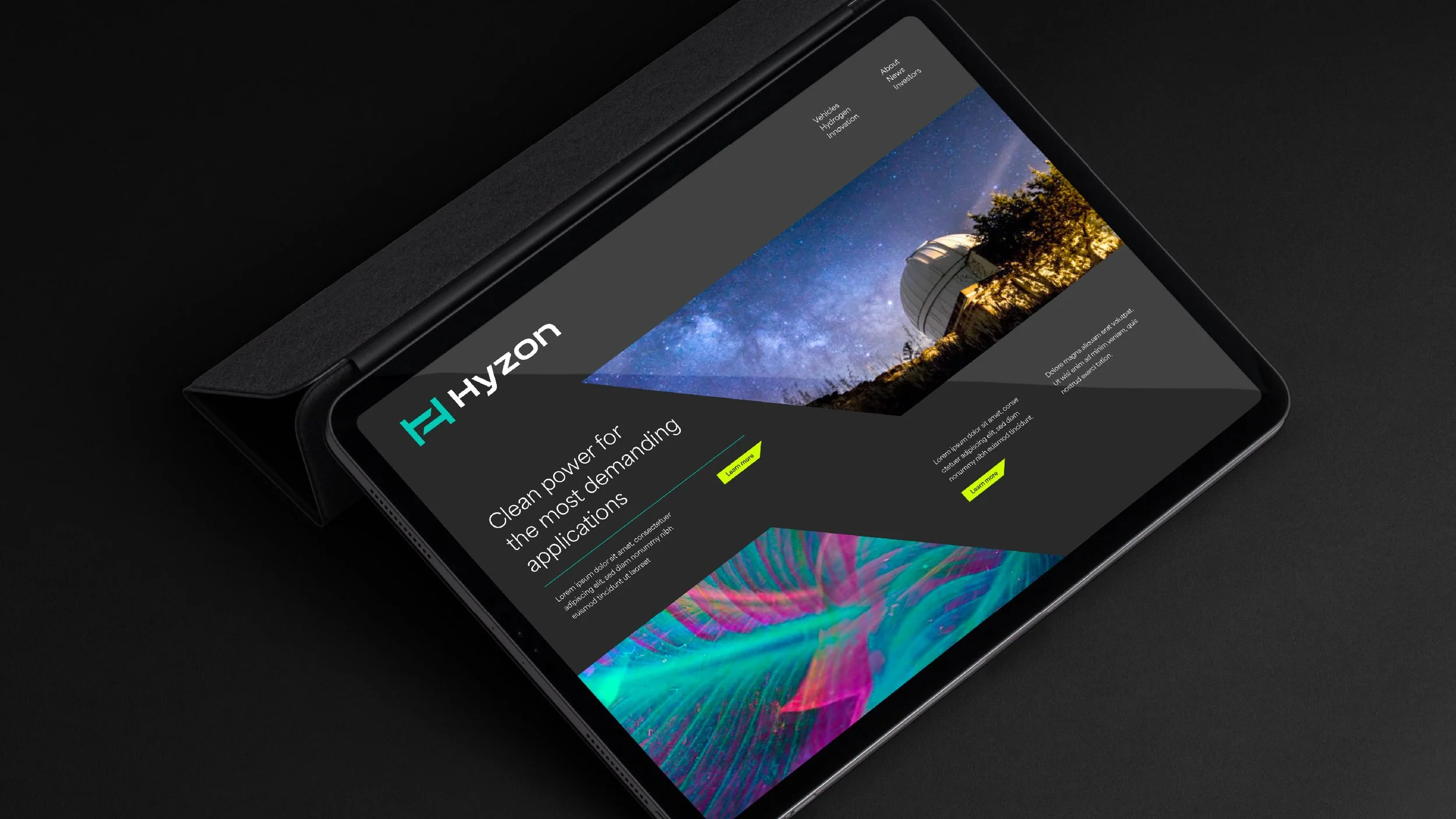
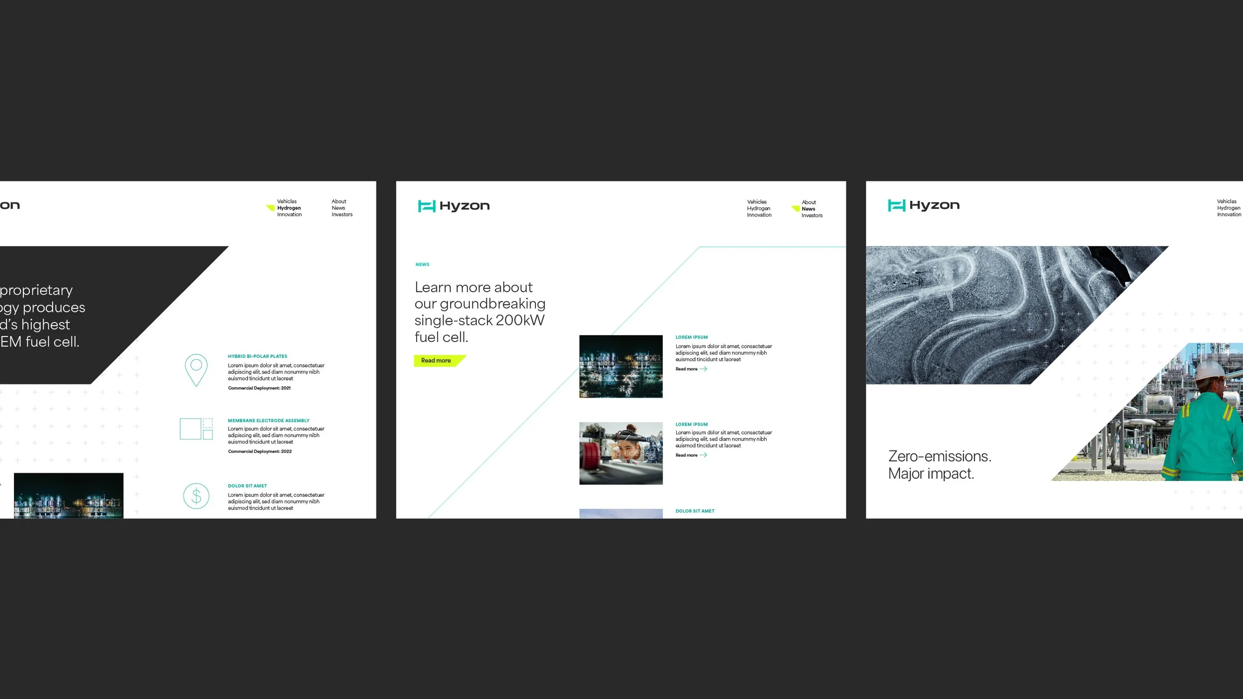
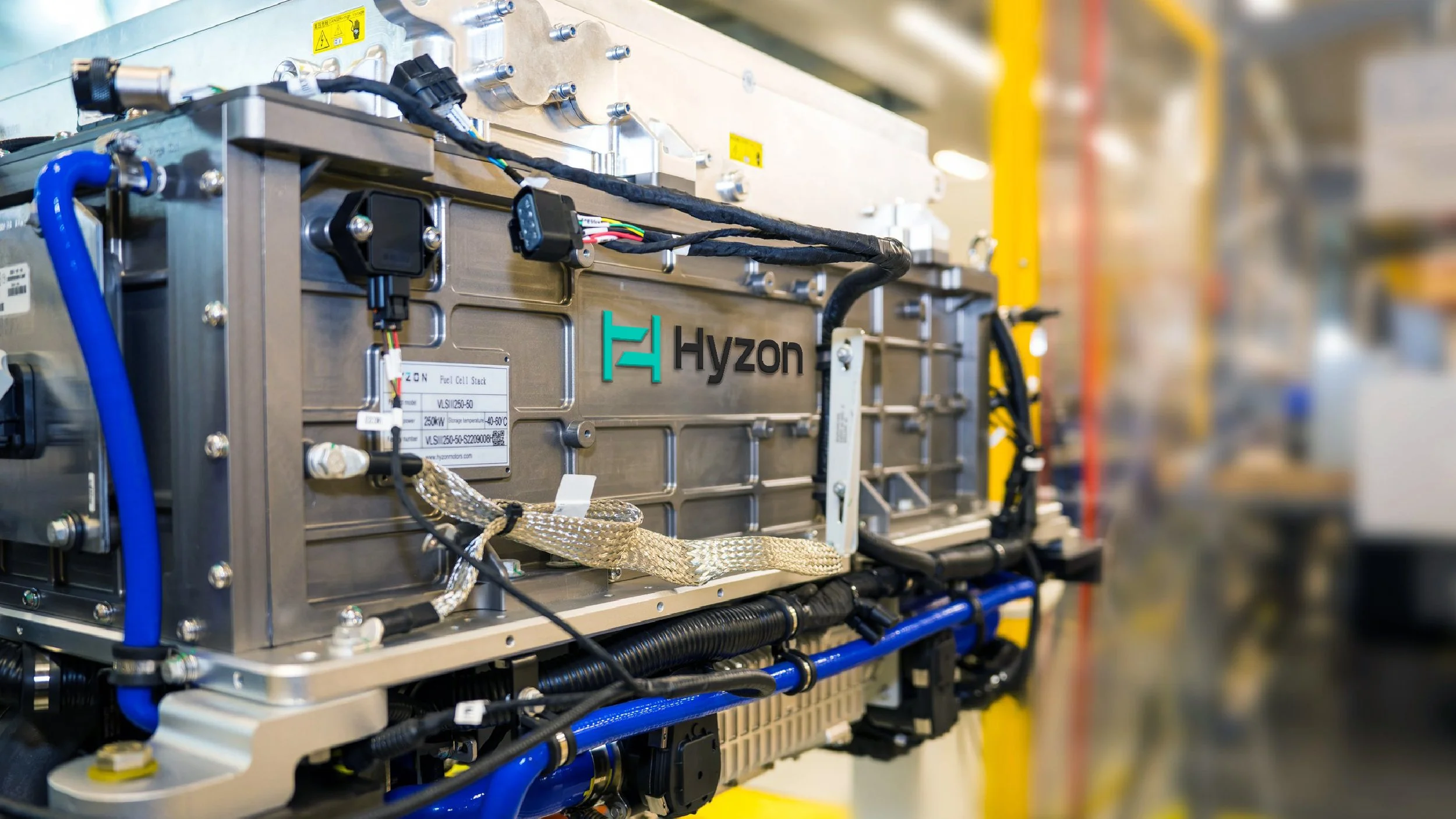
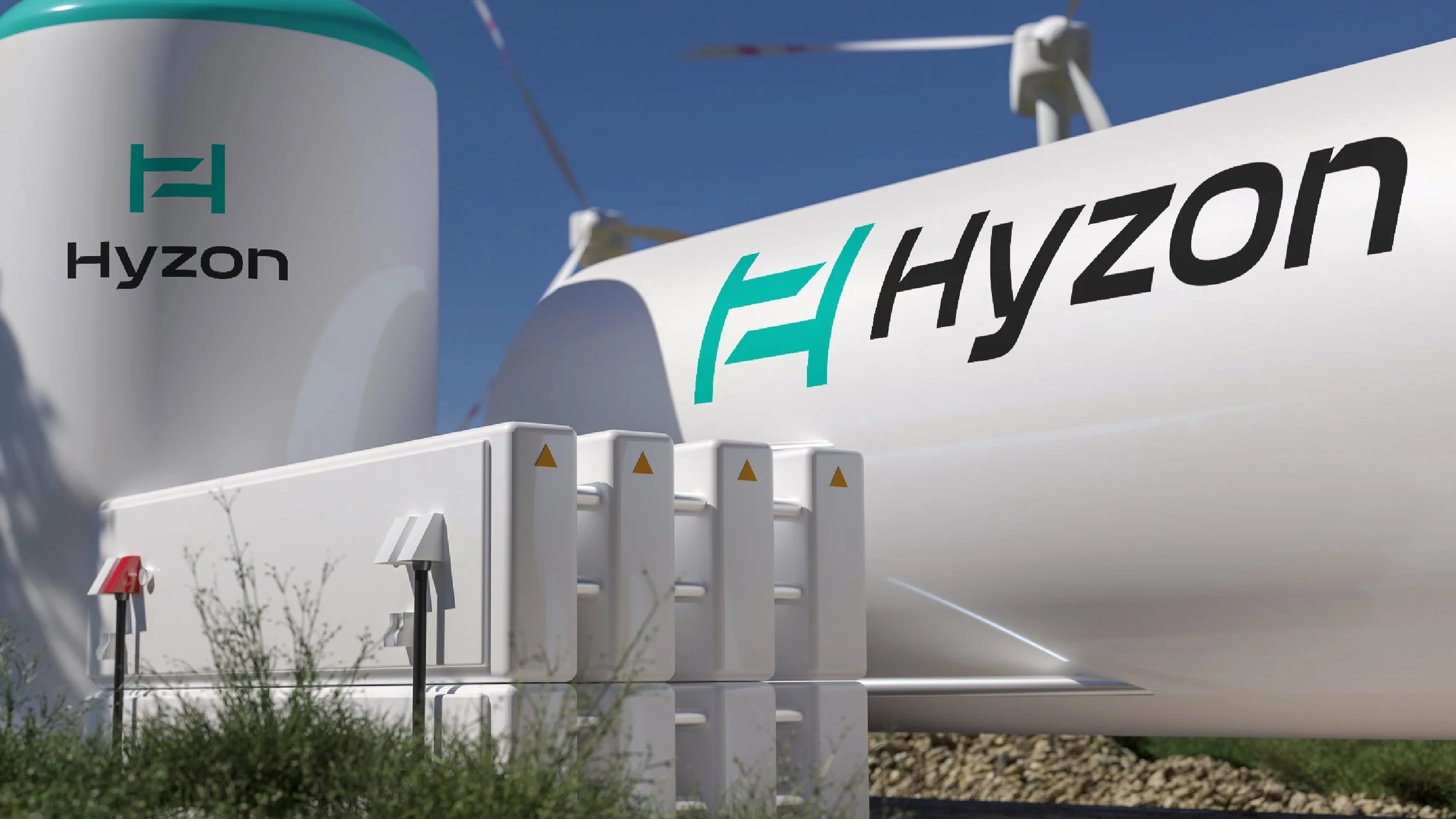
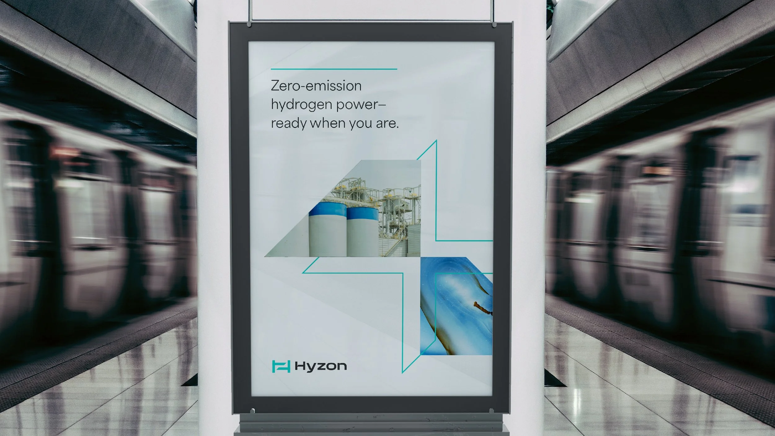
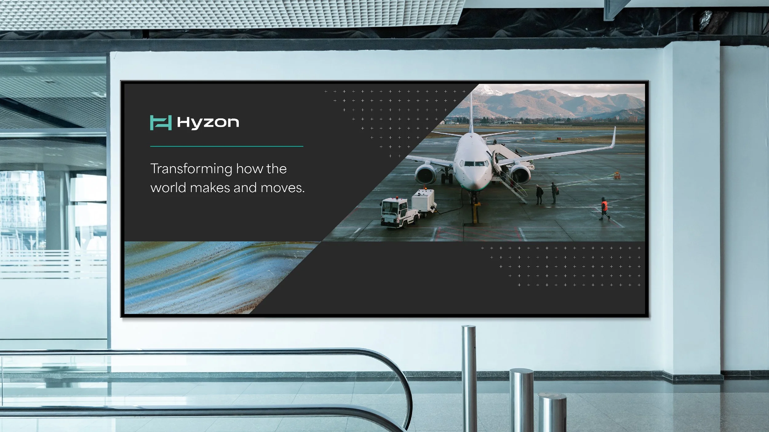
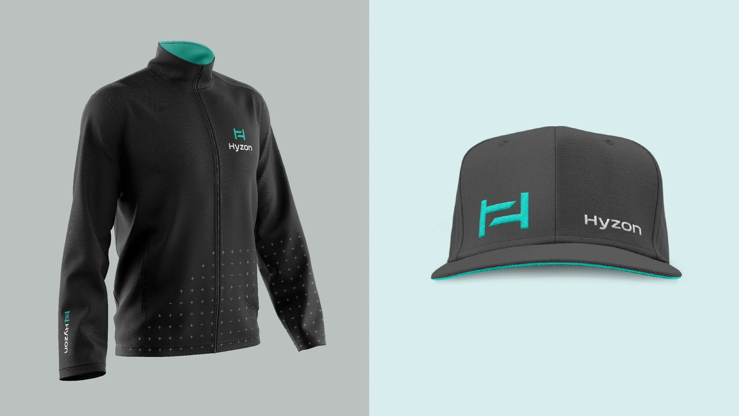
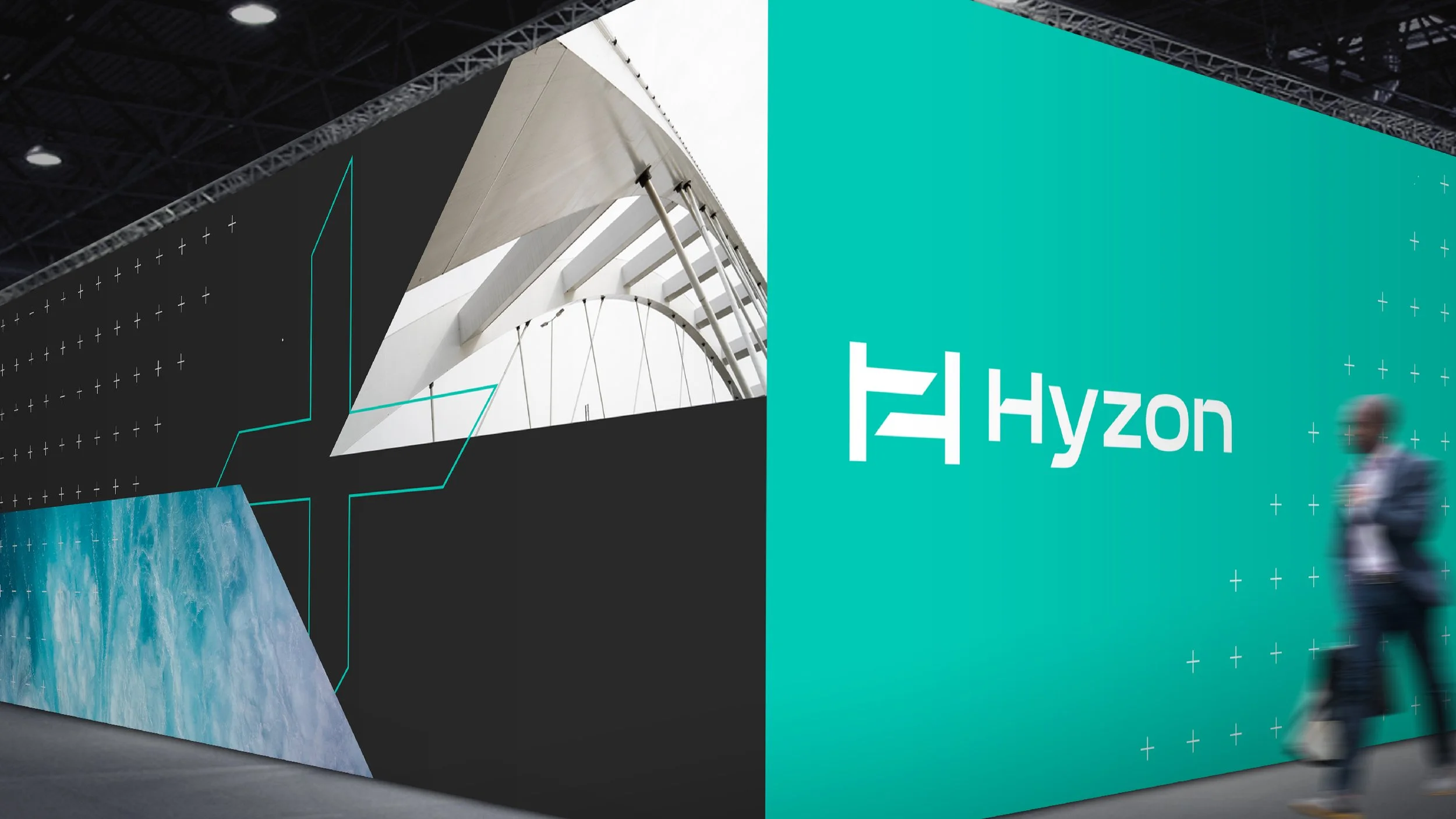
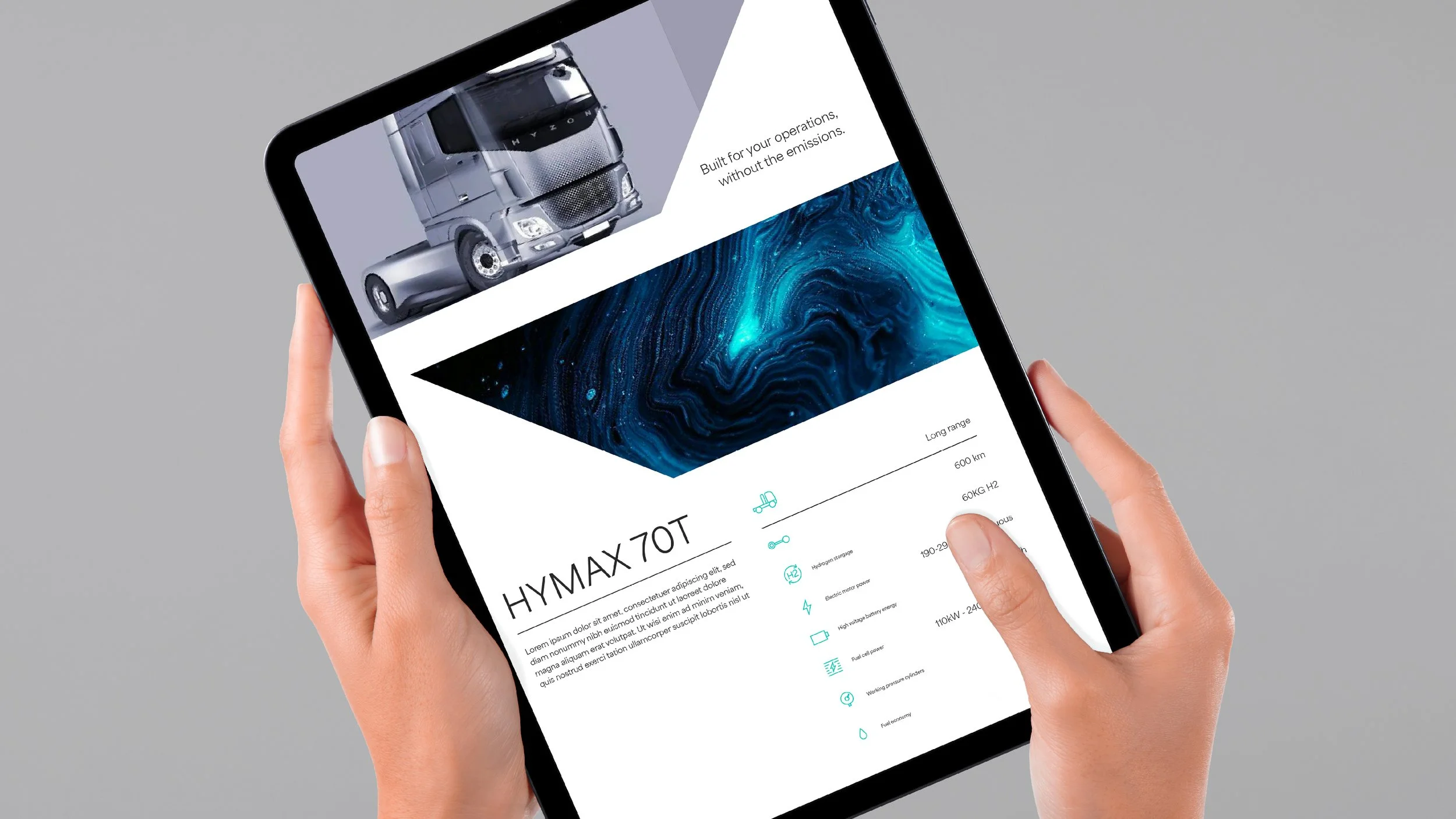
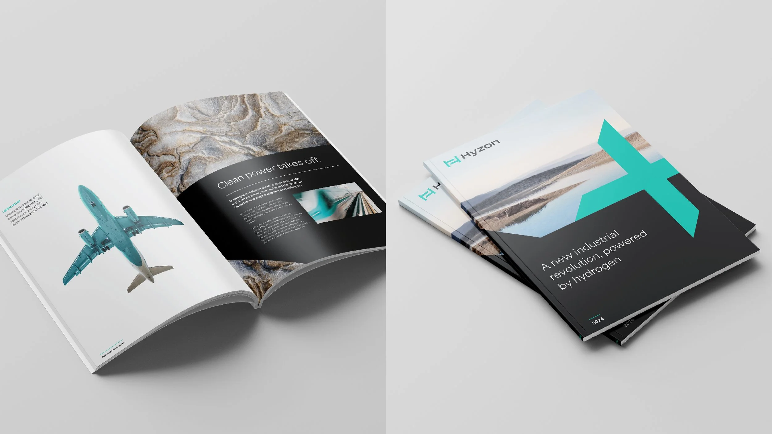
As part of reframing the brand's trajectory, we created a visual system inspired by elements surrounding the technology. The symbol is an H with the number 2 in negative space, representing Hydrogen gas. The two cross bars represent their proprietary plate technology for building fuel cells and are seen throughout the system application. The addition of the plus symbol represents the collaboration between Hyzon and their partners, technology, and nature.
Did it pop?
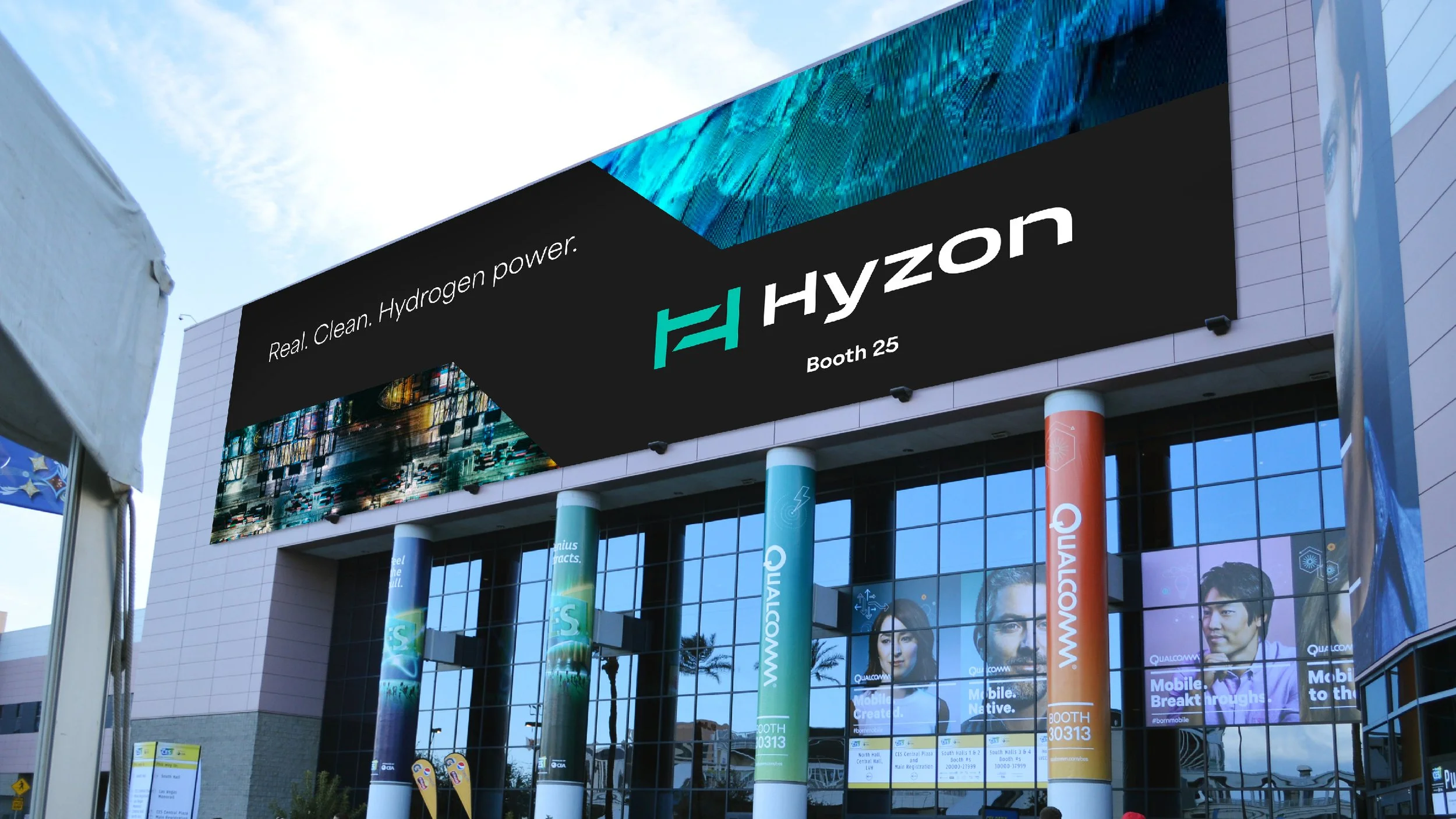
Hyzon re-launched its brand early this year, debuting at the 2024 ACTExpo with a new design and truck emblazoned with the new brand. Equipping Hyzon with a new visual system and strategy, the client team can confidently poise themselves to be among the top competitors in the fuel cell market.
The latest truck was unveiled with new graphics. Photo from HyzonProcess
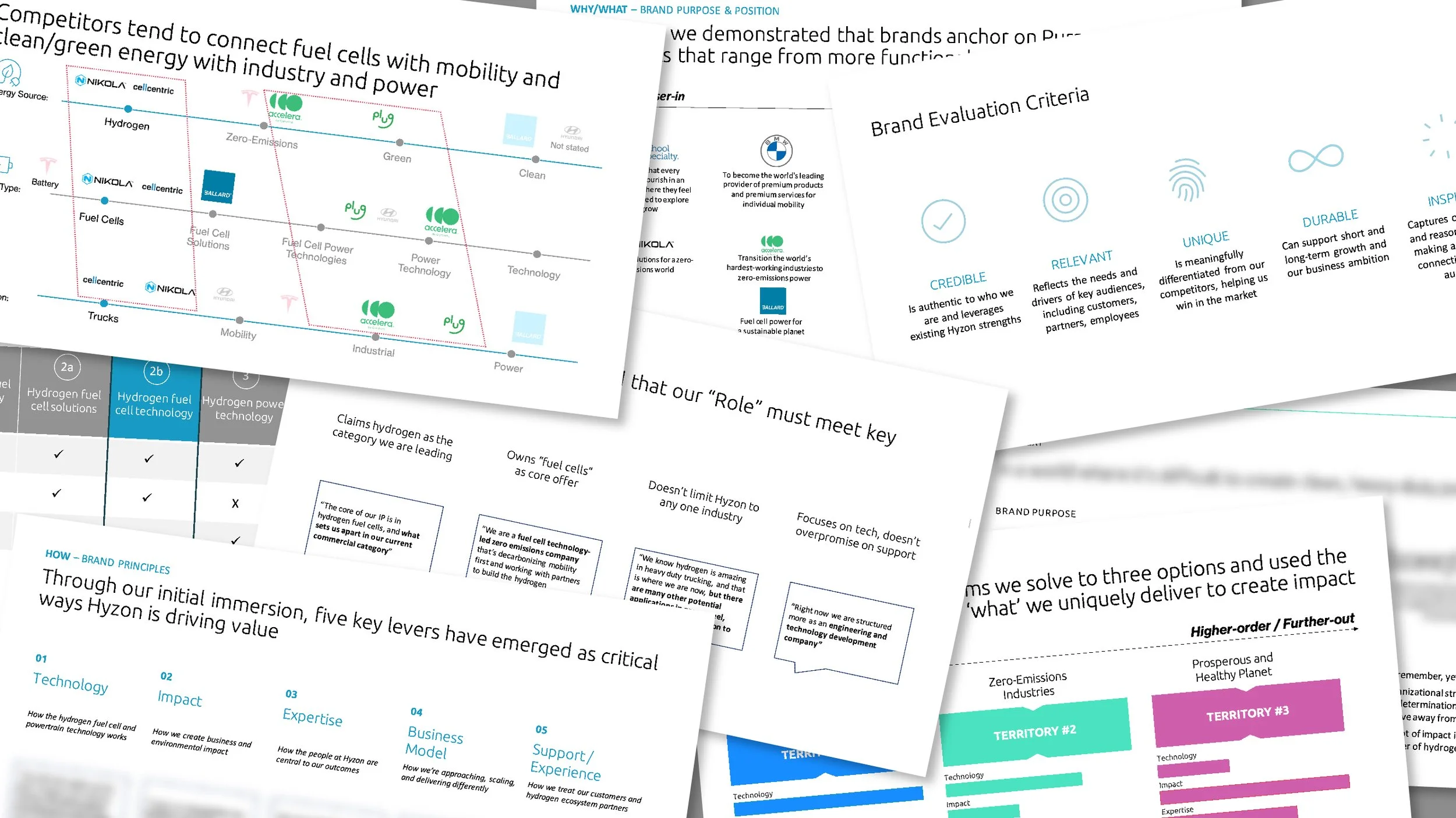
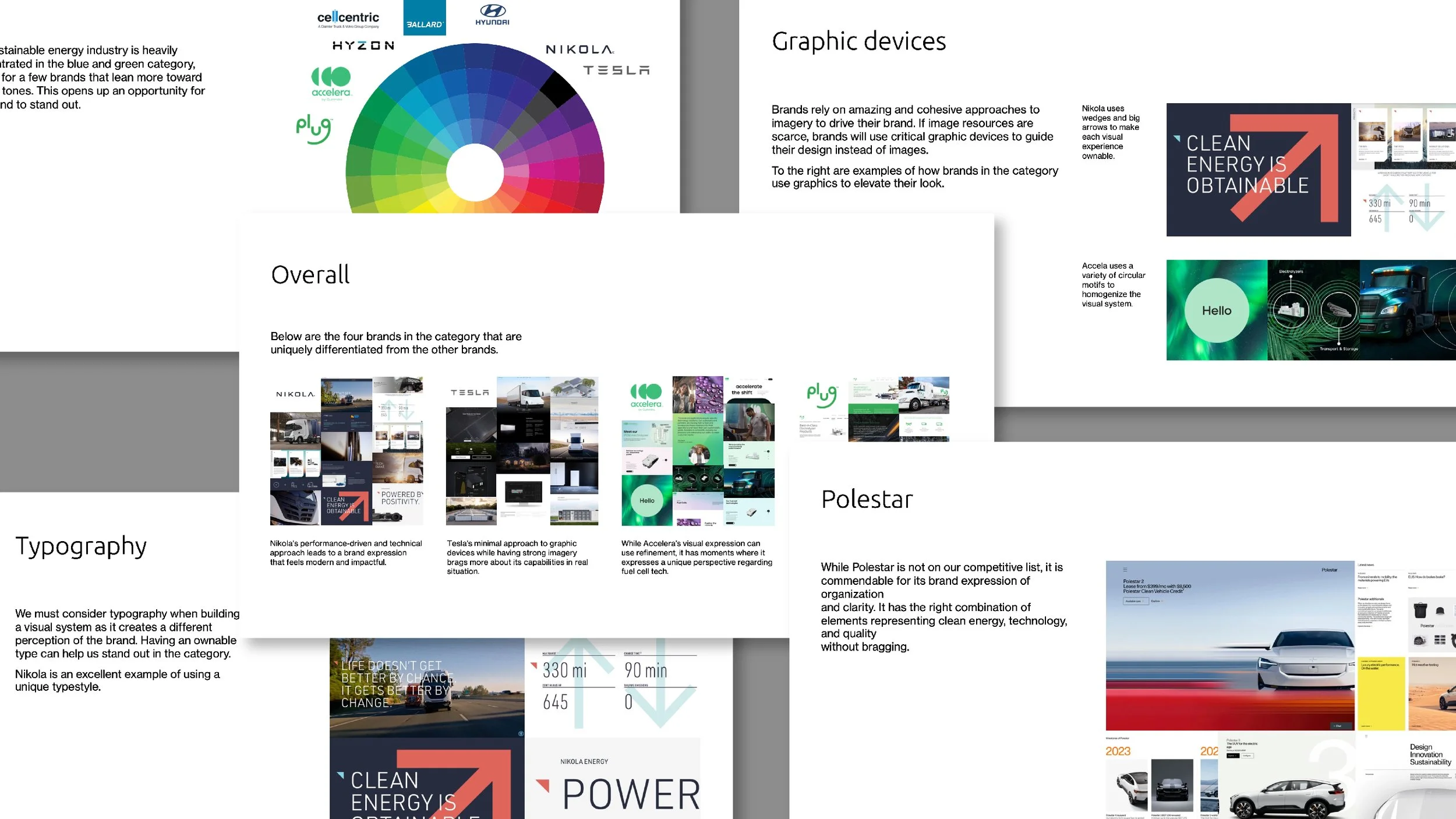
With today's trend of the quick brand-to-market approach, we worked simultaneously with strategy and adjusted our design exploration as we discovered new things throughout the process. As per the design process, we looked at other fuel cell technology and BEV brands to see where their brands are going. From there, we learned where we could take our brand by creating visual territories to align with the strategy development simultaneously.
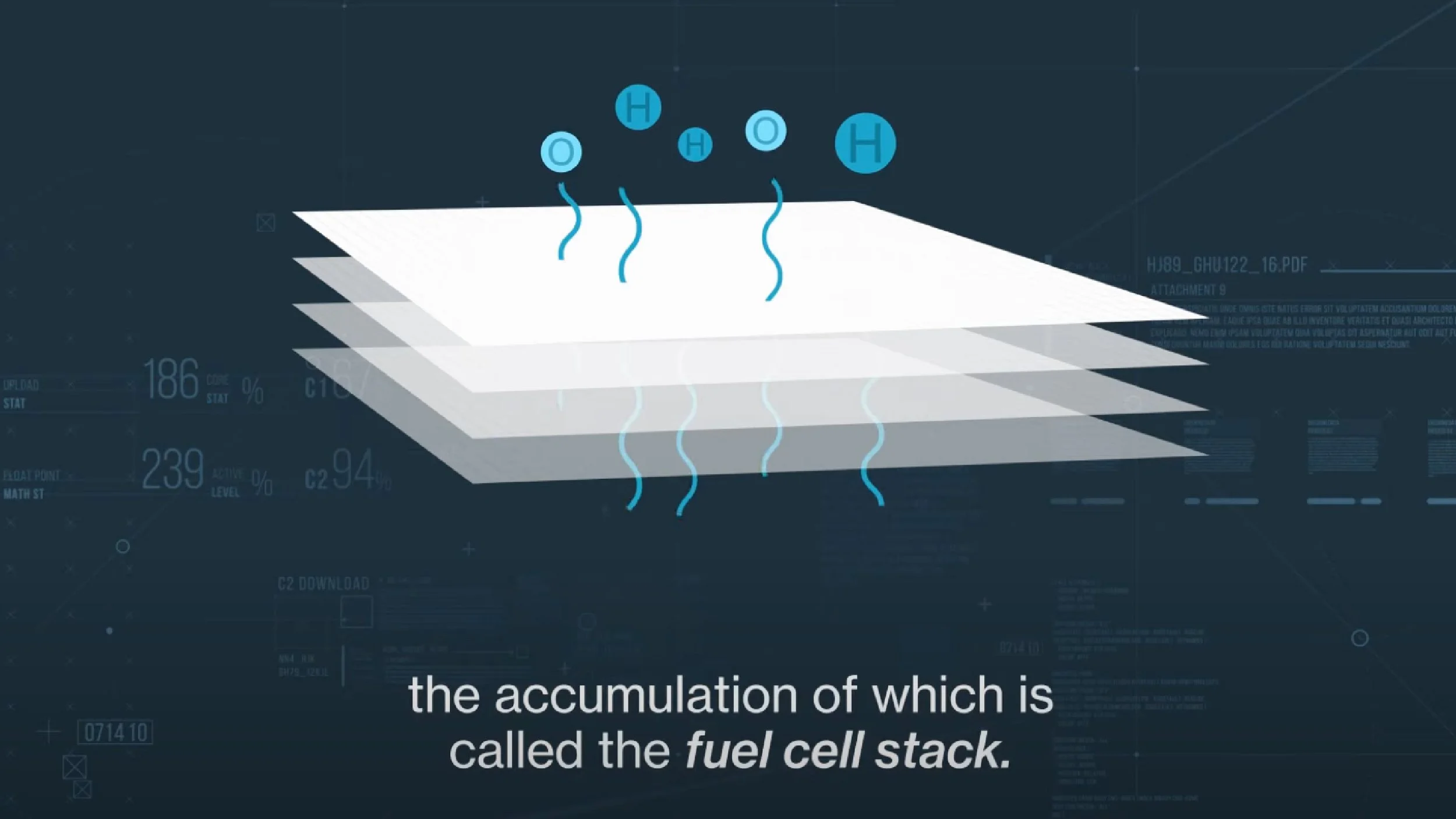
Strategy and researchVisual audit highlightsLayers of PEM stacked together are used as inspiration for creating the visual identity.Inspiration
Their proprietary fuel stack inspired us to create the brand's visual language. Their technology's sharpness and quality helped us shape the visual system as tenacious as their brand story.
Logos sketches How the fuel stack worksVisual territories elevating different visual cuesOther ideas exploredProject squad
Designed with ProphetPeter Dixon, Creative Director
Baron Santiago, Design Director
Raphael Cala, Designer
Sarah Mier, Engagement Manager, Strategy
Jason Wang, Senior Associate, StrategyPeter and I were responsible for developing the visual language and managing the client team. I designed the final logo and visual system, while Rapha helped with the day-to-day design exploration and finalization. Copywriting was split between the strategists and the creative team.


