Getting the
full picture
Designing a currency exchange app for travelers
Backstory
This project is created for the Google UX Design Professional Certificate. This task was to design an app to help global travelers find the latest exchange rates between two currencies. They can also use this information to exchange currencies quickly and easily.
Upon research and personal experiences while traveling, trying to find exchange rates is easy but also wildly inaccurate. While Google and other sites give you value approximation, you still have to deal with the surprises of fees and other charges associated with the purchase or exchange. Calculating that as you purchase an item or exchange money can be anxious, filled with frustration, and buyer's remorse.
Solution
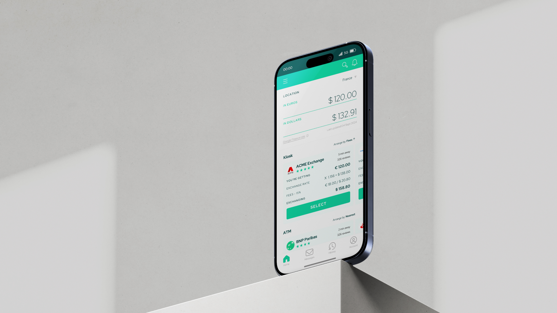
With the knowledge I gained from research and experiences, I designed an app specific for travelers that does the following:
Shows the current exchange forecast as you type the value, whether in your current location's currency or home currency.
Uses geolocation to forecast the currency in your current location and also shows the local kiosks and banks within your specified radius, so getting cash is easy.
Gives you an overview of all the different payment methods available.
Transparent about fees and other charges to give you the exact amount you'll need of your money to exchange or a closer approximation of how much you'll be charged on your debit or credit card.
Facilitates the seamless exchange of hard currency with kiosks.
You can test the prototype here. Please note that input fields are not live and will automatically fill.

The registration process reflects the conversational language that was essential for the user groups.Exchanging for hard cash using kiosks includes a few steps for security, clarity, and control for the user.Did it pop?
It was well received when shared with my peers. They said an app like this will be convenient when traveling. Exchange kiosks, banks, and credit card companies often bury the information when users try to make an educated decision. This app can boost their confidence while spending during their trip and avoid any remorse about their purchases.
PRocess
Research
In my preliminary research, I looked for articles about shopping overseas as a traveler and related articles and forums such as travel tips, cash exchange, FOREX, and preferred travel payment methods.
With this preliminary insight, I set a goal to create a foreign exchange app that shows the most up-to-date rates and broadcast fees and can compare different exchange kiosks, ATMs, and credit cards.
Interview process
To get a better sense of this new app, I created an interview to understand how this app should perform for the users and how it can improve their experience abroad.
Identifying USER PErsonas
After the interviews, I found out that majority of the travelers/users feel lost and uncertain about their purchases and transactions on whether they did the right form of payment or get the best rate for their money.
I created two user personas that I will be designing the product against basing it on transparency, efficiency, and ease of use.
According to my research, these two user personas would be the likely users of this app. Using them as my guide in developing the currency exchange app.Defining the goal
Working at a branding agency helped me conceptualize and build a structure for formulating our goal statement, which is, in essence, a brand statement that includes what the product is, why it is necessary, who it is designed for, and how the app will do it.
Categorizing themes based on the brand principles I developed while defining the brand. Competitive audit
Most apps only show the current foreign exchange rate but do not factor in fees and rates from different bank/kiosks.
Sources for these conversions need to be more transparent, and it might be whatever is easy for a developer and may not be a reputable source.
People love the simplicity of these apps—fast and easy conversions.
Credit card companies have a unique way of calculating exchange rates and are cautious that the actual charges are often different from the day you make the calculations.
Most apps out there are designed mainly for FOREX investors.
IDEATION
designing the next currency exchange app
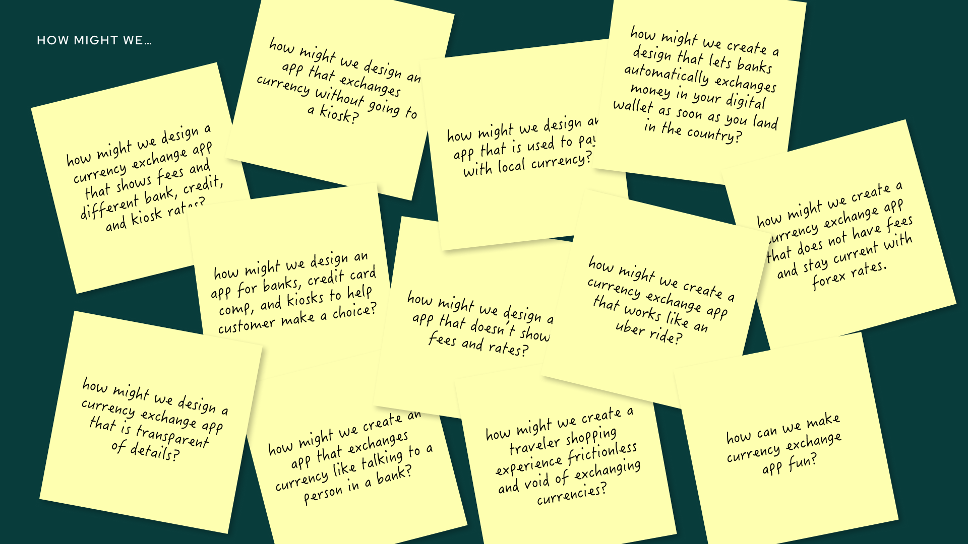
After collecting all the data from my research, I started developing ideas on what this app can do and how it will function. I started with the "how might we's" statements and proceeded with some sketches— Crazy 8s, Userflows, and wireframes. Each time I marked the paper with my pen, there was a new development from how I laid out the interface, what I could include in the experience, and what different instances would happen on the screen. It was helpful to keep iterating the work towards the first version of this app.
Preliminary ideas for the app using the Crazy 8s method. It was helpful to stretch out my creativity before diving into the nitty-gritty of the app.While storyboarding is unnecessary, it shows when this app will be helpful in the situation, especially for something different and new. Creating a storyboard also magnifies the app's necessity for stakeholders overseeing the work.Charting out the userflow helped me ideate how to simplify the experience. I've had many trials and errors made in this process to ensure the app is seamless.The information architecture above helped me organize the user experience in my preliminary designs. I've massaged this even more as I went through the prototyping process.Prototyping
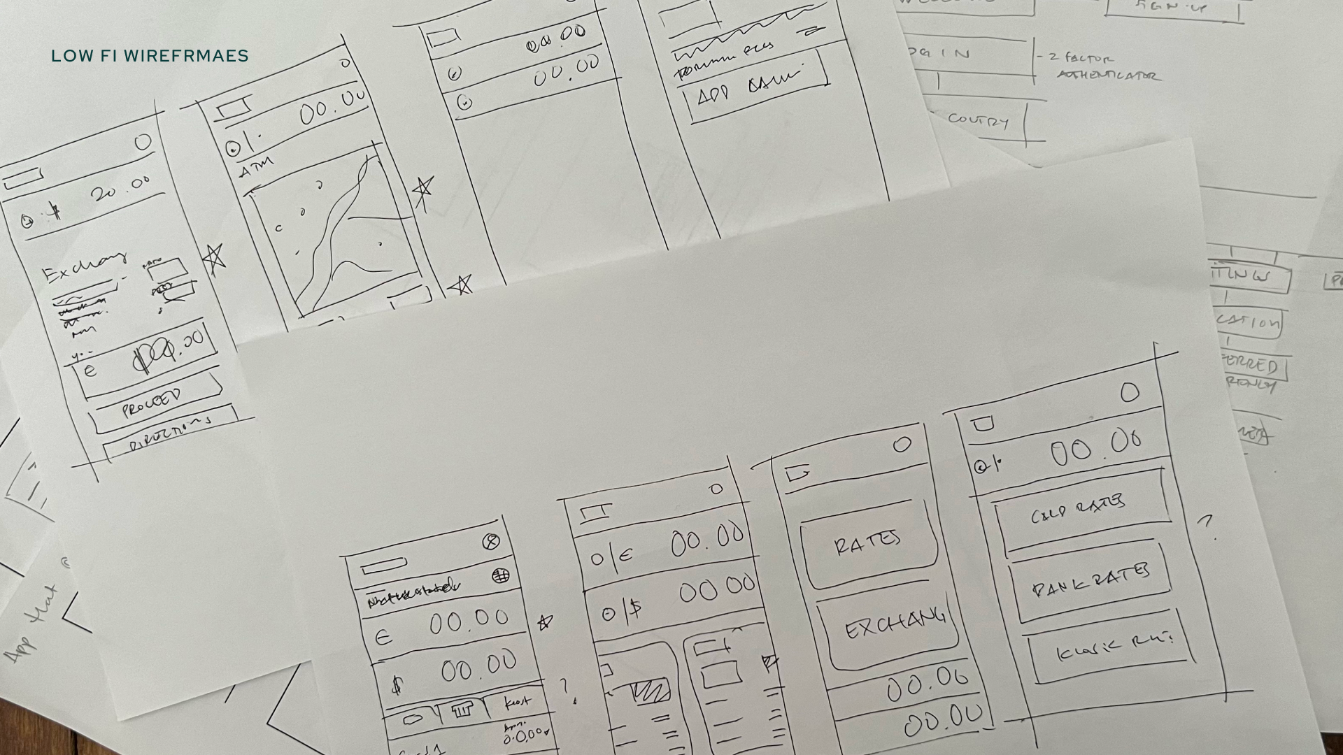
Multiple iterations and research helped me land on the most simplistic approach to this app. As I moved to create lo-fi wireframes, I encountered some challenges and questions regarding how the app would function. For example, gestures familiar to users, like scrolling, swiping, and clicking, created constraints that helped me adjust the designs to the current prototype.
Initial layout ideas for the app. I designed the layout to feel familiar to the users, ensuring that it signals what it exactly does when they see the homepage. With payment method options visible and the ability to calculate values instantly, this experience will be unique.Before I moved on to creating a hi-fi prototype, I tested the lo-fi prototype to ensure that the product directs the users to do what they want.Despite some design adjustments along the way, the app had a high success rate with potential users.Defining the visual language
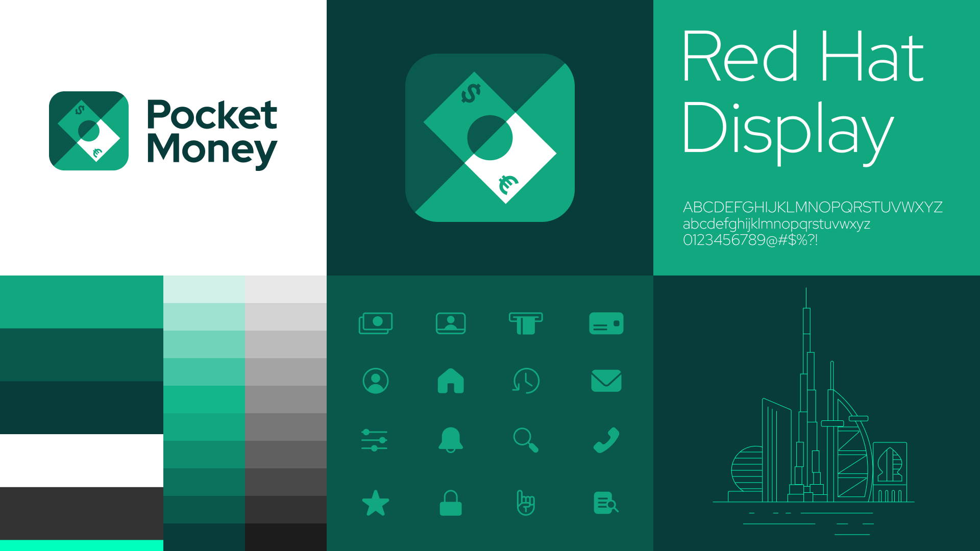
As a brand designer, it was natural for me to establish a visual language that reflects the goal statement. Each element is a strategic choice that visualizes the product principles. In this instance, green is a chosen palette as it is a familiar color for money across different regions. Dark hues establish trust and security, while the brighter palette signals positivity and modernity. The chosen type is clear and has distinct characters to avoid confusion. Meanwhile, the logo shows a transformation—passing through an exchange—using simple shapes with currency symbols on opposing corners that are customizable based on the user's origin country.
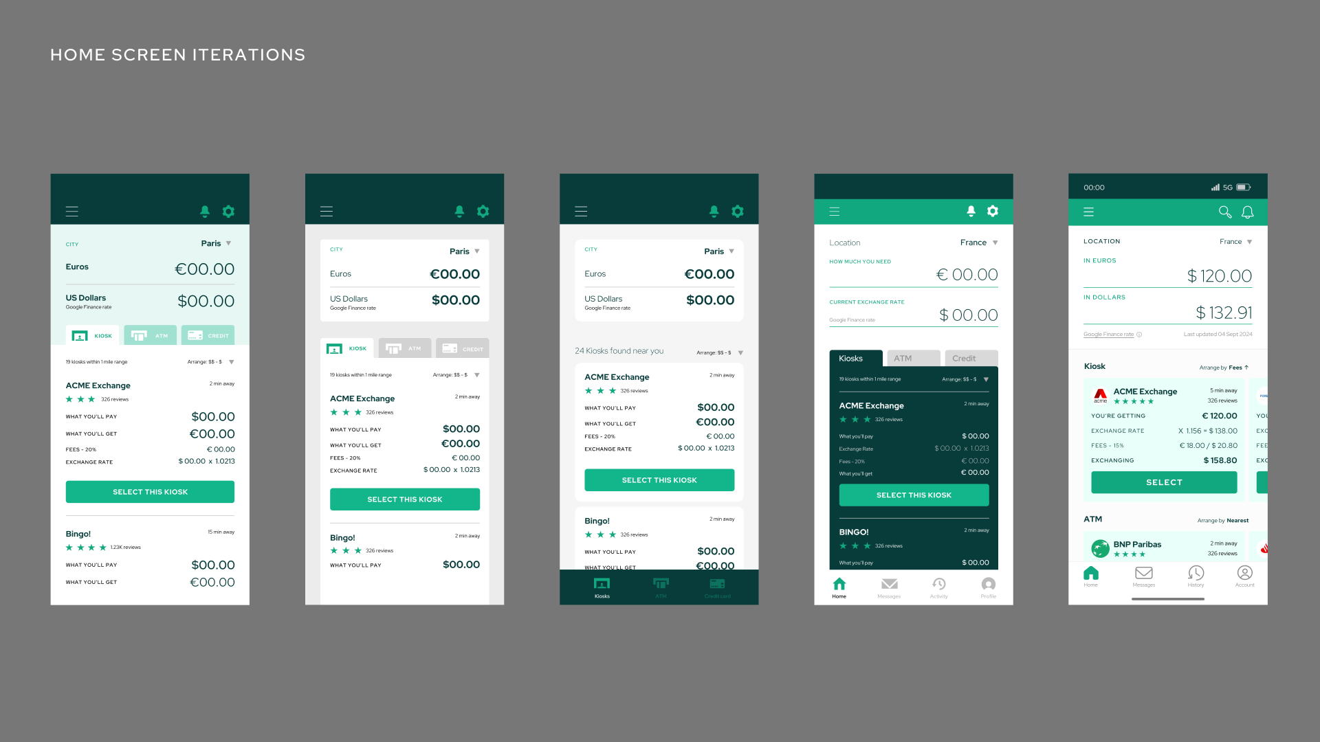
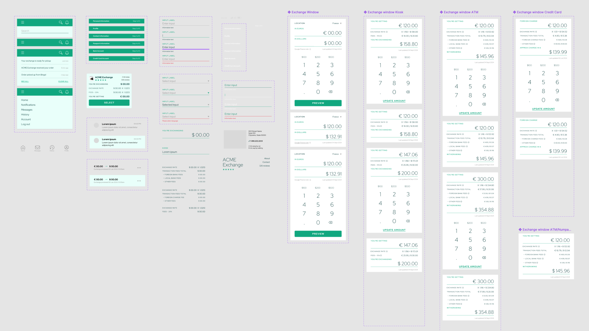
I started the process by designing the home screen; once I landed on the most effective design, I started branching out to other app windows and creating the rest of the UI experience.I started developing ideas for the home screen, as this is where most of the users will interact. From there, I started developing the different components of the system and expanded the visual language to the other screens while also developing a design system for the app.
To the far right is the latest design, as it is the most efficient and natural way to show a comparison between different payment options.
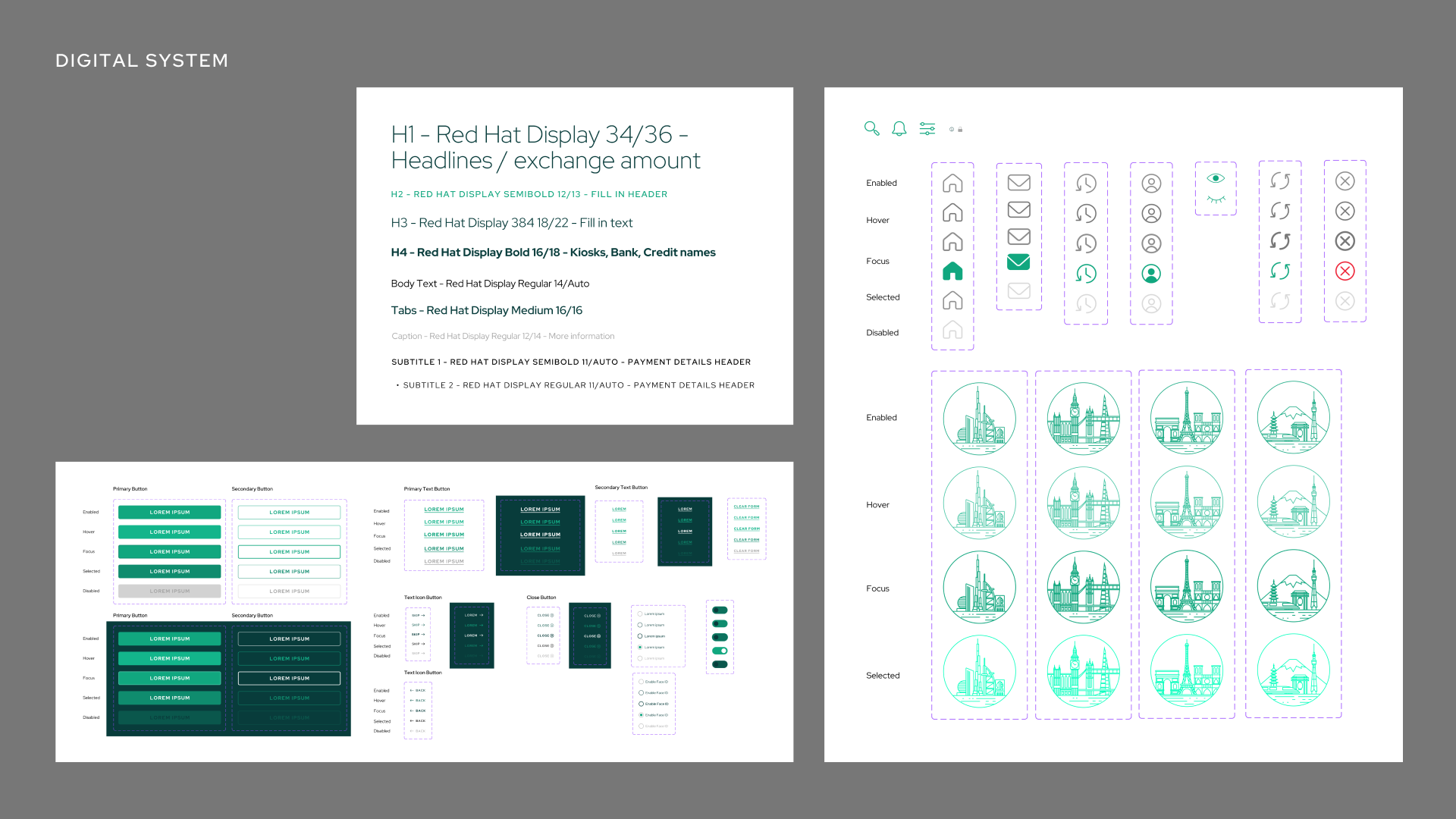
The transition to building the design system was seamless, using the visual language I had established. Creating different components for the app and learning different tactics in Figma for prototyping ideas for this app helped me build a prototype that did what I wanted to do.Project squad
Ideation and design by Baron SantiagoXX


